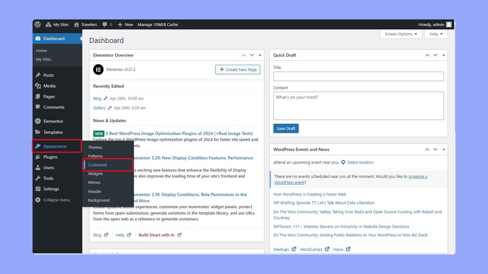
Is your WordPress site ready for mobile users? If your website doesn’t look or work well on phones and tablets, you could be losing visitors—and customers—without even knowing it.
You want your site to load fast, display perfectly, and keep people engaged no matter what device they use. The good news? Adjusting WordPress for mobile is easier than you think. You’ll discover simple, effective steps to make your site mobile-friendly and give your visitors a seamless experience.
Keep reading, and you’ll turn your WordPress site into a mobile powerhouse that works for you 24/7.

Credit: thewebsitearchitect.com
Mobile-first Design Principles
Mobile-first design means creating your WordPress site with mobile users in mind first. This approach ensures the site works smoothly on small screens. It helps improve user experience and keeps visitors engaged.
Designing for mobile first also benefits your site’s search ranking. Google favors mobile-friendly sites in its results. Following these principles helps your site perform well on all devices.
Prioritize Content
Show the most important content at the top of the page. Mobile screens have less space, so focus on key messages. Avoid clutter and keep text short and clear.
Use headings and bullet points to make content easy to scan. Highlight calls to action early to guide users.
Simplify Navigation
Use a simple menu that is easy to open and close. Limit menu items to the essentials only. Large buttons and clear labels help users tap links correctly.
Consider a hamburger menu to save space. Avoid complex dropdowns that are hard to use on phones.
Optimize Load Speed
Fast loading is crucial on mobile devices. Compress images and use lightweight themes. Minimize the use of large scripts and plugins.
Test your site speed regularly and fix issues quickly. A faster site keeps visitors and improves rankings.
Choosing A Responsive Theme
Choosing a responsive theme is key for a mobile-friendly WordPress site. A responsive theme adapts to different screen sizes automatically. This improves user experience on phones and tablets. It also helps your site rank better on search engines. You get a site that looks good on any device without extra work.
Features To Look For
Pick a theme that adjusts to all screen sizes smoothly. It should have flexible grids and images. Fast loading speed matters for mobile users. The theme must support touch gestures and easy navigation. Check if it works well with popular plugins. Regular updates from the developer ensure ongoing compatibility.
Popular Responsive Themes
Some themes have built-in mobile optimization. Astra is lightweight and adjusts well to mobile screens. OceanWP offers many customization options and good speed. GeneratePress is simple and fast, ideal for beginners. These themes have strong user ratings and community support. They provide a solid base for a responsive website.
Testing Theme Responsiveness
Use online tools like Google Mobile-Friendly Test to check your theme. Resize your browser window to see how the layout changes. Test on real devices like phones and tablets. Look for any broken elements or hard-to-read text. Fix issues before launching your site to mobile users. A fully responsive theme ensures visitors stay longer and engage more.
Optimizing Images For Mobile
Images play a big role in how your WordPress site looks on mobile. Optimizing images helps your pages load faster and saves data for your visitors. It also improves the user experience and keeps people on your site longer.
Mobile screens are smaller and need lighter images. Using the right formats, loading images only when needed, and compressing images without losing quality all help your site run smoother on phones and tablets.
Use Proper Formats
Choose image formats that work well on mobile. WebP is a good choice because it keeps quality but uses less space. JPEG works well for photos, while PNG is best for images with clear edges or text. Avoid using large BMP or TIFF files as they slow down your site.
Implement Lazy Loading
Lazy loading delays image loading until the user scrolls near them. This reduces the initial page size and speeds up loading times. WordPress has built-in lazy loading, but you can also use plugins for more control. This saves data and makes the site faster on mobile.
Compress Images Without Quality Loss
Compress images to reduce file size but keep them clear. Use tools like TinyPNG or ShortPixel to do this automatically. Small images load faster and use less data. Compressing images helps your site perform well on all mobile devices without hurting appearance.
Customizing Mobile Menus
Mobile menus play a key role in user experience on small screens. Customizing these menus helps visitors navigate your site with ease. A well-designed mobile menu saves space and looks clean. It guides users to important pages quickly.
Focus on simple, clear menu styles. Keep buttons large enough to tap. Use icons to save space and make menus intuitive. Test menus on different devices for smooth performance.
Creating Hamburger Menus
Hamburger menus hide the full menu behind a small icon. This icon shows three horizontal lines. Tapping it reveals the full navigation list.
They save screen space and reduce clutter. Use plugins or themes that support hamburger menus. Make sure the icon is easy to find on the screen.
Sticky Navigation Bars
Sticky navigation bars stay visible as users scroll down the page. They keep menu options accessible at all times. This improves navigation on long pages.
Use sticky bars to keep important links in view. Choose a simple design to avoid distraction. Make sure the sticky bar does not cover content.
Accessible Menu Design
Accessibility means everyone can use your menu easily. Use high contrast colors for text and background. Ensure menu items are large enough to tap.
Include keyboard navigation for users who don’t use a mouse. Add clear labels to icons and links. Test menus with screen readers to improve usability.
Improving Mobile Page Speed
Improving mobile page speed is key for a better user experience. Fast pages keep visitors engaged and reduce bounce rates. Mobile users expect quick access to content on any device. Simple steps can make your WordPress site load faster on phones and tablets.
Minimize Css And Javascript
Large CSS and JavaScript files slow down your site. Minify these files by removing spaces and comments. Use plugins or online tools to do this automatically. Smaller files load faster and improve mobile speed. Combine multiple files into one to reduce server requests.
Leverage Browser Caching
Browser caching stores parts of your site on a user’s device. This avoids reloading the entire page on repeat visits. Set expiration dates for images, CSS, and JavaScript files. Use caching plugins to simplify this process in WordPress. Faster reload times mean happier visitors.
Use A Content Delivery Network
A Content Delivery Network (CDN) stores your site’s files on servers worldwide. This brings content closer to users, reducing load time. CDNs help handle traffic spikes and improve reliability. Many WordPress plugins offer easy CDN integration. Faster delivery means better mobile performance.
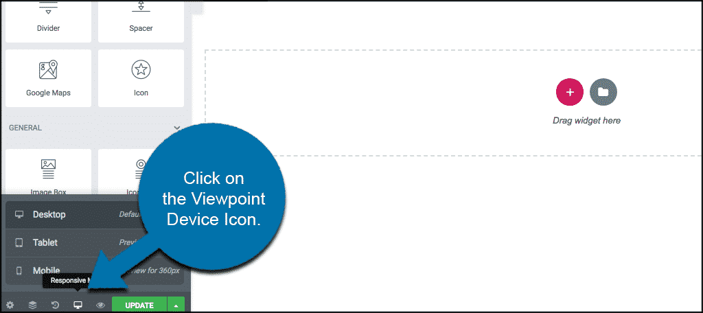
Credit: www.greengeeks.com
Mobile-friendly Plugins
Mobile-friendly plugins improve how your WordPress site works on phones. They help pages load faster and look good on small screens. Using the right plugins boosts user experience and keeps visitors on your site.
Essential Plugins For Ux
Choose plugins that make navigation easy on mobile devices. Plugins for responsive menus and touch-friendly sliders work well. Image optimization plugins help pictures load quickly. Also, caching plugins speed up page loading times.
Avoiding Plugin Conflicts
Not all plugins work well together. Conflicts can slow down your site or break features. Test new plugins one at a time. Keep plugins updated to avoid security and compatibility issues. Remove plugins you no longer use to keep the site clean.
Testing Plugin Performance
Check how plugins affect your site’s speed on mobile. Use tools like Google PageSpeed Insights to measure performance. Test your site on different devices and browsers. Remove plugins that slow your site or cause errors.
Touchscreen Optimization
Touchscreen optimization is key for a smooth mobile experience. It makes your WordPress site easy to use on phones and tablets. Small screens and finger taps need special design care. Optimizing touch controls helps visitors interact quickly and without errors.
Button Size And Spacing
Buttons must be big enough to tap easily. Small buttons cause frustration and missed clicks. Keep buttons at least 44 pixels wide and tall. Space buttons apart to stop accidental taps on the wrong one. Proper size and spacing improve user control and comfort.
Swipe And Tap Gestures
Support common touch gestures like swipe and tap. Swipe helps users move through galleries or menus. Tap triggers actions or opens links. Use clear visual cues for gestures. This guides users and makes navigation feel natural.
Avoiding Hover-only Features
Hover effects don’t work on touchscreens. Users cannot hover fingers like a mouse pointer. Avoid menus or buttons that appear only on hover. Use tap or click triggers instead. This ensures all content is accessible on mobile devices.

Credit: thewebsitearchitect.com
Testing And Debugging Mobile Ux
Testing and debugging mobile user experience (UX) is essential for a WordPress site. It ensures visitors enjoy smooth navigation and quick loading times on their phones. Poor mobile UX can drive users away and reduce site engagement. Regular tests help find and fix problems early.
Using Emulators And Real Devices
Emulators mimic mobile devices on a computer. They let you check how your site looks on different screen sizes and operating systems. They are fast and easy to use but may miss some real-device issues.
Testing on real devices is crucial. It shows how the site performs with actual hardware and network conditions. Use various phones and tablets to cover popular models and screen sizes. This approach catches bugs emulators might miss.
Analyzing User Behavior
User behavior data helps improve mobile UX. Tools like Google Analytics show how visitors interact with your site. Look at metrics such as bounce rate, session duration, and click patterns.
Heatmaps reveal where users tap or scroll the most. This information guides design changes to make navigation easier. Tracking errors and loading times also points out areas to fix.
Fixing Common Mobile Issues
Slow loading is a frequent mobile problem. Compress images and use caching to boost speed. Avoid large files and unnecessary plugins that slow your site down.
Navigation should be simple. Use clear buttons and menus that work well on small screens. Check font sizes and spacing to ensure readability.
Fix broken links and forms that don’t submit on mobile. Test all interactive elements thoroughly to avoid frustration.
Frequently Asked Questions
How To Make WordPress Mobile Responsive?
Use a responsive theme that adapts to screen sizes. Test your site on various devices. Utilize plugins like WPtouch for mobile optimization.
Which WordPress Plugins Improve Mobile Performance?
Plugins like WP Rocket and Autoptimize enhance speed. WPtouch offers mobile-specific themes for better user experience. These plugins reduce load time and optimize images.
How To Test WordPress Site On Mobile Devices?
Use Google’s Mobile-Friendly Test tool for quick checks. Preview your site on smartphones and tablets. Browser developer tools also simulate mobile views.
Can I Customize Mobile Menus In WordPress?
Yes, many themes support mobile menu customization. Use WordPress’s menu settings or plugins like Max Mega Menu. This improves navigation for mobile users.
Conclusion
Making your WordPress site mobile-friendly improves user experience. Visitors stay longer and explore more pages. Simple steps like using responsive themes help a lot. Checking your site on different devices is key. Fast loading and easy navigation keep users happy.
Regular updates ensure your site stays mobile-ready. Small changes can bring better results and more traffic. Start adjusting your site today to reach more people. Mobile-friendly design matters in today’s online world.