

Is your WordPress site looking off on mobile devices? If your visitors struggle to navigate or read your content on their phones, you’re losing their attention—and potentially your business.
But don’t worry, you can fix this. Adjusting your mobile view in WordPress is easier than you think. You’ll discover simple steps to make your site look great and work smoothly on any screen. Keep reading, and you’ll learn how to keep your visitors engaged no matter what device they use.

Credit: thewebsitearchitect.com
Mobile View Importance
Mobile view is crucial for any WordPress site today. Most users browse websites on phones or tablets. A site that looks good on mobile keeps visitors interested. It also makes it easy to read and navigate. Ignoring mobile view can lose many visitors quickly.
Mobile devices have smaller screens and touch controls. A well-adjusted mobile view fits these screens perfectly. It loads fast and avoids clutter. This helps users find what they want without frustration.
Impact On User Experience
Good mobile view improves how users feel on your site. Easy reading and simple navigation keep users longer. Buttons and links should be easy to tap. Text must be large enough to read without zooming. A smooth experience lowers bounce rates and raises engagement.
Seo Benefits
Search engines favor mobile-friendly sites in results. Google uses mobile-first indexing. This means it looks at mobile versions to rank sites. A responsive mobile view boosts your SEO score. It helps your site appear higher in search results. Better SEO leads to more traffic and visitors.
Choosing A Responsive Theme
Choosing a responsive theme is the first step to make your WordPress site look great on mobile devices. A responsive theme changes its layout to fit any screen size. This helps visitors have a good experience, no matter what device they use. Mobile-friendly sites also rank better on search engines. Picking the right theme saves time and effort in the long run.
Key Features To Look For
A good responsive theme adapts smoothly to all screen sizes. It should load fast to keep visitors happy. Clean and simple design makes content easy to read on small screens. Check if the theme supports touch gestures like swipe and tap. Compatibility with popular plugins ensures extra features work well. Regular updates show the theme is maintained and secure. Good customer support is helpful if you face issues.
Top Responsive Themes
Some themes have a strong reputation for responsiveness. Astra is lightweight and very customizable. OceanWP offers many design options and mobile-friendly layouts. GeneratePress focuses on speed and simple design. Neve is easy to set up and works well on all devices. These themes balance style, speed, and usability. Trying demos helps find the best fit for your site.
Using WordPress Customizer
The WordPress Customizer is a built-in tool for changing your site’s look. It lets you see your changes live before saving. This tool helps adjust your website for mobile devices easily. You can control layout, fonts, colors, and more. Customizing for mobile ensures your site looks good on small screens.
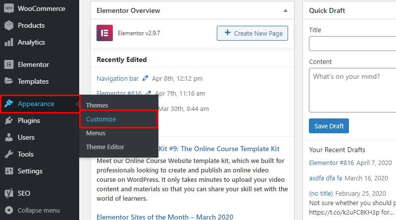
Accessing Mobile Preview
Open your WordPress dashboard. Click on “Appearance” and then “Customize.” The Customizer panel appears on the left. At the bottom, find the device icons. Click the mobile icon to switch to mobile view. This shows how your site looks on phones. Use this preview to check your design. It helps catch layout issues early.
Adjusting Layout And Fonts
In the Customizer, look for sections like “Layout” or “Typography.” These control how your content fits on small screens. Reduce padding or margins to save space. Choose font sizes that are easy to read on phones. Avoid fonts that are too small or too large. Adjust heading sizes to keep balance. Preview changes in mobile view often. This ensures your site stays user-friendly.
Custom Css For Mobile
Custom CSS for mobile devices lets you control how your WordPress site looks on small screens. It helps fix layout issues and improves user experience on phones and tablets.
You can make text easier to read, adjust images, and hide elements that do not fit well. Custom CSS targets only mobile screens without changing the desktop view.
Targeting Mobile Devices
Use media queries to apply CSS only on mobile devices. For example, @media (max-width: 768px) targets screens 768 pixels wide or less.
This helps you write rules that only affect phones and small tablets. You can change fonts, sizes, margins, and more without affecting larger screens.
Common Css Tweaks
Change font size to make text readable on small screens. Increase line height for better spacing.
Resize images to fit the screen width. Use max-width: 100% to keep images from overflowing.
Hide unnecessary elements using display: none;. This keeps the mobile view clean and simple.
Adjust padding and margins to prevent content from feeling cramped or stretched.
Plugins For Mobile Optimization
Plugins for mobile optimization help make your WordPress site look good on phones and tablets. They improve loading speed and make navigation easier. Good plugins adjust images, fonts, and layouts for small screens automatically.
Using the right plugin saves time. It lets you focus on your content instead of coding. Many plugins offer simple controls to customize your mobile view.
Best Mobile-friendly Plugins
Some plugins stand out for mobile optimization. WPtouch creates a mobile theme without changing your desktop site. Jetpack includes tools for speeding up images and improving mobile design. AMP (Accelerated Mobile Pages) makes your pages load very fast on mobile. Others like Smush optimize images to reduce load time.
Choose plugins that update regularly and have good user reviews. Check if they work well with your current WordPress theme.
Configuring Plugins Effectively
After installing, configure plugins to fit your site’s needs. Set image sizes to match mobile screen widths. Turn on features that simplify navigation menus for small devices. Test changes on different phones and tablets.
Keep settings simple. Avoid overloading your site with too many features. Regularly update plugins to fix bugs and improve performance. Clear cache after changes to see results immediately.

Credit: thewebsitearchitect.com
Testing Mobile Responsiveness
Testing mobile responsiveness ensures your WordPress site works well on all devices. It helps find layout issues and slow loading times. Good testing improves user experience and keeps visitors engaged. This section covers two easy ways to test your site’s mobile view.
Browser Developer Tools
Most browsers have built-in developer tools to test mobile views. Open your site in a browser like Chrome or Firefox. Right-click and select “Inspect” to open developer tools. Click the device icon to toggle mobile view. You can choose different screen sizes and devices. This helps see how your site looks on phones and tablets. It also shows if text is readable and buttons are easy to tap.
Online Testing Tools
Online tools offer quick mobile responsiveness tests without coding. Enter your site URL to check its mobile version. These tools simulate various devices and screen sizes. They also report loading speed and errors. Some popular options include Google’s Mobile-Friendly Test and BrowserStack. Use these tools to find problems and fix them fast. They give a clear picture of your site’s mobile health.
Fixing Common Mobile Issues
Many WordPress sites face issues when viewed on mobile devices. These problems can make your site hard to use and look unprofessional. Fixing common mobile issues improves user experience and keeps visitors engaged. Focus on image scaling and menu navigation to start.
Image Scaling Problems
Images often appear too large or too small on mobile screens. This happens when images do not resize properly. Use responsive image settings in WordPress to fix this. Set maximum width to 100% for images. This makes images adjust to the screen size. Check your theme’s settings for image options. Avoid fixed pixel sizes that break layouts on phones.
Menu Navigation Glitches
Menus can be tricky on mobile devices. They might not open or show all options. This frustrates users and stops them from browsing your site. Use a mobile-friendly menu plugin or a theme with built-in responsive menus. Test the menu on different phones. Make sure it opens smoothly and links work. Keep menu items simple and easy to tap.
Improving Mobile Load Speed
Improving mobile load speed is vital for a good user experience. Fast-loading pages keep visitors on your site. They reduce bounce rates and increase engagement. Google also favors websites that load quickly on mobile. This helps improve your search rankings. Focus on two key areas: image optimization and caching with minification. These steps can make your WordPress site much faster on mobile devices.
Image Optimization
Large images slow down your mobile site significantly. Compress images to reduce file size without losing quality. Use tools like TinyPNG or plugins such as Smush for easy optimization. Choose the right image format: JPEG for photos, PNG for graphics with fewer colors. Resize images to fit mobile screens correctly. Avoid uploading images larger than needed. Optimized images load faster and save bandwidth for mobile users.
Caching And Minification
Caching stores website data on visitors’ devices. This speeds up repeat visits by loading saved data. Use caching plugins like W3 Total Cache or WP Super Cache for WordPress. Minification removes unnecessary characters from code files. It shrinks CSS, JavaScript, and HTML files. Smaller files load faster and improve site speed. Many caching plugins include minification features. Enabling both caching and minification boosts mobile load times effectively.
Credit: wpklik.com
Frequently Asked Questions
How Do I Enable Mobile View In WordPress?
To enable mobile view, use responsive themes or plugins. WordPress themes like Astra or GeneratePress automatically adjust mobile layouts for better user experience.
How Can I Customize WordPress Mobile View Easily?
Use the WordPress Customizer tool under Appearance > Customize. It allows you to modify fonts, colors, and layouts specifically for mobile devices.
Which Plugins Help Improve WordPress Mobile Responsiveness?
Popular plugins like WPtouch and Jetpack enhance mobile responsiveness. They optimize loading speed and layout without complex coding.
How To Preview Mobile View Before Publishing Changes?
In WordPress Customizer, click the mobile icon to preview. This lets you see how your site looks on different mobile screens.
Conclusion
Adjusting the mobile view in WordPress improves user experience. It helps your site look good on phones and tablets. Small changes make a big difference in how visitors see your content. Test your site on different devices to check the layout.
Use simple tools and settings inside WordPress to make tweaks fast. Keeping your site mobile-friendly helps visitors stay longer and engage more. Follow these steps regularly for the best mobile view results. Your website will be easier to use and more attractive on any screen.


