
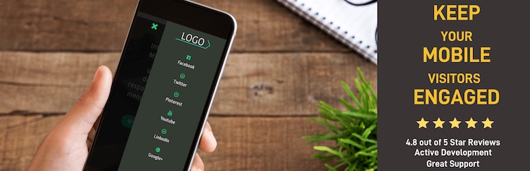
Are you tired of your website’s menu looking great on desktop but turning into a jumbled mess on mobile devices? You’re not alone.
A responsive menu is crucial for providing a seamless user experience across all devices, and it’s easier to implement than you might think. You’ll discover simple steps to add a responsive menu to your WordPress theme, transforming your site’s navigation into something sleek and efficient.
By the end, you’ll feel confident in making your website more user-friendly, keeping your visitors engaged and satisfied. Let’s dive in and give your WordPress site the upgrade it deserves!
Responsive Menu Basics
A responsive menu changes shape on different devices. This keeps it easy to use. Start by using a WordPress plugin. Many plugins help make menus responsive. Some popular ones are WP Responsive Menu and Max Mega Menu. Install the plugin in your WordPress dashboard. Next, go to the plugin settings. Here, you can choose menu styles and colors. The menu should look good on both phones and computers. Use the preview feature to check your menu on different screens. Adjust until it fits well. This way, your website looks neat everywhere.
Choosing A Menu Plugin
Popular Plugins make adding menus easy. Elementor is liked by many. It offers drag and drop features. Another choice is WP Responsive Menu. It is simple and quick. Max Mega Menu is also great. It has many options to explore.
Key Features to Consider include ease of use. Plugins should work smoothly. Look for mobile friendly options. They should fit screens of all sizes. Customizable styles are important too. It helps match your site’s look. Check for regular updates. This ensures safety and new features.
Installing And Activating The Plugin
Begin by logging into your WordPress dashboard. Locate the Plugins section on the left menu. Click on Add New. Use the search bar to find your desired menu plugin. Responsive Menu is a good choice. Click Install Now next to the plugin. Installation will start. Wait for a few seconds. After installation, the Activate button will appear.
Click on the Activate button to enable the plugin. Your plugin is now active. Go to the plugin settings. Customize your menu as needed. Check the preview. Ensure the menu is responsive. Save your changes. Visit your site to see the new menu. The process is simple and easy.
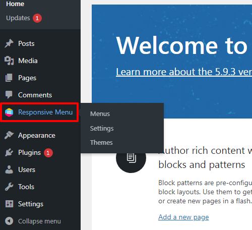
Credit: responsive.menu
Configuring Menu Settings
Crafting a responsive menu in a WordPress theme enhances user experience across devices. Begin by accessing the menu settings and select ‘Responsive Menu’ to tailor display options. Customize menu items and settings to ensure seamless navigation on smartphones, tablets, and desktops.
Setting Up Menu Locations
First, go to your WordPress dashboard. Find the Appearance section. Click on Menus. Here you can create a new menu. Choose a menu name that makes sense. Look for Menu Locations option. Assign your menu to a location. Each theme has different locations. Select the best spot for your menu. Save your changes.
Customizing Menu Appearance
You can change how your menu looks. Go back to the Appearance section. Click on Customize. Look for the Menus option. Choose your menu. You can change fonts and colors here. Make sure the menu is easy to read. Bold important menu items. Try different styles. Check how it looks on phones and tablets. Save your changes when happy.
Integrating Menu With Theme
Adding a responsive menu to your WordPress theme enhances user experience across devices. Start by selecting a compatible plugin that offers customizability. Integrate seamlessly with theme settings to ensure smooth navigation and accessibility.
Editing Theme Files
Find the theme folder in WordPress. Open the header.php file. Locate the spot for the menu. Add the code for the responsive menu. Save changes. Test the menu on the website. Make sure it works on phones and computers.
Using Widgets And Shortcodes
Go to the WordPress dashboard. Click on Appearance. Select Widgets. Drag the menu widget to the sidebar. Save the widget settings. Use shortcodes for more options. Place shortcodes in posts or pages. Preview the changes. Ensure the menu appears correctly. Adjust settings if needed.

Credit: cyberchimps.com
Testing Menu Responsiveness
Tools for Testing a responsive menu are essential. Simple tools like Google Chrome DevTools are great. They help check if menus adjust on different screens. You can use online services like BrowserStack. It tests menus on various devices. Make sure to test your menu on phones, tablets, and desktops. The goal is a smooth user experience on all screens.
Common Issues and Fixes can arise with responsive menus. Sometimes, menus don’t fit well on small screens. Fix this by checking the CSS media queries. Another issue is menus overlapping with other content. Solve this by adjusting the z-index in your CSS. Always ensure menu items are easy to click. Small touch targets can frustrate users. Make them larger for easier access. Regular testing will help catch issues early.
Enhancing Menu With Css
Adding a responsive menu to your WordPress theme enhances user experience. CSS plays a crucial role in achieving this. It ensures menus adapt smoothly to various screen sizes, providing easy navigation on all devices.
Basic Css Techniques
Use CSS to make menus look nice. Start with background colors. Choose colors that match your theme. Add padding to menu items. This gives space around text. Use border styles. Try solid or dotted lines. Change font styles to make text stand out. Use <strong:hover effects for menu items. This makes menus interactive. Try transitions for smooth changes.
Advanced Customizations
For advanced design, use media queries. Adjust menu layout for different screens. Use flexbox for better alignment. This helps items fit well. Try grid layout for complex designs. It organizes items easily. Use animations for lively menus. Add custom icons for unique looks. Icons make menus clear and fun. Make sure menus are accessible. Use ARIA labels. They help everyone use the menu.
Maintaining Menu Performance
Adding a responsive menu to your WordPress theme enhances user experience on all devices. Simplify navigation by using plugins or theme settings. Ensure menus adapt to different screen sizes for better accessibility and engagement.
Regular Updates
Updating your WordPress theme is important. It helps in keeping the menu responsive. Updates bring new features and fix old bugs. You should always use the latest version available. Many themes update automatically. This saves time and effort. Regular updates improve site speed. They also enhance user experience. Make sure to backup your site before updating. This prevents data loss.
Monitoring For Issues
Monitoring the menu is crucial. It ensures everything works smoothly. Check for broken links and slow loading times. These can affect user experience. Use tools to monitor menu performance. Some plugins can help with this. Regular checks prevent major problems. A well-maintained menu keeps visitors happy. It also helps in better navigation. Always test changes made to the menu. This helps in identifying issues early.
Credit: wordpress.org
Frequently Asked Questions
How Can I Add A Responsive Menu In WordPress?
To add a responsive menu in WordPress, install a mobile-friendly theme or use plugins like Responsive Menu or WP Mobile Menu. Customize the menu settings through the WordPress dashboard for better visibility and user experience on different devices.
What Is The Best Plugin For Responsive Menus?
Responsive Menu is a popular plugin for creating mobile-friendly menus. It offers customizable options, easy integration, and supports various menu styles. It improves navigation and ensures your website is accessible on any device.
Do Responsive Menus Impact Seo In WordPress?
Responsive menus improve user experience and accessibility, positively impacting SEO. They ensure your site is easy to navigate on all devices, reducing bounce rates and increasing engagement, which can lead to better search rankings.
How Do I Customize My WordPress Responsive Menu?
Customize your WordPress responsive menu using the theme’s customization options or a menu plugin. Adjust colors, fonts, and layout for a cohesive look. Ensure the menu is easy to use and matches your site’s design.
Conclusion
Adding a responsive menu to your WordPress theme is simple. It improves user experience and site navigation. Follow easy steps and your site will look great on any device. Responsive menus adapt to different screen sizes. This keeps your site visitor-friendly.
No need for technical skills. Just a few adjustments, and you’re set. Responsive design is important for modern websites. It boosts engagement and satisfaction. Try it today, and see the difference. Your visitors will appreciate the effort. Happy website designing!


