
Are you looking to create a visually appealing and organized website on WordPress? If so, understanding the grid layout could be your golden ticket.
A grid layout in WordPress can transform your site, making it not only look professional but also function seamlessly. Imagine a layout where your content is structured like a neat, tidy grid. It draws the eye and guides your visitors effortlessly through your pages.
This layout is not just about aesthetics; it’s about enhancing user experience and boosting engagement. Curious about how you can leverage this design strategy for your site? Stick around, and you’ll discover the ins and outs of grid layouts in WordPress, and how they can elevate your web presence to new heights.
Grid Layout Basics
Grid Layout in WordPress helps organize content. It’s like a checkerboard. Each block holds text, images, or videos. This layout keeps your site neat and tidy. Users can find things quickly. No more messy pages!
Grid Layout uses rows and columns. Think of rows as horizontal lines. Columns are vertical lines. Together, they make a grid. You can adjust these to fit your needs. Add more rows for extra content. Or shrink columns for a cleaner look.
Many WordPress themes come with grid options. Some themes let you change grids easily. No coding needed! Just drag and drop. This makes web design fun and easy for everyone.
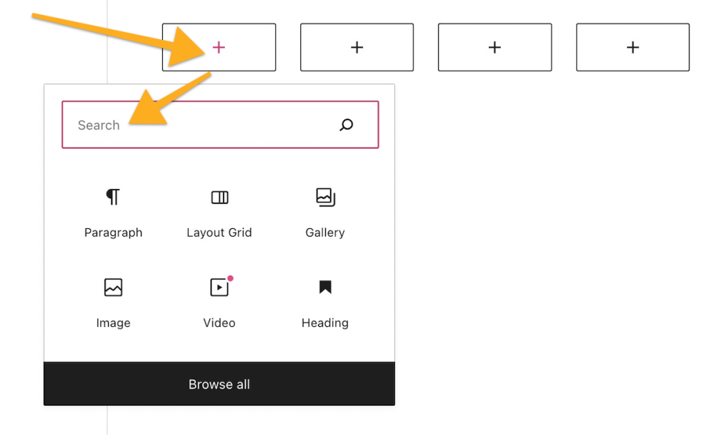
Credit: wordpress.com
Benefits Of Grid Layout
Grid layouts fit all screen sizes. They look good on phones and computers. This makes websites user-friendly. Visitors enjoy a smooth browsing experience. No more zooming in or out. Everything fits perfectly.
Grids keep your site neat. All elements are in order. This makes content easy to read. A tidy site attracts more visitors. It helps people find information faster.
Changing layout is simple. Grids allow flexibility. Add or move elements with ease. No need for coding skills. This makes your site unique. Stand out from the crowd.
Setting Up Grid Layout
Choose a theme with built-in grid options. Themes with grid support make design easy. Look for themes with customizable grid layouts. These themes let you change the design easily. Many free themes offer grid layouts too. Start with a theme that matches your style. Simple grids help make your site look neat.
Plugins add more grid features. Install a plugin to enhance your site. Search the plugin store for grid layout plugins. Popular plugins include Elementor and GridKit. These plugins offer drag-and-drop features. They are easy to use, even for kids. Plugins help make your design flexible. Try different plugins to find the best fit.

Credit: developer.wordpress.org
Customizing Grid Layout
Adjusting columns and rows can make your site look neat. You can change the number of columns easily. Fewer columns make items look bigger. More columns make items look smaller. Rows are horizontal lines. You can add more rows if needed. It’s like arranging bricks in a wall. It keeps everything in order.
Styling makes your grid layout special. You can choose colors for the background. Pick fonts to match your style. Borders can be added for a neat look. Shadows give depth to your design. Make sure everything matches your theme. This way, your site looks cool and organized.
Widgets are like small apps for your site. You can add a calendar or a search box. Content includes text, images, and videos. Place them in the grid to make your site interesting. Mix widgets and content for a fun layout. This helps visitors find what they need quickly.
Popular Grid Layout Plugins
Essential Grid is a plugin that creates grid layouts. It displays pictures, videos, and posts. Users can choose different styles and skins. It helps in designing responsive grids. It works well with many WordPress themes.
WPBakery Page Builder offers drag-and-drop features. It helps users build custom grids easily. This tool is flexible. It supports many design elements. Templates can be adjusted to fit the user’s needs. Users get a user-friendly experience with this tool.
Elementor is a popular page builder. It provides grid layout options. Users enjoy its visual editor. It offers many widgets for design. Users can create responsive layouts without coding. Customizable designs make it attractive. It is known for its speed and efficiency.
Common Grid Layout Challenges
Grid layout in WordPress helps organize content efficiently on web pages. Common challenges include maintaining responsive design across devices and ensuring consistent alignment. Balancing aesthetics with functionality often requires careful planning and adjustment.
Mobile Responsiveness
Mobile screens are small. Grid layouts must fit well. Elements can shift or look strange. Design must adapt to different screen sizes. Responsive grids solve this. Media queries help adjust layouts. They change styles based on screen width.
Cross-browser Compatibility
Browsers show websites differently. Grid layouts must work everywhere. Some browsers support modern CSS features. Others do not. Testing is crucial for compatibility. Developers use tools to check layouts. Consistent design across browsers is key.
Performance Optimization
Websites need to load fast. Grid layouts can slow them down. Images, scripts, and styles affect speed. Optimizing assets helps improve performance. Developers compress files. They also use caching techniques. Fast loading enhances user experience.
Future Of Grid Layout In WordPress
Web design is always changing. New styles come and go. Grid layouts are popular now. They make sites look neat. Everything has its place. People love this clean look. Designers use it more and more. It’s easy to make changes with grids. You can move things around quickly.
WordPress keeps getting better. New tools come out often. Grid features are improving. Users can make nice sites fast. It’s simple to use. Even beginners can learn quickly. They can create stunning designs without stress. The future looks bright for WordPress grids.

Credit: wordpress.com
Frequently Asked Questions
How Does Grid Layout Enhance WordPress Design?
Grid layout organizes content efficiently, creating visually appealing designs. It offers flexibility in arranging elements, ensuring balance and symmetry. By using grid layout, you can improve user experience, make navigation intuitive, and showcase content effectively. It is ideal for responsive design, adapting seamlessly to different screen sizes.
Can I Customize Grid Layout In WordPress?
Yes, WordPress allows customization of grid layouts. You can use themes and plugins to modify layout structures. Many tools offer drag-and-drop functionality for easy customization. You can adjust column numbers, row spacing, and alignments. Customization helps tailor the grid to match your branding needs and design preferences.
What Are Popular WordPress Grid Layout Plugins?
Popular plugins include WPBakery Page Builder, Elementor, and Grid Plus. These plugins offer robust grid layout options and customization features. They provide user-friendly interfaces, making it simple to design complex layouts. Using plugins can enhance your website’s visual appeal and improve functionality without requiring coding skills.
Is Grid Layout Suitable For Mobile Devices?
Yes, grid layout is suitable for mobile devices. It offers responsive design capabilities, automatically adjusting to various screen sizes. Grid layout ensures content remains organized and accessible on smartphones and tablets. Using a responsive grid layout improves user experience and maintains design integrity across all devices.
Conclusion
Grid layout in WordPress offers a flexible design option. It helps create organized and visually appealing pages. Users can easily arrange content. Designers gain control over spacing and alignment. This layout enhances user experience. It simplifies navigation and improves content accessibility.
WordPress grid layout adapts well to various screen sizes. It ensures a consistent look across devices. Exploring grid layout features can elevate site design. Understanding its basics opens creative possibilities. Implementing grids can lead to better engagement. Grid layout remains a valuable tool for modern web design.


