Are you feeling puzzled about the terms “px” and “em” in WordPress? You’re not alone.
Many WordPress users find themselves scratching their heads when it comes to understanding these units of measurement. But worry not, because we’re here to clear up the confusion. Imagine being able to design your website with precision, confidently adjusting font sizes and layouts to perfectly fit your vision.
By understanding px and em, you’ll gain the power to transform your WordPress site into a masterpiece. So, if you’re ready to unlock the secrets of px and em and take control of your design, keep reading. This knowledge could be the game-changer you’ve been looking for!
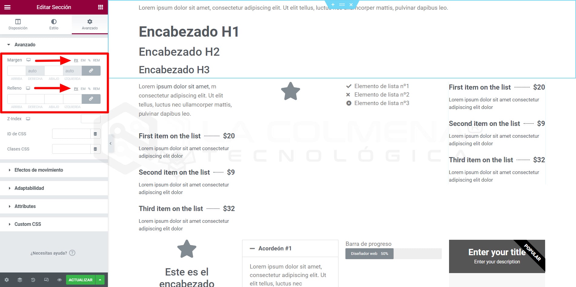
Credit: lacolmenatecnologica.com
Px And Em Basics
Px and em are units for measuring size in web design. Px stands for pixels. Pixels are tiny dots on your screen. A larger number means a larger size. Em is different. It depends on the font size of the parent element. If the parent font size is 16px, then 1em equals 16px. It’s useful for responsive design. Em scales with the user’s settings. This makes text readable on all devices. Choose px for exact sizes. Choose em for flexible, scalable designs.

Credit: www.youtube.com
Pixel (px) Explanation
Pixels are tiny dots on screens. They measure size in a fixed way. Every screen has pixels in rows and columns. A pixel is the smallest unit of a picture. Pixels do not change with screen size. So, they keep the design looking the same. This is why they are called fixed units. Designers use pixels for exact measurements. It helps in creating sharp images and layouts. Pixels are great for precise control. They are used in many parts of web design.
In web design, pixels are used for font size and image dimensions. They help in maintaining the structure of a page. Designers choose pixels for precise control. They ensure content looks good on all screens. Pixels are reliable for maintaining visual elements. They are often used in CSS for layout settings. This makes pages look consistent across devices. Pixels are also used for spacing and padding. They keep things neat and organized on a webpage.
Em Unit Explanation
Em is a unit of measurement in web design. It is based on the font size of the parent element. If the parent font size is 16px, then 1em equals 16px. This means that the size adjusts according to the parent. It can make designs more flexible and responsive.
The em unit scales with the parent element’s font size. If the parent changes, the child element changes too. For example, if the parent size is 20px, then 1em equals 20px. This allows designers to create consistent and adaptable layouts. It is useful for responsive design.
Px Vs Em: Key Differences
Px is a fixed unit. It does not change with screen size. This makes it less flexible. Em changes with the base font size. It is more flexible. You can scale text easily with em. This helps with different screen sizes.
Responsive design needs flexible units. Em units are better for this. They adapt to different devices. Px units can make designs static. This can be a problem on small screens. Choose units wisely for a responsive site. Responsive sites work better for all users.
Choosing Between Px And Em
Size consistency is key for WordPress design. Px units are fixed. They keep the same size always. Em units are flexible. They change with the parent element’s size. This can be good or bad. Consider your design needs. Consistent size or flexible size? Your choice.
Use px for pixel-perfect designs. This helps when exact size matters. Use em for responsive designs. This helps when you want flexibility. Mix them if needed. Use px for some parts. Use em for others. Choose what fits best.
Common Misconceptions
Many think “px” and “em” are confusing in WordPress. “Px” refers to pixels, a fixed size. “Em” is relative, based on the parent element’s font size. Understanding these units helps in responsive design.
Misunderstanding Relative Sizing
Many people think px and em are the same. But they are not. Px stands for pixels. Pixels are fixed sizes. They do not change. Em is different. It is a relative size. This means it can change. It adapts to the font size.
Confusion In Responsive Design
Responsive design is important. Websites need to look good on all devices. Some think px is better for this. But it is not. Em is more flexible. It helps make designs responsive. Using em, the text changes size. It fits better on screens.
Practical Examples In WordPress
WordPress themes can be styled with px or em units. Pixels (px) are fixed sizes. They don’t change. Pixels are like a ruler. One inch is always one inch. Use px for exact control.
Em units are flexible. They change size based on the parent element. This makes text resizeable. Use em for responsive design. Em units help with mobile-friendly sites.
Fonts can look different with px and em. Px gives a fixed size. It’s best for headers. Em changes with the parent font size. It’s best for body text.
Layouts need balance. Use px for fixed elements. Use em for fluid elements. This makes the layout adaptable. Your site will look good on any device.

Credit: www.youtube.com
Frequently Asked Questions
What Are Px And Em In WordPress?
Px and em are units for font sizing in CSS. Px stands for pixels, providing a fixed size. Em is relative to the parent element’s font size, allowing more flexibility. Choosing between px and em affects how text scales across different devices, enhancing readability and accessibility.
How Do Px And Em Affect Design?
Px provides consistent sizing, ensuring uniform design across devices. Em offers scalability, adjusting text size relative to its container. This flexibility allows for responsive designs that adapt to various screen sizes. Using em can enhance user experience by maintaining readability across different devices.
Why Choose Em Over Px In WordPress?
Em is preferred for responsive design, as it scales with the user’s settings. This adaptability enhances accessibility and ensures readability on diverse devices. Em supports fluid layouts, adjusting seamlessly to changes in screen resolution, making it a valuable choice for modern web design.
Can Px And Em Be Used Together?
Yes, px and em can be combined in WordPress designs. Using px for specific, fixed elements ensures consistency, while em allows other elements to scale responsively. This combination can create a balanced design, ensuring both stability and adaptability across different screen sizes.
Conclusion
Understanding px and em in WordPress is crucial for web design. Pixels (px) offer precise control. Em units are flexible and scalable. Both have their unique uses. Choosing between them depends on your design needs. Pixels are great for fixed layouts.
Em units work well for responsive designs. They adapt to different screens easily. Knowing this helps you make informed decisions. Your website can look professional and user-friendly. Experiment with both to see what suits your style. Happy designing!