
Imagine visiting a website where the content seems to spill off the screen or buttons are too small to click. Frustrating, right?
If you’ve ever wondered why some websites look perfect on every device while others don’t, you’re about to discover the magic behind it. The term “responsive” in WordPress is more than just tech jargon; it’s a critical feature that can drastically improve your site’s user experience.
But what does responsive really mean, and how does it affect your WordPress site? By understanding this, you can ensure your website is accessible and engaging for every visitor, no matter the device they use. Dive in to find out how a responsive design can captivate your audience and keep them coming back for more.
Credit: wordpress.com
Responsive Design Basics
Responsive design makes websites look good on all devices. It adjusts to fit different screen sizes. This is important for phones, tablets, and computers. WordPress themes often have built-in responsive features. This helps your site work everywhere. With responsive design, no need to create different sites for different devices.
Images and text resize automatically. This makes sure everything is easy to see. Buttons and links are big enough to tap on a phone. Menus change to fit smaller screens. Responsive design uses flexible grids and layouts. This keeps your site looking neat and tidy. It’s a smart way to create a user-friendly website.
Importance Of Responsiveness
Websites need to fit any device. Phones, tablets, and computers are all used today. Responsive design makes this possible. Content adjusts smoothly for different screens. Users can read and navigate easily. This keeps them happy and engaged. Google likes responsive sites. It ranks them higher. This means more visitors. More visitors can lead to more sales. Businesses benefit greatly from responsive sites. Responsiveness is essential for modern web design. Without it, you may lose visitors. Losing visitors is bad for any site. Keep your site responsive and user-friendly. It’s a simple yet powerful approach.
Responsive Themes In WordPress
Selecting a responsive theme is very important. It makes your site look good on all devices. Big screens or small screens, it adjusts. Responsive themes save time and effort. You don’t need different designs for phones and computers. Your site will load faster too. Faster sites keep visitors happy. Happy visitors stay longer. They might even come back.
Many themes are popular for their responsive features. Astra is quick and easy to use. It works well with many plugins. OceanWP offers lots of customization. It’s good for beginners and experts. Divi gives you many design options. You can create unique layouts. Neve is lightweight and fast. It helps your site load quickly. All these themes are great choices.
Responsive Plugins
Responsive plugins are vital for a website. These tools help the site look good on all devices. They adjust the layout. This means the website works on phones and computers. WP Touch is a popular choice. It creates a mobile-friendly site instantly. Jetpack offers many features. It includes responsive design settings. Using these plugins makes your site user-friendly. Visitors will have a better experience. They can view content easily. Good plugins help with SEO too. Search engines prefer responsive sites. They rank higher in search results. Make sure your site is responsive. Choose the right plugin for your needs.
A responsive site enhances user experience. Users can access content on any device. Easy navigation is key. Responsive design ensures smooth browsing. Sites load faster with good plugins. This improves user satisfaction. Visitors stay longer. They explore more pages. Engaging content helps too. Combine it with responsive design. Your site becomes more attractive. Users will return often. Responsive sites boost engagement. They increase visitor interaction. Choose plugins wisely. They make a big difference.
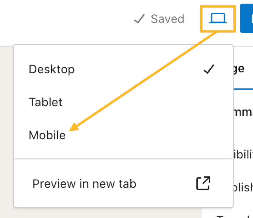
Testing Responsiveness
Responsive design in WordPress adjusts the site’s layout to fit different screen sizes. It ensures your website looks good on smartphones, tablets, and desktops. Testing responsiveness helps improve user experience by providing easy navigation across all devices.
Tools For Testing
Testing a website’s responsiveness is important. There are many tools available. Google’s Mobile-Friendly Test is popular. It checks if your site works on phones. BrowserStack lets you test on different devices and browsers. Responsinator shows how your site looks on various screens. These tools help find problems fast. They save time and effort.
Common Issues And Fixes
Common issues include text size being too small. This makes reading hard. Images may not fit the screen. Fix this with responsive design. Use CSS media queries. They adjust layout based on screen size. Another issue is navigation menus not being touch-friendly. Make buttons bigger for easy clicks. Test your site often. This ensures it works well everywhere.

Credit: wordpress.com
Responsive Content Strategies
Large images can make web pages slow. Slow pages can be frustrating. Always choose the right image size. Use tools to compress images. Compressed images load faster.
Responsive images adjust to fit screens. They look good on all devices. Use HTML tags like
Mobile screens are smaller than desktops. Content should fit well on these small screens. Use simple layouts. Large text is easier to read on small screens.
Responsive layouts improve user experience. Users can read and navigate easily. Place buttons where they are easy to click. Test your site on phones and tablets.
Seo Benefits Of Responsive Design
Responsive design adapts to different screen sizes. It helps search engines understand your site better. Google likes sites that look good on all devices. This can improve your search rankings. Visitors stay longer on easy-to-read pages. This lowers your site’s bounce rate. Higher engagement means better SEO.
Using one site for all devices makes life easier. It saves time and money. It also helps your site load faster. Fast sites get better search rankings. Mobile users find responsive sites friendly. Happy users lead to more traffic. More traffic boosts your SEO. Responsive design is a smart choice.
Credit: mytechguy.co.nz
Frequently Asked Questions
What Is Responsive Design In WordPress?
Responsive design in WordPress ensures your website looks great on all devices. It automatically adjusts layout and elements for screens of different sizes. This improves user experience and search engine rankings. Most modern WordPress themes offer built-in responsive design features, making it easy to create a mobile-friendly site.
Why Is Responsive Design Important For Seo?
Responsive design improves user experience and boosts SEO rankings. Google favors mobile-friendly websites, enhancing search visibility. A responsive site reduces bounce rates by providing seamless navigation. It also ensures faster load times, which is crucial for retaining visitors and improving search engine performance.
How Can I Make My WordPress Site Responsive?
Choose a responsive WordPress theme to make your site mobile-friendly. Use plugins like WPtouch or Jetpack for additional customization. Optimize images and utilize flexible grid layouts. Test your site across various devices to ensure responsiveness. Regularly update your theme and plugins to maintain compatibility with new devices.
Can I Test My WordPress Site’s Responsiveness?
Yes, you can test your site’s responsiveness using online tools. Tools like Google’s Mobile-Friendly Test or Responsinator help check responsiveness. These tools simulate how your site appears on various devices. Regular testing ensures your site remains user-friendly and optimized for all screen sizes.
Conclusion
Responsive design matters in WordPress. It ensures your site looks good everywhere. Mobile phones, tablets, and desktops all need attention. Visitors expect easy navigation. A smooth experience keeps them coming back. Search engines favor responsive sites. Better rankings mean more visitors.
Simple design tools help you achieve this. WordPress themes often support responsive designs. Choose wisely for best results. Test your site on different devices. Make adjustments as needed. Stay updated with design trends. Regular checks maintain quality. Your site’s responsiveness boosts user satisfaction.
It also enhances visibility online. Invest time in responsive design. Your audience will appreciate it.


