Are you ready to transform your WordPress site with a unique look and feel, without losing the original theme’s updates? Building a responsive WordPress child theme might be just what you need.
Imagine having the power to customize your website to perfectly align with your brand, all while ensuring mobile-friendliness and maintaining the core functionalities of your chosen theme. In this guide, you’ll discover the secrets to creating a child theme that not only enhances your website’s aesthetics but also boosts its performance across all devices.
By the end of this article, you’ll have the skills to give your site a fresh and dynamic presence, tailored entirely to your vision. Ready to dive in and take control of your WordPress design? Let’s get started!
Credit: olliewp.com
What Is A Child Theme?
A child theme is a special kind of WordPress theme. It inherits the look and feel of another theme. This other theme is called the parent theme. The child theme lets you make changes without touching the parent. It keeps your changes safe during updates. You can customize it as you like. Add new styles, scripts, and features. All this without breaking the parent theme. Developers love child themes. Beginners can use them too. They are a great way to learn. You keep the original design intact. This is important. No worries about losing updates.
Credit: www.etsy.com
Benefits Of Using A Child Theme
Child themes are great for customizing your site. They help keep the original theme safe. Updates to the parent theme won’t break your changes. This means less stress during updates.
Learning to make a child theme can be simple. A child theme helps with maintaining your site. You can easily change styles and layouts. All without touching the main theme files.
Child themes are also a good way to test new ideas. You can try different designs. You can see what works best. And if it doesn’t work, the main theme stays the same.
Setting Up Your Development Environment
First, get a good code editor like Visual Studio Code. It helps in writing clean code. Next, install a local server, such as XAMPP or MAMP. These tools create a local testing environment. Finally, make sure you have FTP software to upload files. FileZilla is a popular choice. These tools make the process easier and faster.
Select a parent theme that suits your needs. A popular choice is the Twenty Twenty-One theme. It offers flexibility and many features. Look for a theme with good support and updates. Check if the theme is responsive. This ensures it works on all devices. Once chosen, download and install it to begin.
Creating A New Child Theme
Building a responsive WordPress child theme involves creating a new directory and style. css file. Customizing functions. php and other template files helps maintain updates without losing changes. Ensure your child theme inherits styles from the parent theme for seamless integration.
Folder Structure
Start by creating a new folder. Name it after your child theme. The folder should be inside the wp-content/themes directory. This folder will hold all your child theme files. Make sure the name has no spaces. Use dashes or underscores instead.
Inside this folder, create a new file called style.css. This file will hold the CSS rules for your child theme. You also need a file named functions.php. This file will add extra features to your theme. You may also need a template file like header.php or footer.php. These files will override the parent theme’s files.
Essential Files
The style.css file is the most important. It should start with a comment block. This block describes your child theme. Include the theme name, parent theme, and description. Make sure to link it to the parent theme’s stylesheet.
In functions.php, use the wp_enqueue_style function. This will load the parent theme’s styles. Add custom functions here if needed. Remember, keep the code simple and clean.
Customizing The Style
CSS is key to your child theme. It changes how your site looks. Add new styles in the child theme’s style.css file. Use classes and IDs wisely. They help you target elements. Make sure to test your changes. This ensures everything works well. Use clear comments in your CSS. This helps you remember what each style does. Change colors, fonts, and sizes to match your vision.
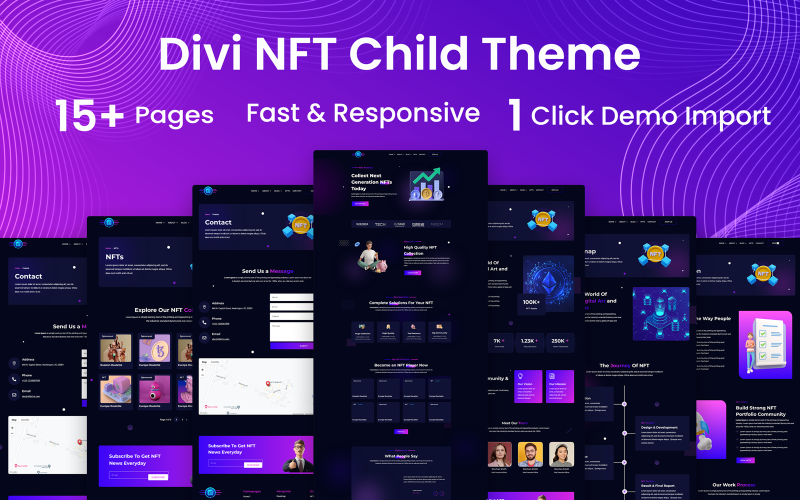
Custom fonts make your site unique. Download fonts from websites like Google Fonts. Add them to your style.css file. Use the @font-face rule for local fonts. Choose fonts that fit your site’s theme. Don’t use too many fonts. This keeps your site clean. Test your fonts on different devices. Make sure they look good everywhere. Keep font sizes readable for users.
Credit: www.templatemonster.com
Enhancing Functionality
WordPress child themes let you add custom functions. These functions make your site unique. You can create new features or modify existing ones. Use the functions.php file for this. Write your code here to change how your site works. Be careful with your code. It affects your site’s performance.
Overriding parent functions helps you control theme behavior. You can change how your theme looks or works. Make sure to use proper coding practices. This keeps your site stable and secure. Test your changes often. It ensures everything works well. Understanding PHP basics is useful. It helps in writing clean code.
Testing For Responsiveness
Developer tools help check if your website is responsive. Open your browser and find the tools. Usually, right-click and select “Inspect.” Look for the icon that looks like a phone or a tablet. Click it to see your website in different sizes. This helps understand how your site looks on mobile devices. Change the size to see different views. Make sure everything looks good and works well.
| Device Type | Breakpoint Width |
|---|---|
| Mobile | 320px – 480px |
| Tablet | 481px – 768px |
| Desktop | 769px and up |
Breakpoints are important for designing. They help decide how content changes on different devices. Common breakpoints include mobile, tablet, and desktop sizes. Each size needs a different design approach. Make sure text and images adjust well at each size. This ensures a good user experience across all devices.
Troubleshooting Common Issues
Building a responsive WordPress child theme can present challenges. Common issues include broken layouts and missing styles. Solve these by checking parent theme compatibility and ensuring proper stylesheet enqueuing.
Parent Theme Updates
Parent themes get updates often. These updates can break child themes. It’s important to check changes after each update. Always back up your theme before updating. This way, you can restore if things go wrong. Keep a record of what changes you’ve made. It helps to fix issues quickly. You can find help in WordPress forums if needed. These forums have lots of helpful people.
Css Conflicts
Sometimes, CSS rules in the parent theme clash with child theme rules. This can change how your website looks. Use browser developer tools to find conflicting CSS. They show which rules are causing problems. Remove or adjust them in your child theme. Add custom CSS carefully. Check your site on different devices. This ensures it looks good everywhere. Take your time. Fixing CSS can be tricky.
Best Practices For Maintenance
Backups keep your work safe. Regular backups are essential. They save your hard work. Set a schedule for this. Weekly backups are good. Use tools like UpdraftPlus. These tools make backups easy. You can restore your site quickly. No need to worry about losing data.
Organized code makes updates easy. Use neat and clean code. Comments help understand your code. They explain complex parts. Group related code together. This keeps things tidy. Follow a naming system. This helps find code parts fast. Use folders for different files. It keeps everything in place.
Frequently Asked Questions
What Is A WordPress Child Theme?
A WordPress child theme allows you to customize a parent theme without altering its core files. This ensures that your modifications are preserved during updates. Child themes are essential for maintaining site functionality and design while upgrading the parent theme.
They offer flexibility and safety in theme customization.
How Do You Create A Child Theme?
To create a child theme, start by creating a new folder in the themes directory. Inside, add a style. css file with the required header information. Link it to the parent theme using an @import statement. Finally, create a functions.
php file for additional functionality.
Why Is Responsive Design Important?
Responsive design ensures your website looks great on all devices. It enhances user experience by adapting to different screen sizes. With more users accessing websites via mobile, it’s crucial for engagement and SEO. Responsive design improves accessibility and reduces bounce rates.
Can Child Themes Be Customized?
Yes, child themes can be extensively customized. You can modify styles, layouts, and functionalities without affecting the parent theme. Use CSS, PHP, and WordPress hooks to tailor your child theme. This allows for creativity while maintaining the parent theme’s integrity during updates.
Conclusion
Building a responsive WordPress child theme is simpler than it seems. Start with a clear plan. Use the right tools and resources. Customize your theme carefully. Test your design on various devices. Ensure everything works smoothly. Keep learning and adapting your skills.
This process enhances your website’s flexibility and future updates. A well-crafted child theme can make maintenance easier. It also protects your main theme. Your site looks great and works well on all screens. Remember, practice leads to perfection. Enjoy creating and improving your WordPress site!