Struggling with a WordPress theme that feels a little too narrow? You’re not alone.
Many website owners like you want to make their site more visually appealing and user-friendly by increasing its width. A wider layout can enhance readability, showcase your content more effectively, and keep visitors engaged longer. Imagine giving your readers a more spacious environment where your content truly shines.
Sounds appealing, right? You’ll discover simple, actionable steps to widen your WordPress theme, making your site not only look better but also perform better. Ready to transform your website? Let’s dive in!
Credit: www.wpxpo.com
Choosing The Right Theme
Responsive design is crucial for websites today. Themes must adjust to different screen sizes. This ensures all visitors have a good experience. Check if the theme is mobile-friendly. Look for themes that adapt smoothly across devices. This means no horizontal scrolling. A theme that responds well attracts more users.
The best themes offer flexibility
Flexible themes offer more options. They support different plugins. You can add features without breaking the design. Flexibility in themes helps in future updates. You can keep the site fresh and modern. Always choose themes that offer easy adjustments. This ensures your site can grow and change as needed.

Credit: www.youtube.com
Customizing Theme Settings
First, log into your WordPress dashboard. This is where all changes start. Look for the Appearance tab on the left side. Click on it, then choose Customize. This opens the theme settings.
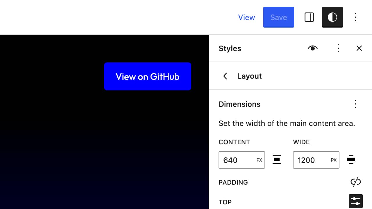
In the customization panel, find the Layout or Width option. It might be under different names. Once found, use the slider or input box to change the width. Make sure to preview changes. See how it looks on your site.
If you like the new width, hit Save or Publish. This will apply the changes to your live site. Always check the site on different devices. Ensure it looks good everywhere.
Using Custom Css
Enhancing your WordPress theme’s width is simple with custom CSS. Access the WordPress Customizer, navigate to “Additional CSS,” and input the desired width code. This approach offers precise control over your site’s appearance, allowing for a more tailored and visually appealing design.
Locating The Customizer
Find the WordPress Customizer in your dashboard. Click on “Appearance” then “Customize”. This opens the theme settings. Look for the “Additional CSS” option. It’s usually at the bottom. This is where you’ll add custom styles. Always preview changes before saving them. It ensures that everything looks right.
Adding Css For Width Adjustment
To adjust theme width, add CSS code. Type the CSS in the box. Example: body { max-width: 1200px; }. This sets a maximum width. Make sure to save changes. Changes reflect immediately. Experiment with different values. Different themes may need different settings. Use percentages for fluid layouts. It helps with responsive design. Keep testing until satisfied.
Modifying Theme Files
Find the main theme files in your WordPress dashboard. These files hold the layout settings. Look for files like style.css and functions.php. They often have width settings. Backup these files before editing. This keeps your changes safe. Use a child theme to avoid losing edits after updates.
Open the style.css file. Locate the width properties. Change values to increase width. Use small changes first. See how they look on the site. Use a tool to inspect elements. This helps find the exact CSS code. Save changes and refresh your site. Check if the layout looks better.
Employing A Child Theme
First, open your WordPress dashboard. Go to the themes section. Create a new folder in the wp-content/themes directory. Name it child-theme. In this folder, add a style.css file. Add a functions.php file too. These files are important. They help WordPress recognize your child theme. In style.css, add a few lines. Mention the parent theme. This links your child theme to the parent.
Open the style.css file in your child theme. Find the width settings of the parent theme. Copy these settings to your child theme’s style.css. Now, change the width value. Save the file. This changes the theme’s width. Refresh your website to see the changes. If it looks good, you did it right!
Utilizing Page Builders
Page builders help make websites look better. They are easy to use. You can change the look of your site. Many builders have drag and drop features. This makes moving things around simple. Builders give you control over design. You can add more space for text and pictures. Builders are tools to create beautiful web pages.
Adjusting width is simple with page builders. Find the settings for width. Choose your desired size. Many builders have this option. You can make your page wider. This helps if you want more space for content. Wider pages look spacious and neat. Adjusting width improves user experience.
Testing And Troubleshooting
Check your theme’s responsiveness after changes. View it on different devices. Use screen sizes from small to large. Make sure everything looks good. Text should not be too big or small. Images should fit well. Adjust settings if needed. Use tools like Google’s Mobile-Friendly Test. They help check your site’s look on phones.
Ensuring Responsiveness
Ensure your site works on all devices. Use responsive design techniques. Styles should adapt to screen sizes. Test pages on tablets and phones. Look at your site in portrait and landscape views. Adjust widths for better readability. Responsiveness makes sites user-friendly. Visitors enjoy using sites that adjust well.
Fixing Common Issues
Fix problems quickly. Issues may include broken layouts. Text may overflow on small screens. Adjust CSS settings to correct errors. Use tools to find bugs. Keep code clean and organized. Check for missing elements. Ensure images load correctly. Common issues can affect user experience. Good troubleshooting improves site performance.
Credit: frostwp.com
Best Practices For Width Adjustment
Consistency keeps a website looking good. Adjusting width should match your theme’s style. It helps the website stay neat. Always make changes carefully. This keeps the site from looking messy.
Colors and fonts should remain the same. They help the site look balanced. Visitors like sites that are easy on the eyes. So, keep the design simple.
User experience is very important. People should find things easily. A wider site can help them see more. But don’t make it too wide. It can be hard to read if lines are too long.
Navigation should stay clear. Links must be easy to click. This helps users find what they need. Always test changes on different screens. This ensures everyone sees the site well.
Frequently Asked Questions
How To Change WordPress Theme Width?
To change a WordPress theme’s width, go to your theme’s customization settings. Navigate to Appearance > Customize. Look for layout or design settings to adjust the width. You can use custom CSS for more control. Always check responsiveness on different devices after making changes.
Can I Adjust Theme Width Without Coding?
Yes, you can adjust theme width without coding. Many WordPress themes offer built-in customization options. Use the WordPress Customizer by navigating to Appearance > Customize. Look for layout settings. Drag sliders or input values to adjust the width. Changes apply instantly without coding.
Why Is My WordPress Theme Too Narrow?
Your WordPress theme might be narrow due to default settings. Some themes prioritize readability with narrower content areas. Check your theme’s customization options under Appearance > Customize. Adjust the layout settings for a wider display. If needed, use custom CSS for more precise adjustments.
How Do I Make WordPress Theme Full Width?
To make your WordPress theme full width, use the Customizer. Go to Appearance > Customize and find layout settings. Adjust the width to 100%. Some themes provide full-width templates for specific pages. Apply these templates to achieve a full-width design without additional coding.
Conclusion
Changing your WordPress theme width is simple. Follow these steps carefully. Adjust settings, preview changes, and ensure responsiveness. Small tweaks can make big impacts on design. Better width improves user experience. Visitors stay longer with a clean layout. Experiment with different widths.
Find what suits your content best. Keep your site visually appealing. Remember, practice makes perfect. Your theme should reflect your brand. Consistency is key in design. Happy customizing your WordPress theme!