Are you feeling confined by the narrow layout of your WordPress theme? It’s frustrating when your website doesn’t quite look the way you envisioned.
Maybe you want your content to spread out more, or you’re trying to make the best use of the space on your screen. Don’t worry, you’re not alone, and you’re in the right place! In this guide, you’ll discover simple and effective ways to increase the width of your WordPress theme.
Imagine the possibilities: more room for eye-catching images, spacious text, and a layout that truly represents your brand. By the end of this article, you’ll be equipped with the know-how to transform your site’s appearance and engage your audience like never before. Ready to dive in and unlock the full potential of your website? Let’s get started!

Credit: www.youtube.com
Choosing The Right Theme
Selecting a theme is crucial. Some themes have limited width settings. Check the theme’s features. Look for themes with customizable width. Read theme reviews. Users often share their experiences. Responsive themes adjust width automatically. This is helpful for different screens. Test the theme on various devices. Make sure it looks good everywhere.
Explore theme settings. Many themes have a layout option. You can change width from there. Look for themes with easy settings. User-friendly themes make width adjustments simple. Read the theme documentation. It often provides useful tips. Don’t forget to check theme updates. Updates may offer new features.
Customizing Theme Settings
First, login to your WordPress dashboard. Find the Appearance tab on the left menu. Click on it, then select Customize. This will open the WordPress Customizer.
In the Customizer, look for the Layout or Theme Options. Here, you can find the Width Settings. Use sliders or input boxes to change the width. See changes live on the right preview panel.
Remember to Save your changes. Click the Publish button at the top.
Editing Css For Width Adjustments
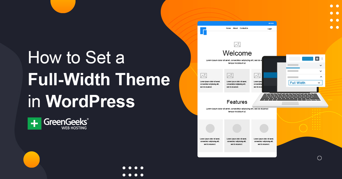
First, find the right CSS file to change. Open your WordPress dashboard. Go to Appearance, then click on Theme Editor. Look for files ending with .css. These files control your site’s look.
Check style.css or custom CSS files. These usually hold the width settings. Take your time and explore.
Now, change the width in the CSS file. Search for terms like .container or .content. These often define the width. Change width: 100% or similar values to make it wider.
Save your changes. Refresh your site to see the effects. Check if the new width looks good.
Credit: www.greengeeks.com
Using Page Builder Plugins
Popular Page Builders like Elementor, Divi, and Beaver Builder help change theme width. They offer easy-to-use tools. Kids can drag and drop elements. These builders have many options. You can adjust the width easily.
Configuring Width in Builders is simple. Open the builder. Find the section or element you want to change. Look for the width setting. It might be in the style or layout tab. Set the width by dragging the slider. You can type in numbers too. Save your changes to see the new width.
Child Theme Modifications
A child theme is a safe way to change your theme. It keeps the original theme safe. First, create a new folder in your theme directory. Name it “child-theme” or something similar. Inside, create a file named style.css. This file will hold your changes. Next, create another file named functions.php. This file helps link the child theme to the main theme.
Then, open the style.css file. Add a few lines of code to show that it is a child theme. You can copy these lines from WordPress guides. Save all your files. Now, activate the child theme in your WordPress dashboard. Your changes will now appear without harming the main theme.
To change the width, edit the style.css file in the child theme. Find the code that controls width. It might look like .container { width: 80%; }. Change the percent value to make it wider. You can try 90% or 100%. This will make your site look wider.
Always preview your changes. Check how the site looks on different devices. Make sure it looks good on phones and tablets too. If it breaks, you can always adjust the values. This method keeps your site looking clean and neat.
Considerations For Responsive Design
Ensuring mobile compatibility is crucial for your theme. Small screens need special care. Always use a responsive design. It helps your site look good on all devices. Your site should adjust to different screen sizes. This includes smartphones, tablets, and computers. Use flexible layouts and fluid grids. They allow content to fit any screen size. Content should be easy to read and navigate.
Testing across devices is also important. Make sure your theme works on various gadgets. You can use tools to check how your site looks. Test on both Android and iOS devices. This ensures that everyone can access your site. Good testing finds problems early. Fixing these issues makes users happy. Happy users come back to your site.
Common Mistakes To Avoid
Adjusting the theme width in WordPress can lead to mistakes. Avoid changing core files directly. This can break your website. Always use a child theme or custom CSS. This keeps your changes safe during updates.
Overlooking Backup
Changing theme width can break your site. Always backup your website before any changes. Without a backup, you risk losing data. Backups help restore your website quickly. Many plugins can help with backups. Use them for safety. Backups are like safety nets. Don’t skip them.
Ignoring Browser Cache
Browser cache stores old site data. This can hide your changes. Clear the cache to see updates. It ensures you view the latest version. Caches can confuse you. They show old themes. Refresh your browser often. Clearing cache is easy and quick. Remember to do it regularly.

Credit: wordpress.com
Resources For Further Learning
Explore online tutorials and forums for detailed steps to increase theme width in WordPress. Videos and articles offer practical guidance, making it easy to understand adjustments. Utilize these resources for clear instructions and troubleshooting tips.
Online Tutorials
Online tutorials help you learn WordPress theme width changes. Many websites offer step-by-step guides. YouTube has videos showing each step clearly. Blogs explain how to use CSS codes for adjustments. Practice these lessons to understand better. Remember, patience is key while learning.
WordPress Support Forums
WordPress support forums are great for seeking help. Users share solutions for theme width issues. You can post questions and get answers. Reading others’ posts can teach you new tricks. Forums are friendly spaces to learn. Always be polite while interacting.
Frequently Asked Questions
How Can I Change Theme Width In WordPress?
To change the theme width in WordPress, navigate to Appearance, then Customize. Select the Layout or General Settings option. Adjust the width settings to your preference. If your theme supports custom CSS, you can add CSS code for specific width changes.
Always preview changes before saving.
What Tools Help Adjust WordPress Theme Width?
Several tools can help adjust WordPress theme width. You can use the built-in Customizer, page builders like Elementor, and plugins such as Simple Custom CSS. They offer user-friendly interfaces to change layout settings and apply custom CSS. Always test changes to ensure compatibility across devices.
Is It Safe To Modify Theme Width?
Yes, modifying theme width is generally safe. Use the Customizer or child themes to prevent losing changes during updates. Backup your site before making changes to avoid data loss. Always check responsiveness to ensure your site looks good on all devices after modifications.
Can Plugins Help Change WordPress Theme Width?
Yes, plugins can help change WordPress theme width. Use plugins like Simple Custom CSS or Advanced WordPress Backgrounds to modify layouts. They offer flexible customization options without altering core theme files. Ensure plugins are compatible with your theme and WordPress version for optimal performance.
Conclusion
Increasing the theme width in WordPress is straightforward. Follow the steps outlined. Experiment with different widths to find your ideal look. Adjusting the theme’s width can enhance your site’s appearance. A wider layout often improves readability and design. Always preview changes before saving them.
This ensures the desired outcome. Remember, each theme may have different settings. So, be patient and explore the options available. Regular updates keep your site fresh and appealing. Happy customizing your WordPress site!