Struggling with how your WordPress site looks on mobile? You’re not alone.
With more people browsing on their phones than ever before, ensuring your site looks perfect on smaller screens is crucial. But don’t worry, customizing your WordPress mobile theme isn’t as daunting as it sounds. Imagine having a mobile site that’s not just a smaller version of your desktop layout, but a tailored experience that captivates your audience.
It’s about making sure your visitors stay longer, engage more, and ultimately convert better. Ready to transform your mobile presence and boost your site’s performance? Let’s dive into the essentials of making your WordPress site shine on mobile devices.

Credit: jetpack.com
Choosing The Right Mobile Theme
A good mobile theme makes your site look great on phones. First, check the theme’s responsiveness. This means it works well on all screen sizes. Next, look at the design. It should match your brand. A simple design is often best. Also, check if the theme is fast. Slow themes can make visitors leave.
Some themes offer many customization options. This means you can change colors, fonts, and layouts easily. Look for themes that are SEO-friendly. This helps your site show up in search results. Finally, read reviews from other users. Their experiences can help you choose.
Installing A Mobile Theme
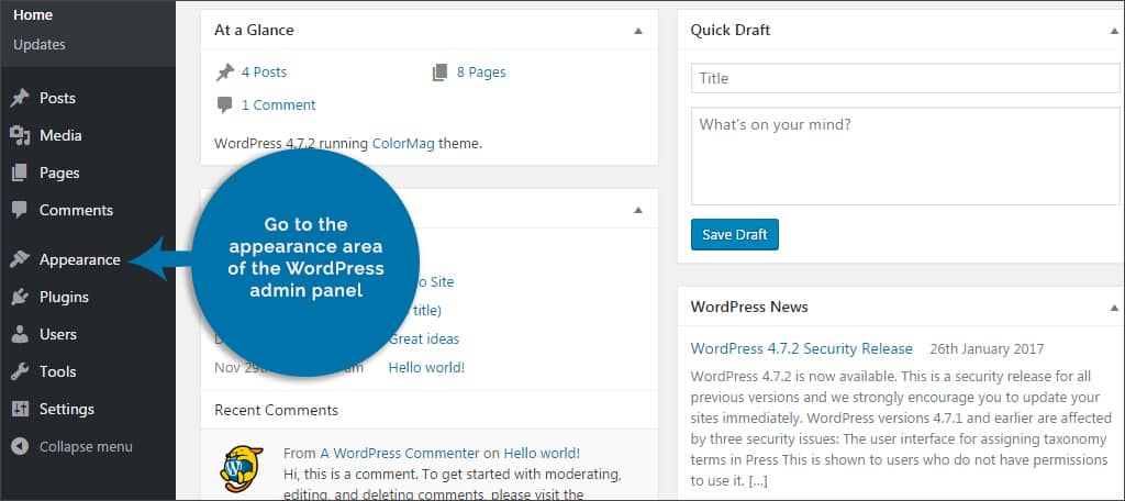
Choose a mobile theme that fits your site’s style. Visit the WordPress dashboard. Navigate to the Appearance section. Click on Themes. Select Add New to browse themes. Search for a theme using the search bar. Preview the theme to see how it looks. Click Install once you find the right one. After installation, activate the theme. Check your site on a mobile device. Ensure the theme displays correctly. Adjust settings if needed. This process helps your site look good on phones.
Using WordPress Plugins
WordPress has many plugins for mobile themes. WPtouch is a popular choice. It makes mobile sites fast. Jetpack is another great plugin. It helps with mobile design. AMP for WP speeds up pages. It makes them load faster.
First, log into your WordPress dashboard. Find the Plugins menu. Click on Add New. Type the plugin name in the search box. Click Install Now once you find it. Wait for the installation to finish. Then click Activate. Your plugin is now ready to use.
Customizing Theme Settings
Choose a theme that fits your style. Adjust fonts to make text clear. Change colors to match your brand. Use images that look good on small screens. Check how it looks on different phones. Make sure buttons are easy to tap. Keep layout simple for easy reading.
Create a menu with important pages. Put home, contact, and about pages in it. Keep the menu short for easy use. Use drop-downs for extra links. Test the menu on your phone. Make sure links work well. Use icons for faster access. Always check how it looks.
Adding Custom Css
Open the WordPress dashboard. Go to Appearance and click Customize. Find the Additional CSS section. Here, you can add your own CSS code. This will help change how your mobile theme looks. Write simple CSS rules. Test them on your phone. Make sure everything looks right.
Keep your design simple. Use easy-to-read fonts. Large buttons are best. They are easy to tap. Avoid using many images. They can slow down your site. Your site should load quickly on phones. Test your site on different devices. Make sure it looks good everywhere.

Credit: www.youtube.com
Optimizing For Speed
Large images can slow down your website. Use tools to make them smaller. JPEG and PNG are good formats. They keep quality but reduce size. Try using lazy loading. It makes images load only when needed. This helps pages load faster.
Too much code can slow down websites. Remove unnecessary spaces in CSS and JavaScript. This is called minifying. It makes the files smaller. Use plugins to help with this. Smaller files load faster. This improves user experience.
Testing Mobile Responsiveness
Customizing a WordPress mobile theme enhances user experience and engagement. Start by selecting a responsive theme with customizable settings. Use WordPress plugins to adjust fonts, colors, and layouts for mobile devices.
Using Browser Developer Tools
Browser developer tools help check if your site looks good on phones. Open your browser and right-click on your page. Select “Inspect” from the menu. A panel will pop up. Look for the device toolbar icon. Click it to view your site on different phone screens. You can see how your site changes for each device. Adjust the size and see what breaks. Fix any problems you notice. Make sure your theme works well on all devices.
Third-party Testing Tools
Online tools can show if your site works on phones. Sites like Google’s Mobile-Friendly Test help check this. Enter your site URL in the tool. It will show if your site is mobile-friendly. Some tools might give a score or tips to improve. Make sure to check your site often. Always aim for a high score. This helps with user experience.
Credit: www.greengeeks.com
Troubleshooting Common Issues
Customizing a WordPress mobile theme often presents common issues. Slow loading times or broken layouts can frustrate users. Ensure responsive design by checking your theme settings. Adjust plugins and CSS for optimal performance.
Resolving Theme Conflicts
Theme conflicts can cause many problems. It can break your site. Always check for plugin conflicts. Disable all plugins first. Then, activate them one by one. This helps find the problem. Choose themes that work well with plugins. This avoids conflicts. Backup your site regularly. Backups can save you from data loss. This ensures a safe recovery.
Fixing Display Errors
Display errors can make your site look bad. Check your theme settings first. Ensure they match your needs. Clear the browser cache often. This shows the latest changes. Mobile theme testing is crucial. Use different devices. See how your site looks. Adjust the CSS and HTML if needed. This fixes layout problems. Use online tools to check the responsive design. They help you find display errors.
Frequently Asked Questions
How To Change WordPress Theme For Mobile?
To change the WordPress theme for mobile, use a plugin like WPtouch. It allows you to create a mobile-friendly version. Customize settings to match your website’s style. This ensures a responsive design for mobile users without altering the desktop version.
Can I Customize WordPress Mobile Theme Easily?
Yes, customizing a WordPress mobile theme is easy with plugins. Use tools like Elementor or WPtouch to simplify the process. These plugins offer drag-and-drop features, making customization straightforward. You can modify layouts, colors, and fonts to suit your mobile design preferences.
Why Is A Mobile-friendly WordPress Theme Important?
A mobile-friendly WordPress theme enhances user experience and boosts SEO. Most users access websites via mobile devices. A responsive theme ensures your site looks good on all devices. This reduces bounce rates and improves search engine rankings, providing a seamless browsing experience.
What Plugins Help With WordPress Mobile Customization?
Plugins like WPtouch, Elementor, and Jetpack assist in WordPress mobile customization. WPtouch creates a mobile-friendly site version. Elementor offers responsive design tools for easy customization. Jetpack improves mobile performance with its optimization features, ensuring a smooth user experience.
Conclusion
Customizing your WordPress mobile theme boosts user experience. Make your site unique and engaging. Start by understanding your theme options. Use plugins to simplify the process. Test changes for mobile responsiveness. Keep your design clean and simple. Prioritize fast loading times for better performance.
Regular updates can fix bugs and enhance features. Don’t forget to back up your site before major changes. Aim for a mobile-friendly interface. Your visitors will appreciate the effort. With these tips, your mobile theme will shine and attract more users.
Happy customizing!