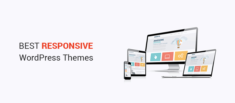
Imagine your website looking stunning on any device, whether it’s a smartphone, tablet, or desktop. That’s the magic of a responsive theme in WordPress.
If you’re wondering how to create one yourself, you’re in the right place. This guide will walk you through each step, making the process simple and enjoyable. No more worrying about your site’s appearance on different screens—your visitors will have a seamless experience every time.
By mastering the art of responsive design, you enhance your site’s user experience, boost engagement, and even improve your SEO. So, if you’re ready to captivate your audience and keep them coming back for more, let’s dive into the world of responsive WordPress themes. You’ll discover practical tips, useful tools, and easy-to-follow instructions that make the design process a breeze. Stick with us, and you’ll soon see your website transform into a digital masterpiece, perfect for the modern web user.
Credit: www.isitwp.com
Responsive Design Principles
Fluid grids help make a website flexible. They adjust to different screen sizes. Columns and rows change in size. This keeps the layout neat. Use percentages instead of fixed units. This makes elements shrink or grow smoothly. Designers use fluid grids for better user experience. They ensure content looks good on all devices.
Images can cause layout problems. Flexible images solve this issue. They scale to fit the screen. Use CSS to make images responsive. Set max-width to 100%. This helps images stay within their container. Large images can slow down a website. Compress them for faster loading. Flexible images improve site appearance.
Media queries change styles based on device type. They help designers create responsive themes. Different styles are applied for phones, tablets, and desktops. Use media queries in CSS. Set breakpoints to target screen sizes. This ensures layouts adapt to various devices. Media queries enhance user experience across platforms.
Credit: crocoblock.com
Setting Up Development Environment
Pick a text editor that you like. Some popular options are Visual Studio Code and Sublime Text. They help you write code easily. These tools often offer syntax highlighting. This makes it easier to spot errors.
Set up WordPress on your computer. You need a software like XAMPP or MAMP. These create a local server. This means you can test your theme on your computer. No need to go online.
Debugging tools find problems in your code. Debug Bar and Query Monitor are great choices. They show errors and warnings. These tools help you fix issues fast. Always check for bugs to improve your theme.
Theme Structure And Files
Every WordPress theme needs essential filesstyle.css. It defines styles. Another important file is index.php. It shows main content. The functions.php file is crucial too. It adds features. header.php and footer.php wrap your pages. They add headers and footers. Lastly, sidebar.php creates side areas. These files work together. They help your theme function.
WordPress uses a template hierarchy. It decides which file to load. If a page is single, WordPress might use single.php. For archives, it may use archive.php. Front pages use front-page.php. Other pages use page.php. This hierarchy helps organize. It allows easy changes. Files load in a specific order. This keeps things neat. It makes theme development easier.
Adding scripts and styles is important. Use wp_enqueue functions for this. These functions add JavaScript and CSS. They keep things organized. They prevent conflicts. wp_enqueue_script adds JavaScript files. wp_enqueue_style adds CSS files. Always use these functions. They are safer. They ensure files load correctly. This method improves theme performance.
Building Custom Layouts
CSS Flexbox is a powerful tool. It helps create flexible layouts. Items in a container can adjust size. They stretch or shrink. This ensures content looks good on all screens. With Flexbox, you can align items in a row or column. It makes web design easy and neat.
In contrast, Grid Layout Techniques offer a different approach. They allow you to create complex grids. These grids help in placing items in rows and columns. You can specify the size and position of each item. This gives you more control over your design.
The Mobile-First Approach is important. Start designing for small screens first. Then, add more features for larger screens. This ensures your site is responsive. It works well on all devices. It also improves user experience. Everyone can access your content easily.
Integrating Responsive Media
Crafting a responsive theme in WordPress involves integrating media elements that adapt to different screen sizes. Flexible layouts and scalable images ensure optimal viewing experiences on mobile devices and desktops. This approach enhances user engagement and improves website accessibility across various platforms.
Optimizing Images
Images should be light and fast. Use formats like JPEG or PNG. Compress them to reduce size without losing quality. Tools like TinyPNG help a lot. Make sure images adapt to screen sizes. Use CSS to make images fit. Responsive images improve site speed.
Handling Videos
Videos can slow a site. Host them on platforms like YouTube or Vimeo. Embed them instead of uploading directly. Choose the right size for video players. Use HTML5 for better performance. Autoplay can be annoying; let users choose. Adjust settings for mobile viewing.
Responsive Embeds
Embedding content must be flexible. Use iframes smartly. Make sure they adjust to screen size. Set width to 100% and height to auto. This makes embeds responsive. CSS can help style embeds. Test on different devices to ensure good appearance.
Testing Across Devices
Browser developer tools help check how your theme looks. Open the tools in your browser. Change the view to see different screen sizes. Inspect elements to find issues. Console shows errors that need fixing. Check colors, fonts, and images. Make sure everything fits nicely.
Use online platforms for testing. They show your site on many devices. This helps find problems. Platforms like BrowserStack and LambdaTest are popular. They offer free trials. You can test on phones, tablets, and desktops. This ensures your theme works everywhere. Testing online saves time and effort.
Testing on real devices is crucial. Use your phone and tablet to check the theme. Click links and scroll pages. Ensure buttons are easy to tap. Loading speed should be fast. Images should not be blurry. Ask friends to test on their devices. This gives more feedback.
Improving Performance
Crafting a responsive theme in WordPress boosts performance and user experience. Use flexible layouts and media queries to ensure compatibility across devices. Optimize images for faster loading, enhancing site speed and accessibility.
Minifying Css And Javascript
Minifying CSS and JavaScript files helps reduce load times. Smaller files mean faster websites. Use tools to remove spaces and comments. This makes files lighter. Faster sites make users happy.
Lazy Loading Techniques
Lazy loading delays loading images until needed. This saves bandwidth. Pages load quicker. Users see the important parts first. This technique improves user experience. It is great for sites with many images.
Caching Strategies
Caching stores website data for later use. It makes sites load faster. Users get content quickly. Use plugins to manage caching. This helps handle traffic better. Faster websites keep visitors engaged.
Accessibility Considerations
Creating a responsive WordPress theme requires attention to accessibility. Ensure all users can navigate your site easily. Use readable fonts, clear colors, and descriptive alt texts for images to enhance accessibility.
Keyboard Navigation
Keyboard navigation is crucial. Users rely on the Tab key to move through links. Ensure all buttons and menus are accessible this way. Use the tabindex attribute for custom elements. This helps users who can’t use a mouse.
Screen Reader Compatibility
Screen readers help people understand web content. Use alt text for images. This describes the image to the user. Ensure headings are in order. Use H1, H2, and so on. This helps screen readers understand the page structure.
Color Contrast Checks
Good color contrast is important. It makes text easy to read. Use tools to check contrast. Ensure text stands out against the background. This helps people with visual impairments. Stick to simple color schemes. Avoid colors that clash.
Theme Customization Options
Explore theme customization options in WordPress to craft a responsive design. Adjust layouts, fonts, and colors effortlessly. Responsive themes ensure optimal viewing across devices, enhancing user experience and engagement.
Customizer Api
The Customizer API is a powerful tool in WordPress. It helps change theme settings without coding. You can tweak colors, fonts, and layouts easily. This makes your site look unique. The API is user-friendly. Even beginners can use it with ease. Explore the options and make your site special.
Adding Custom Widgets
Custom widgets can improve your website’s functionality. They allow you to add new features. Examples include recent posts or social media links. These widgets are easy to add. You can drag and drop them into widget areas. This process is simple and quick. It enhances your site’s appearance and usability.
Creating Custom Post Types
Custom post types allow you to organize content better. You can create separate sections for different content. For example, portfolios or testimonials. This helps in showcasing content in a structured way. Users find information easily. It keeps your site neat and user-friendly. Custom post types enhance the overall user experience.

Credit: wordpress.org
Frequently Asked Questions
How To Make A WordPress Theme Responsive?
Use a responsive CSS framework like Bootstrap. Implement flexible grid layouts and media queries. Optimize images and use responsive typography. Test across various devices and browsers. Ensure touch-friendly elements for better user interaction.
How Do I Know If My WordPress Theme Is Responsive?
Test your theme on various devices and screen sizes. Use browser tools like Chrome’s “Inspect” feature. Check for smooth scaling and readability. Responsive themes adapt content automatically for mobile, tablet, and desktop views. Ensure your theme passes Google’s Mobile-Friendly Test for confirmation.
How To Create A Responsive Menu In WordPress?
Install a responsive menu plugin like “Responsive Menu. ” Configure settings for mobile and tablet views. Customize menu style and layout. Save changes and test responsiveness on different devices.
How Can I Convert My Website To Responsive?
Use a responsive framework like Bootstrap. Employ flexible grids and layouts. Optimize images for different screen sizes. Implement CSS media queries for adaptable styling. Test across various devices to ensure functionality.
Conclusion
Creating a responsive theme in WordPress is easier than it seems. Focus on key elements like flexible layouts and mobile-friendly designs. Use tools that simplify your workflow. Test thoroughly on different devices to ensure quality. A responsive theme enhances user experience significantly.
It boosts engagement and improves site performance. Keep learning and adapting as technology evolves. Stay updated with trends to remain competitive. Your efforts will pay off with a better-performing website. Dive in and start crafting your responsive theme today. Success is within reach with the right approach.