Creating a responsive WordPress theme from scratch might sound daunting, but imagine having complete control over your website’s look and feel. You get to tailor every detail to fit your needs and brand, ensuring your site stands out in a crowded digital world.
Whether you’re a beginner eager to learn or a seasoned developer looking to refine your skills, this guide is for you. You’ll learn how to design a theme that not only looks great but also functions seamlessly on any device.
No more clunky layouts or frustrated users. Instead, imagine a smooth, engaging experience for every visitor. The best part? You can do all this without relying on pre-made themes that limit your creativity and personalization. Stay with us, and you’ll discover the step-by-step process to build a responsive WordPress theme from scratch. By the end of this article, you’ll have the confidence and skills to create a website that truly represents you and captivates your audience. Let’s dive in and unlock the potential of your website together!
Setting Up The Development Environment
Building a WordPress theme needs some tools. A text editor is a must. Use Visual Studio Code or Sublime Text. They make coding easy. You also need a local server. XAMPP or MAMP works well. These tools help run WordPress on your computer. A browser is essential too. Chrome or Firefox is good. They let you see your theme in action. These tools make your job easier.
First, download WordPress from the official site. Next, unzip the file. Move the folder to your server’s htdocs directory. Open your browser and type localhost/wordpress. This starts the installation. Follow the steps on the screen. You need a database for WordPress. Use phpMyAdmin to create one. Connect WordPress to this database. Now, WordPress is ready on your computer. You can start making your theme.

Credit: www.linkedin.com
Theme Structure Basics
WordPress themes need special files. These files help the theme work. Key files include index.php, style.css, and functions.php. The index.php file is like a map. It shows how your site looks. The style.css file changes the site’s colors and fonts. The functions.php file adds cool features. Every theme needs these files.
Put all theme files in one folder. Keep files tidy and easy to find. Make folders for CSS, JavaScript, and images. Use names that make sense. This helps when you work on your theme later. Keep your folder clean and neat. This makes your theme strong and easy to use.
Creating The Style Sheet
CSS is used to style WordPress themes. It helps make pages look nice. CSS code goes in a file called style.css. Start with basic styling like colors and fonts. Use selectors to target HTML elements. Classes and IDs are useful for specific styling.
Responsive design is crucial for modern websites. It adjusts layouts for different screens. Use media queries in CSS for this purpose. These queries change styles based on screen size. This way, your site looks good on phones, tablets, and computers.
Css Basics For WordPress
CSS rules are simple to understand. They have selectors and declarations. Selectors choose which element to style. Declarations set properties like color and size. Each property has a value. CSS files should be organized. Group similar styles together for easier reading.
Implementing Responsive Design
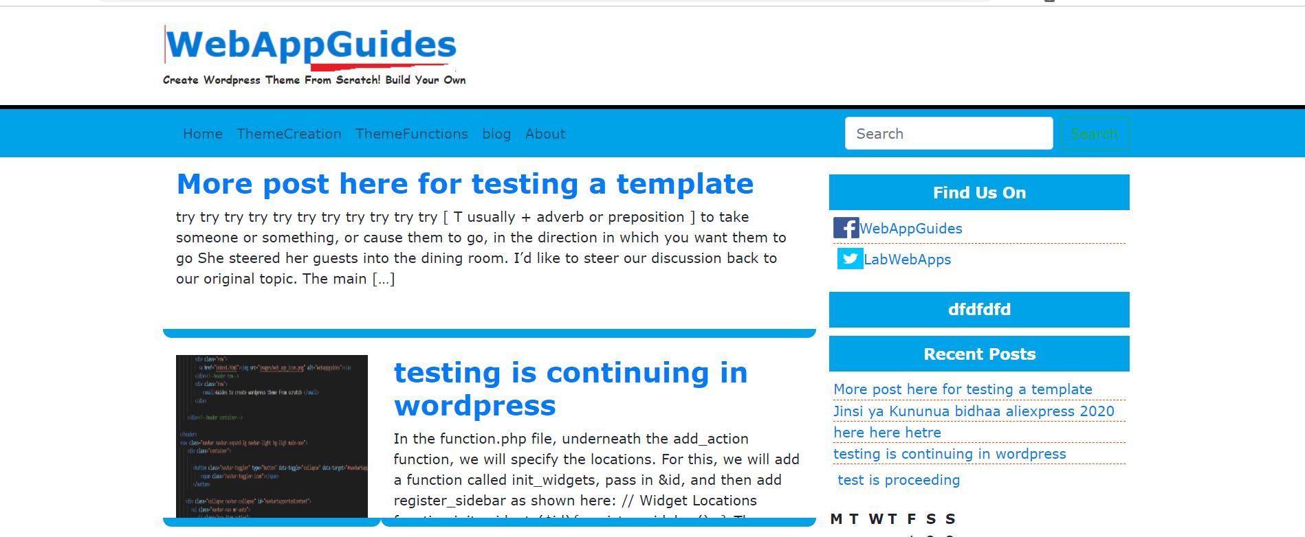
Responsive design makes websites flexible. It uses fluid grids and flexible images. Media queries are key for responsive styles. They apply different CSS rules for different devices. This ensures your theme looks good everywhere.
Credit: webappguides.com
Developing The Header And Footer
A custom header is essential. It gives your theme a unique look. Start by creating a simple HTML structure. Use
The footer is the end of the page. It holds important links and info. Use tags to wrap the content. Add navigation links and social media icons. Make it look neat. Styling with CSS is key. Use Flexbox for a clean layout. Ensure the footer is responsive too. It should look good on all devices. Test its appearance on various screens. Adjust styles if needed for better display.
Building The Main Templates
Crafting main templates is crucial for building a responsive WordPress theme. Start by designing the header, footer, and sidebar with clean, organized code. Integrate CSS for adaptable layouts across devices, ensuring seamless user experience.
Home Page Layout
The home page is the first page people see. It should be simple and clear. Use a header with a logo and menu. Add a main section for featured posts. People love images, so use them. Place a sidebar for widgets. Add a footer with links and contact info. Keep everything responsive. It should look good on phones and computers.
Single Post Template
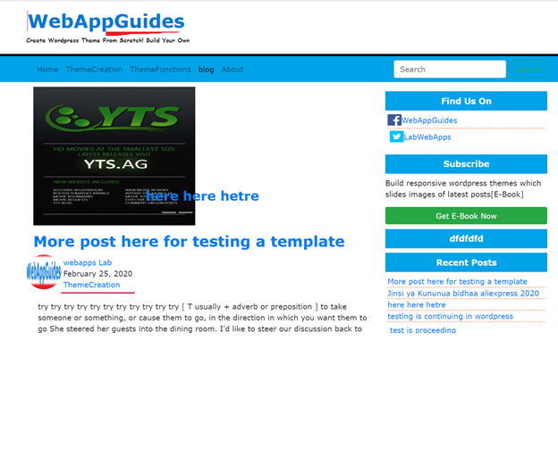
Every post needs a single post template. Start with a header and post title. Add author name and date below it. Use the main section for the post content. Add images and quotes to make it nice. A comment section is important. People want to share their thoughts. End with a footer. Make sure it is easy to read. Keep it responsive for all devices.
Credit: webappguides.com
Adding Responsive Navigation
A mobile-friendly menu is key for a responsive site. Use simple code to create a toggle button. This button hides or shows the menu. People can tap it on small screens. Style the menu using CSS media queries. These help you adjust the menu’s look for different screen sizes. Keep the layout clean and easy to use. Avoid too many links or buttons in one area.
JavaScript makes the menu interactive. It listens to the toggle button. When clicked, it shows or hides the menu items. Use simple JavaScript functions. This makes your code easy to read and change. Always test the menu on real devices. This ensures it works well on all screens.
Customizing With Theme Options
Adding a Theme Customizer is a fun way to change your site. It helps make your site look nice. You can pick colors, fonts, and more. This makes your site special. Users love sites that look good. They stay longer and click more. Use the customizer to make quick changes. It’s easy and fast. No coding skills are needed. Just drag and drop items. You can see changes right away. This saves time and makes work easy.
Integrating User Preferences helps users feel good. Users can choose what they like. They can pick colors and fonts. This makes them happy. Happy users come back often. They tell friends about your site. This helps grow your site. Add options for users to select. Make it easy and clear. More choices make users smile. Keep options simple. Too many choices confuse users. Simple is best for everyone.
Testing For Responsiveness
Developer tools help check if your site looks good on all devices. Open the developer tools in your browser. This lets you see your site in different screen sizes. You can change the size and see how your site looks. Make sure the text and images adjust well. If something looks odd, you might need to fix your CSS. Check buttons and links. They should be easy to click. If they are too small, users may have trouble. Testing helps make sure everyone can use your site easily.
Your theme should work well in all browsers. Test it in Chrome, Firefox, Safari, and Edge. Some features work differently in each browser. Look for problems in layout or features. Use tools to check if your site looks the same everywhere. Fix any differences you find. Make sure JavaScript and CSS work properly. Users may use different browsers. Ensure your theme is ready for all. This helps your site reach more people.
Preparing For Launch
Optimizing for Performance is key to a successful launch. Use tools to compress images. Smaller images load faster. Minimize CSS and JavaScript files. This reduces the load time. Fast websites keep visitors happy.
Check your theme on different devices. Make sure it is responsive. A good theme looks great on all screens. Test speed using online tools. They show areas needing improvement.
Ensuring SEO Readiness is crucial for visibility. Use keywords wisely in your theme. They help search engines find your site. Ensure your site has a sitemap. It guides search engines through your site.
Check for broken links. They can harm your site’s ranking. Use SEO plugins. They offer guidance for better optimization. Keep your content fresh. Updated content helps in search rankings.
Frequently Asked Questions
What Is A Responsive WordPress Theme?
A responsive WordPress theme adjusts its layout to fit different screen sizes. This ensures optimal viewing and interaction across devices. Creating one involves using flexible grids, media queries, and fluid images. This enhances user experience, boosts engagement, and improves SEO rankings by ensuring mobile-friendliness.
How Do You Start Building A Theme?
Begin by planning your theme’s structure and design. Use HTML, CSS, and PHP to create templates and styles. Incorporate responsive design principles like flexible grids and media queries. Test thoroughly on various devices to ensure adaptability. Utilize WordPress functions and hooks for dynamic content management.
What Tools Help In Theme Development?
Tools like WordPress Codex, Sublime Text, and Chrome Developer Tools assist in theme development. Codex offers documentation, Sublime Text provides code editing, and Chrome Tools aids in testing responsiveness. These enhance efficiency, ensure accuracy, and help create a robust, responsive theme from scratch.
Why Is Responsive Design Crucial?
Responsive design is vital for providing a seamless user experience across devices. It improves accessibility and engagement, catering to users on mobile, tablets, and desktops. This boosts SEO rankings, as search engines prioritize mobile-friendly sites. Ensuring responsiveness enhances user satisfaction and site performance.
Conclusion
Creating a responsive WordPress theme from scratch is rewarding. You learn new skills and gain control over design. Start with a clear plan. Focus on mobile-first design. Use flexible grids and media queries. Test your theme on different devices. Ensure it looks great everywhere.
Keep your code clean and organized. This helps with updates and troubleshooting. Remember, practice makes perfect. The more you code, the better you become. Enjoy the process and happy coding! Your theme will soon be ready to impress users.