Are you looking to enhance your WordPress website with a responsive theme that looks stunning on any device? Creating a responsive theme is not just a trend; it’s a necessity in today’s digital landscape.
Imagine the frustration of your visitors when they can’t navigate your site easily on their mobile devices. You don’t want to lose potential customers or readers because your site isn’t mobile-friendly, do you? By the end of this guide, you’ll have the knowledge to craft a responsive WordPress theme that adapts beautifully to any screen size, ensuring a seamless experience for your audience.
Dive in, and transform your website into a user-friendly haven that keeps your visitors engaged and coming back for more.
Understanding Responsive Design
Responsive design makes websites look good on all devices. Screens come in different sizes. A responsive theme adjusts to these sizes. It helps users enjoy the site on phones, tablets, or desktops.
Using flexible layouts is key. These layouts use a grid system. This system helps organize content. Images should also adjust. Use fluid images to ensure they fit any screen.
Media queries are tools. They help change styles based on screen size. This is how the website knows to adjust. For example, a menu might change from horizontal to vertical.
Testing is important. Check your design on many devices. It helps find problems. Fix these issues for a smooth user experience.
Responsive design improves accessibility. More people can use your site. This leads to more visitors. Keep your design simple. Simple designs often work best on all screens.
Setting Up A WordPress Environment
Crafting a responsive WordPress theme involves setting up a flexible layout that adapts to various devices. Utilize CSS media queries and fluid grids to ensure your theme looks great on smartphones, tablets, and desktops. Test across multiple browsers to maintain consistent appearance and functionality.
Choosing Development Tools
Picking the right development tools is vital. Start with a code editor. Popular choices are VS Code and Sublime Text. Both are easy to use. They help you write clean code. A local server is also needed. Options include XAMPP and MAMP. These tools help create a local WordPress site.
Installing WordPress Locally
Install WordPress on your computer. First, download WordPress from its website. Next, move the file to your server folder. Open the server software. Then, start the server. Create a database for WordPress. Use tools like phpMyAdmin. Finally, open WordPress in a browser. Follow the setup instructions. This makes WordPress ready to use. Now you can start building your theme.
Creating A Custom Theme
Crafting a responsive WordPress theme involves using CSS media queries to ensure adaptability across devices. Start by designing flexible grid layouts and fluid images. Test the theme on various screen sizes to guarantee a seamless user experience.
Theme Structure Basics
Building a WordPress theme starts with a strong structure. Folders and files make up this structure. Organizing them well is key. Think of your theme as a house. Each file is a room. Each room has a job. A style.css file defines the look. A functions.php file adds special features. These files are important for the theme to work.
Essential Theme Files
Every theme needs some essential files. A style.css file is one. It tells WordPress about your theme. The index.php file is another. It shows the main page. The functions.php file is like a toolbox. It lets you add extra features. These files are the heart of your theme. Without them, the theme will not work.
Using Html And Css For Responsiveness
CSS Grid helps in making flexible layouts. It arranges items in rows and columns. This makes the design neat. Each item can resize to fit the screen. This is called a responsive layout. It works on all devices. Phones, tablets, and computers. CSS Grid helps in making pages look good on all screens.
Media queries help adjust design based on screen size. They check the width of the screen. Then they change styles. This helps in making the website look good on different devices. You can hide or show parts of the page. This makes the page load faster. Media queries make websites user-friendly.
Incorporating Responsive Images
Image size matters for a responsive theme. Large images can make sites slow. Slow sites can lose visitors. Always use smaller images. They load faster.
Use tools to make images smaller. TinyPNG is one tool. It helps reduce image size. Smaller images save space. They make your site better.
These attributes help images fit screens. Srcset lets browsers pick the right image size. It makes images clear on all devices.
Sizes attribute tells browsers how big images should be. It works with srcset. Together, they make images fit well.
Always use these attributes. They improve your site’s look. Your site will be more user-friendly.

Credit: cyberchimps.com
Enhancing User Experience
Crafting a responsive theme in WordPress significantly improves user experience. It ensures your website adapts seamlessly to various devices. This flexibility enhances readability and navigation, keeping users engaged and satisfied.
Responsive Navigation Menus
Responsive navigation menus are crucial for a good user experience. They adapt to different screen sizes. This ensures that users can easily find what they need. A simple menu design is best. Use clear labels to help users understand. Make sure the menu is easy to tap on small screens. This prevents frustration and keeps users happy.
Touch-friendly Design Elements
Touch-friendly design elements are key for mobile users. Buttons should be large enough to tap. Spacing between buttons helps avoid mistakes. Use simple gestures like swipe or tap. These make it easy for users to interact. Always test design on different devices. This guarantees a smooth experience for everyone.
Testing For Responsiveness
Creating a responsive theme for WordPress involves testing across devices. Ensure design adapts smoothly to various screen sizes. Optimize images and layout to enhance user experience and functionality.
Using Browser Developer Tools
Browser developer tools help check if your theme is responsive. Open the tools in your browser. Look for the ‘Responsive Design Mode’. Change the screen size. Watch how your theme changes. Make sure it looks good on all sizes. Check font size and images. They should adjust well. Adjustments make sure the theme works on all devices.
Cross-device Testing
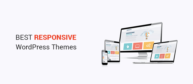
Testing on different devices is important. Use a phone, tablet, and computer. See how your theme looks on each. Check buttons and links. They should be easy to click. Images must fit the screen. Text should be readable. Test on different browsers too. This ensures everyone can view your site.
Credit: www.isitwp.com
Optimizing Performance
Minify your CSS and JavaScript files to make them smaller. This helps pages load faster. Every kilobyte counts. Use tools like UglifyJS or CSSNano. They make your code compact. Smaller files mean quicker loading. Visitors will thank you.
Let browsers save some files. This is called browser caching. It speeds up loading times. Files don’t need to download again. Set cache expiration for images, CSS, and scripts. Longer expiration means faster loading. Use cache-control headers to manage this. Faster sites make users happy.
Deploying Your Theme
Crafting a responsive theme for WordPress involves deploying essential elements to ensure adaptability across devices. Focus on fluid grids, flexible images, and media queries for seamless user experience. Prioritize efficient coding practices to enhance load times and maintain functionality.
Uploading To A Live Server
First, ensure your theme files are ready. Use an FTP client to upload files. Connect to your server using FTP. Navigate to the wp-content/themes directory. Drag and drop your theme folder into this directory. Double-check all files are uploaded correctly. Test your theme on the live site. Ensure it looks good and works well.
Submitting To WordPress Repository
Your theme must meet certain standards. Check WordPress guidelines for themes. Create a ZIP file of your theme folder. Go to the WordPress Theme Repository site. Log in with your WordPress.org account. Submit your theme for review. The review process can take time. Wait patiently for approval. Once approved, your theme is live!
Credit: stewartgauld.com
Frequently Asked Questions
What Is A Responsive WordPress Theme?
A responsive WordPress theme adapts to different screen sizes and devices. It ensures your website looks great on desktops, tablets, and smartphones. This improves user experience and SEO, as search engines favor mobile-friendly sites. Responsive themes are crucial for reaching a wider audience effectively.
How Can I Make A Theme Responsive?
To make a theme responsive, use CSS media queries to adjust layouts for different screen sizes. Implement flexible grids and images to ensure proper scaling. Test your design on various devices to ensure consistency. Consider using responsive frameworks or plugins to streamline the process.
Why Is Responsiveness Important For Seo?
Responsiveness is important for SEO because search engines prioritize mobile-friendly websites. A responsive design enhances user experience by making navigation easy on any device. This can lead to longer site visits and lower bounce rates, improving your site’s search engine ranking and visibility.
Can I Use Plugins For Responsive Design?
Yes, you can use plugins for responsive design in WordPress. Plugins like Elementor and WP Touch offer responsive design features. They allow customization without coding and ensure compatibility across devices. Always check reviews and compatibility with your theme before installing plugins.
Conclusion
Creating a responsive WordPress theme is essential today. It improves user experience across devices. Start with a flexible grid and fluid images. Test your theme on various screen sizes. Use media queries to enhance adaptability. Keep navigation simple and accessible.
Optimize your theme for speed and performance. Responsive design supports better SEO. It boosts your site’s visibility and engagement. Follow these steps to ensure a mobile-friendly website. Visitors will appreciate the smooth experience. Your efforts will lead to more satisfied users.
And ultimately, to a more successful website.