Are you frustrated with how your WordPress site looks on mobile devices? You’re not alone.
Many site owners struggle with creating a seamless mobile experience. But here’s the good news: crafting a mobile theme for WordPress isn’t as daunting as it seems. Imagine boosting your site’s traffic by making it look stunning on every screen, capturing the attention of more users effortlessly.
With a few simple steps, you can transform your website into a mobile-friendly powerhouse. Ready to dive in and discover how to enhance your site’s mobile presence and keep visitors engaged? Let’s get started on creating a mobile theme that not only looks great but also provides an exceptional user experience.
Choosing The Right Tools
A good theme framework is key. Frameworks help you build a theme fast. They have ready-made parts. These parts save time and effort. Choose a framework that is simple. It should also be responsive. Responsive means it works on any device. Try frameworks like Bootstrap or Foundation. These are popular. They are easy to use. Many developers trust them.
Plugins add features to your theme. They make it better. Use plugins that focus on speed. Speed is important for mobile users. They also need to be lightweight. Heavy plugins can slow down a site. Some good plugins are WP Super Cache and Jetpack. These plugins help with performance and security. Always keep plugins updated. Updates fix bugs. They also improve functionality.
Credit: www.isitwp.com
Designing For Mobile
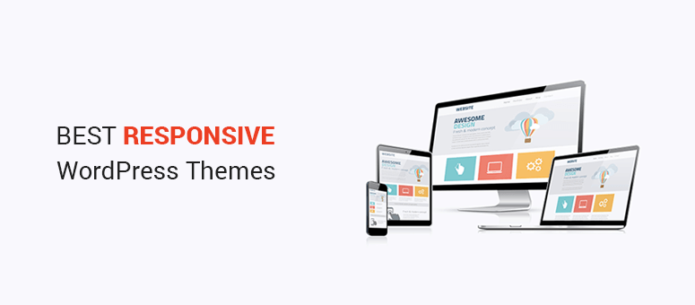
Mobile sites need to look good on all devices. Tablets, phones, and desktops. Use responsive design to adjust layouts. A flexible grid system helps. Images should scale and not break the layout. Font sizes must be clear and readable. Navigation should be easy to use. No one likes confusing menus. Touch-friendly elements are key. Buttons must be big enough to tap. Avoid tiny links. Mobile users want fast load times. Compress images to speed things up. Less is more. Use fewer elements on small screens.
User experience matters a lot. People get frustrated if a site is slow. Keep it fast and simple. Give users what they want. Quick access to information is vital. Don’t hide important content. Use white space wisely. It helps focus attention. Make sure text is easy to read. High contrast is better. Avoid tiny fonts. A clean design attracts users. They stay longer. Happy users mean more visits. More visits can lead to more success.
Customizing The Theme
Change the CSS to make your site look nice on phones. Use media queries to adjust styles for small screens. Make text sizes bigger so they are easy to read. Keep menus simple and easy to use. Always test changes on different devices. This ensures everything works well everywhere.
Small images load faster on phones. Use compressed images to save space. Tools like TinyPNG can help. Videos should be short and mobile-friendly. Use formats like MP4 for videos. This helps with faster loading. Always check how media looks on different phones. It ensures everything displays correctly.
Testing On Multiple Devices
Emulators help see how your site looks on different phones. They are software tools. You can try them on your computer. They are easy to use. But real devices show the true picture. Different screens and sizes matter. Test on phones and tablets. You will find what works well.
Display issues can be tricky. Text might look too small. Or, images may not fit. Check for broken links. Make sure buttons work. Adjust your CSS settings. This can fix many problems. Test again after changes. Ensure everything is okay. Keep users happy with a smooth experience.
Optimizing Performance
Faster load times make users happy. Reduce the size of images on your site. Use formats like JPEG or PNG. Compress CSS and JavaScript files. Tools like Gzip help with this. Use lazy loading for images. Images appear only when needed.
Fewer server requests mean quicker pages. Combine files like CSS and JavaScript. This creates fewer requests. Use browser caching to store data. It makes repeat visits faster. Limit plugins to only what you need. Too many plugins slow down your site.
Credit: wpthemego.com
Deploying The Mobile Theme
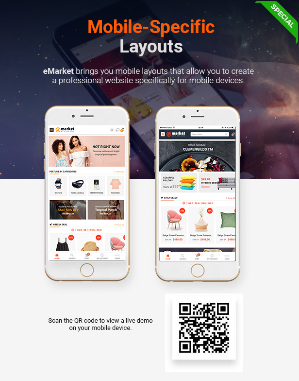
Crafting a mobile theme for WordPress enhances user experience on smartphones. Focus on responsive design to ensure content fits small screens. Use plugins to simplify the process and optimize loading times for mobile users.
Setting Up A Staging Environment
Creating a staging environment is very important. It helps test changes without risk. Use a plugin like WP Staging. It copies your site to a safe place. Make sure everything works well here first. This way, your main site stays safe. Test the mobile theme carefully. Look for any errors or bugs. Fix them before moving forward.
Going Live With Minimal Downtime
Switching to the new theme should be smooth. Backup your site before changes. This keeps your data safe. Use a maintenance mode plugin. It tells visitors the site is being updated. Check all pages after switching. Make sure everything looks right. This ensures a good user experience. No broken links or missing content.
Maintaining And Updating
Keeping your mobile theme fresh ensures a seamless user experience. Regular updates fix bugs and enhance functionality. Constant maintenance keeps the theme compatible with new WordPress versions.
Regular Updates And Bug Fixes
Regular updates keep your mobile theme fresh. They help fix bugs and improve security. Themes must stay compatible with the latest WordPress version. Updating plugins is important too. This ensures all features work correctly. Fixing bugs makes the theme run smoothly. It also improves the user experience. Always test the theme after updates. This helps catch any new bugs. Don’t forget to backup before updating. This saves your hard work if something goes wrong.
Monitoring User Feedback
Listening to users is key. Their feedback shows what works well. It also shows what needs fixing. Users notice details you might miss. They tell you about bugs and issues. Respond quickly to their concerns. This builds trust and loyalty. Use feedback to make your theme better. Positive reviews attract more users. Negative feedback helps you improve. Always thank users for their input. It shows you care about their experience.

Credit: wpastra.com
Frequently Asked Questions
What Is A Mobile Theme In WordPress?
A mobile theme in WordPress is a design optimized for mobile devices. It ensures your site looks good on smartphones and tablets. Mobile themes are crucial for user experience and SEO. They improve loading times and navigation on smaller screens, enhancing accessibility for mobile users.
How To Choose A Mobile Theme?
Choose a mobile theme by focusing on responsiveness and speed. Ensure it’s compatible with your plugins and easy to customize. Read reviews and test demos to check functionality. A good theme should enhance user experience and support your site’s goals.
Can I Create A Mobile Theme Without Coding?
Yes, you can create a mobile theme without coding by using WordPress page builders and theme customizers. Tools like Elementor and Divi offer drag-and-drop interfaces. These tools allow you to design responsive layouts easily, making them accessible to non-developers.
Why Is A Mobile Theme Important?
A mobile theme is important for improving user experience and SEO. Most users browse websites on mobile devices, so responsive design is crucial. Mobile-friendly sites rank better on search engines, attract more visitors, and reduce bounce rates. Ensuring your site is mobile-optimized boosts engagement.
Conclusion
Creating a mobile theme for WordPress enhances user experience. It improves site accessibility and boosts engagement. Start by choosing a responsive theme. Customize it to fit your brand. Ensure fast loading times for mobile users. Test your theme on various devices.
Make adjustments for seamless navigation. Mobile themes are vital for modern websites. They meet the growing demand for mobile browsing. A well-crafted theme can attract more visitors. Keep your mobile site simple and functional. Regular updates keep your theme fresh.
Stay ahead by focusing on mobile optimization. Your efforts will pay off with increased site traffic.