
Imagine your website with a sleek, professional layout that captures attention immediately. You’ve chosen the Sydney WordPress theme for its modern design and flexibility, but now you’re wondering how to create a stunning three-column layout.
You’ve come to the right place! Creating a three-column design can transform your website into a more organized, visually appealing space that guides your visitors effortlessly through your content. It’s easier than you might think, and by the end of this guide, you’ll be ready to implement this simple yet effective change.
You’ll learn step-by-step how to set up and customize three columns to enhance your website’s functionality and aesthetic appeal. Let’s dive in and unlock the potential of your Sydney theme!

Credit: wordpress.org
Getting Started With Sydney Theme
Sydney WordPress theme allows easy customization. Creating three columns is simple with the page builder. Drag and drop widgets into column sections for a balanced layout. Adjust column settings to fit content needs effortlessly.
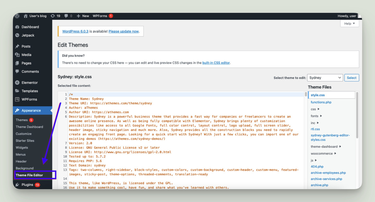
Installing Sydney Theme
First, open your WordPress dashboard. Then, go to Appearance and click Themes. Next, click the Add New button at the top. In the search bar, type “Sydney”. Once you see the Sydney theme, click the Install button. Wait for the installation to complete.
Activating Sydney Theme
After installation, you must activate the theme. Go back to Appearance and then Themes. You will see the Sydney theme listed there. Click the Activate button. Now, Sydney theme is active on your site. You can start customizing it.
Setting Up A Custom Page
Start with your WordPress dashboard. Click on Pages. Choose Add New. Name your page. Keep it simple. Just like naming a pet. You will see a blank space. This is your canvas. You can add text. You can add images. You can add anything you want. Save your work regularly. You don’t want to lose it.
Go to the right side. Look for Page Attributes. Click on it. You will see Template. Pick the template that has 3 columns. It arranges content neatly. Helps readers understand better. Make sure to preview your page. See how it looks. Make adjustments if needed. Always check your work.
Using Elementor For Column Layouts
First, go to your WordPress dashboard. Find the Plugins section on the left. Click on it and select Add New. In the search bar, type Elementor. Once you see it, click on Install Now. After installation, click Activate. Now, Elementor is ready to use.
Open a page with Elementor. Click on the plus icon to add a section. Choose the three-column structure. Now, you have three columns. Add content by dragging widgets into each column. You can add text, images, or videos. Customize each column’s settings for the best look. Adjust width and padding as needed. Now, enjoy your new layout!
Customizing Column Content
Columns make your webpage look neat. Widgets add more features to columns. Widgets can be text, images, or buttons. Place a widget in each column. This adds color and life to your page. You can mix and match widgets. Try different widgets to see what fits best. Always save your work. Changes will be seen on your page.
Adding Widgets To Columns
Drag a widget to your column. Release it where you want it. Each column can have a unique widget. This makes your page special. Use the widget toolbar to adjust settings. You can change the size or color. It is easy and fun to customize your page.
Styling Columns With Elementor
Elementor is a tool for styling columns. Choose a column and pick a style. You can change the background color. Add borders to make it look sharp. Use padding to add space inside columns. Try different styles to make your page beautiful. Always preview changes before saving.
Responsive Design Considerations
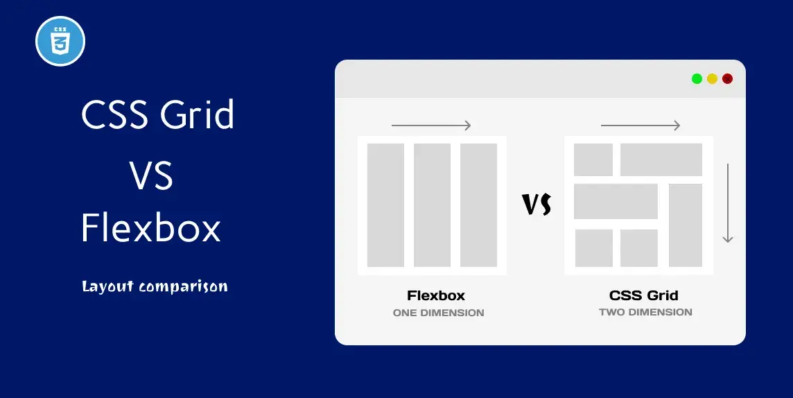
Mobile devices are smaller. They need different layouts. Adjusting columns for mobile view is important. Three columns can look cramped. Make them responsive. They should adapt to screen size. Try using flexbox or CSS Grid. These tools help. They make columns flexible. Columns stack on small screens. This improves readability.
Adjusting Columns For Mobile View
Use media queries. They change styles based on screen width. Set breakpoints for different devices. Adjust column width at each breakpoint. Keep content clear and accessible. Test on various devices. Ensure columns display well. Use tools like Chrome DevTools. They show how design changes. Keep refining design.
Testing Responsiveness
Test responsiveness regularly. Use multiple devices. Check phones and tablets. Ensure columns look good everywhere. Browsers have built-in tools. Use them for testing. They simulate different screen sizes. Adjust as needed. Keep an eye on text size. Make sure it is readable.
Credit: fastdot.com
Saving And Previewing Changes
Click the Save button often. This keeps your work safe. Use a clear name for your layout. This helps you find it later. Save changes each time you make them. Avoid losing your progress.
Check your page on a computer. Then view it on a tablet. Finally, look on a phone. This helps you see how it looks everywhere. Make sure it fits well on all screens. Adjust if needed.
Credit: livechatai.com
Frequently Asked Questions
How Do I Add Columns In Sydney Theme?
To add columns in the Sydney theme, use the Elementor page builder. Drag and drop the “Columns” widget onto your page. Customize the number of columns and their width. This allows for flexible layout creation without coding. Elementor is user-friendly and enhances your design options.
Can I Customize Column Widths In Sydney?
Yes, customizing column widths in Sydney is easy with Elementor. Select the column widget and adjust its width using the slider. This ensures your layout matches your design vision. Sydney theme and Elementor provide flexibility for precise customization, enhancing user experience and visual appeal.
Are Columns Mobile-responsive In Sydney Theme?
Columns created with Sydney and Elementor are mobile-responsive by default. Elementor automatically adjusts column sizes for optimal viewing on different devices. You can further customize the responsiveness settings. This ensures a seamless experience for mobile users, enhancing accessibility and engagement.
Do I Need Coding Skills For Columns In Sydney?
No coding skills are needed to create columns in the Sydney theme. Elementor simplifies the process with its drag-and-drop interface. This allows you to focus on design without technical barriers. Enjoy creating engaging layouts effortlessly, making your site visually appealing and user-friendly.
Conclusion
Creating three columns in the Sydney WordPress theme is straightforward. Follow the steps and see changes instantly. This setup boosts your site’s organization. Readers find content easier to navigate. A clean layout makes information clear. Try different styles for uniqueness.
Adjust settings to fit your brand. Experiment with spacing for visual appeal. Use plugins if needed for extra features. Keep exploring options. Enhance your website without coding skills. Enjoy the creative process. Your site now has a professional touch. Keep it updated for the best user experience.
Happy designing!


