Struggling to make your WordPress site look perfect on mobile devices? You’re not alone.
With the world increasingly relying on smartphones, having a mobile-friendly website is no longer a luxury—it’s a necessity. If you’ve ever felt frustrated with how your WordPress theme appears on mobile, this guide is for you. Imagine this: your website, looking sleek and professional, no matter the screen size.
It’s not just about aesthetics; it’s about capturing and retaining your audience’s attention. We’ll show you how to transform your WordPress theme into a mobile theme effortlessly. Ready to enhance your user experience and boost your site’s performance? Let’s dive in and get started!
Why Mobile Optimization Matters
People use phones more than computers now. Websites must fit small screens. If not, users might leave. Slow or hard-to-read pages are frustrating. Google ranks mobile-friendly sites higher. This means more visitors. And more visitors can mean more success.
Navigation should be easy. Text must be big enough to read. Buttons should be easy to tap. Images need to load fast. A good mobile site keeps users happy. Happy users come back. They might even tell friends.
In a world full of phones, a website should work well on them. It’s not just nice. It’s important. Businesses grow with a good mobile site. Mobile optimization is key to online success today.
Assessing Your Current Theme
Check if your theme adjusts to different screen sizes. Resize the browser window on your computer. Does the content shift smoothly? Use a mobile device to visit your site. Look for elements that overlap or disappear. Responsive designs adapt to every screen. Responsive themes are crucial for user experience.
Load speed matters for mobile users. Use tools like Google PageSpeed Insights. These tools show how fast your site loads. Faster sites keep users happy. Slow sites might lose visitors. Check the theme’s code for unnecessary scripts. Clean code speeds up loading. Fast loading enhances mobile browsing.
Selecting A Mobile-friendly Framework
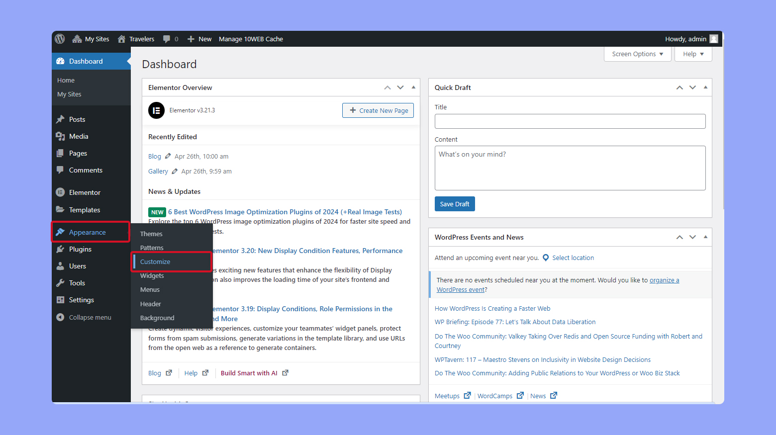
Choosing the right mobile framework is key. It helps in making your site look good on phones. Some popular options include Bootstrap, Foundation, and jQuery Mobile. Each of these offers tools to make your site responsive. This means the site will adjust to fit any screen size.
Bootstrap is widely used. It has many ready-made components. Foundation is another choice. It is known for its flexibility and customization. jQuery Mobile focuses on touch-friendly designs. All these frameworks make designing for mobile easy.
Check if the framework works with your existing WordPress theme. Most frameworks have good support. They offer guides and examples. This helps in integrating them with your theme. Compatibility ensures fewer issues during the conversion.
Credit: 10web.io
Adapting Theme Design For Mobile
Mobile screens are small. Navigation should be easy. Use a simple menu. Avoid too many links. Keep it clean. Important links should be on top. Use a hamburger menu. It saves space. Users tap to open. Buttons should be big. Easy to tap. No tiny buttons. Users should find things fast. No long searches.
Images should load fast. Slow images annoy users. Use small images. Compress them. They load faster. Use the right format. JPEG for photos. PNG for graphics. Lazy loading helps. Images load as you scroll. Save data. Users love fast pages. No waiting. Keep images clear. No blurriness. Quality matters. Even on small screens.
Implementing Responsive Css
Media queries help your site look good on all devices. They check the device size and change styles. Use them to make text and images fit. Small screens need different styles. Add special rules for phones and tablets. Use breakpoints to adjust the layout. Common breakpoints are 768px for tablets and 480px for phones. These make your site responsive and easy to read.
Flexbox helps in arranging content in rows or columns. It’s great for small layouts. It aligns items neatly. Grid layouts are more powerful. They create complex designs easily. Both Flexbox and Grid help make sites responsive. They adjust content based on the screen size. Use Flexbox for simple alignments. Use Grid for more detailed designs. They make sites look nice on all devices.
Credit: colorlib.com
Utilizing WordPress Plugins
WordPress plugins can make themes mobile-friendly. They help your site look good on phones. Some plugins are very popular. They are used by many websites. These tools can be very helpful.
Top Plugins For Mobile
- WPtouch: Changes your site to a mobile theme. Easy to set up.
- Jetpack: Has many features. Includes mobile theme options.
- AMP: Makes pages load fast. Good for mobile users.
Plugin Configuration Tips
Always read the plugin instructions. They tell you how to set it up. Check the settings in your dashboard. Make sure the mobile view is active. Test your site on different phones. See how it looks on each one. Adjust settings if needed. This helps your site look good everywhere.
Testing Mobile Usability
Testing Tools help check if a website looks good on phones. They show how a site works on small screens. Tools like Google’s Mobile-Friendly Test are useful. They show if a site is easy to use on phones. PageSpeed Insights is another tool. It checks how fast a site loads on phones. A slow site can make users unhappy.
User feedback is also important. Ask friends to check your site on their phones. They can tell if buttons are hard to click. Or if text is too small. Feedback helps make the site better for everyone. Use these tools and feedback to ensure a good mobile experience.
Seo Considerations For Mobile
Mobile SEO is very important. A fast-loading site attracts more visitors. Images should be small to load quickly. Use responsive design to fit all screen sizes. Make sure the text is easy to read. Big buttons help users click easily. Test your site on different devices. Check how fast it loads. Make sure it works well. Good mobile SEO helps your site rank higher.
Many people forget about mobile users. They design only for computers. This makes it hard for mobile users. Pop-ups can be annoying on phones. Users might leave your site. Avoid big images. They slow down your site. Navigation should be simple. Users need to find things quickly. Check your site often. Fix any problems you find.
Monitoring Performance
Keep track of your site’s mobile metrics. Use tools like Google Analytics. Check how fast your site loads on phones. A slow site can cause users to leave. Look at bounce rates too. High bounce rates mean users leave quickly.
Watch user engagement on mobile. Are they clicking links? Are they scrolling through pages? This shows if users find your content interesting. These metrics help you improve the mobile experience.
Always look for ways to improve. Test your site often on different phones. New updates can change how your site works. Fix problems quickly to keep users happy.
Get feedback from users. They can tell you what they like. Or what they don’t like. Use this feedback to make your site better. Always aim to give the best mobile experience.
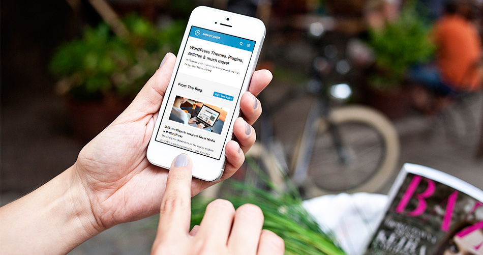
Credit: www.wpexplorer.com
Frequently Asked Questions
How To Make WordPress Theme Mobile-friendly?
To make a WordPress theme mobile-friendly, use responsive design techniques. Implement CSS media queries to adjust layouts for different screen sizes. Consider using plugins like WPtouch, which automatically creates a mobile version of your site. Test your site on various devices to ensure a seamless user experience.
Can I Convert Any Theme To Mobile?
Yes, you can convert any theme to mobile-friendly. Use CSS media queries and responsive design principles. Additionally, some plugins can assist in this transformation. However, starting with a responsive theme is often more efficient. Regular testing ensures compatibility with various devices.
What Is A Responsive WordPress Theme?
A responsive WordPress theme automatically adjusts its layout to fit different screen sizes. It ensures a consistent user experience on desktops, tablets, and smartphones. Responsive themes use flexible grids, images, and CSS media queries. This adaptability enhances SEO and improves user engagement across devices.
Do I Need Coding Skills For Conversion?
Basic coding skills are helpful for theme conversion. Understanding HTML, CSS, and JavaScript aids in making responsive changes. However, many plugins and tools simplify the process for non-developers. Learning fundamental coding can be beneficial for customizations and troubleshooting.
Conclusion
Making your WordPress theme mobile-friendly is crucial today. Users expect seamless experiences across devices. Start by checking your theme’s responsiveness. Use tools to test it on various screens. Modify CSS for better mobile views. Consider using plugins designed for mobile optimization.
They simplify the process. Don’t forget to test the site regularly. This ensures all elements work perfectly. Speed is key, so optimize images and scripts. Remember, a mobile-friendly site enhances user satisfaction. It boosts engagement and retention. Follow these steps to create a smooth mobile experience.
Your visitors will appreciate the effort.