Are you ready to take your WordPress skills to the next level? Imagine creating a website that not only looks stunning but also adapts perfectly to any screen size.
In today’s digital age, having a responsive WordPress theme is crucial. With Foundation, a powerful front-end framework, you can achieve just that. This guide will walk you through the step-by-step process of building a responsive WordPress theme using Foundation. Whether you’re a seasoned developer or just starting out, you’ll find valuable insights and tips to create a site that’s both functional and visually appealing.
Stick around to discover how you can enhance user experience and keep visitors coming back for more.
Getting Started With WordPress And Foundation
WordPress is a popular tool. It helps to create websites easily. Foundation is a framework. It helps make sites responsive. Combining both is a great idea. First, install WordPress on your computer. This step is simple. Follow the setup guide. Next, download the Foundation files. These files are important. They help make your site look good on all devices.
Open your theme folder in WordPress. Add the Foundation files here. This helps in making a responsive theme. Check if your theme works on mobile and desktop. Making changes is easy with Foundation. Your site will look modern and clean. This is the power of using WordPress with Foundation.
Setting Up Your Development Environment
Start by downloading WordPress from its official site. Extract the files to your computer. Use software like WAMP or MAMP for local setup. These tools help create a local server. Open your server software and find the www directory. Place WordPress files here. Go to your browser and type localhost. Follow the installation steps. You will need a database name. Create it using phpMyAdmin. Connect WordPress to this database during setup. Installation is complete when you see the login screen.
Download the Foundation framework from the official site. Extract the files and move them to your theme folder. Open your theme’s functions.php file. Add code to load Foundation’s CSS and JS. Use the wp_enqueue_style and wp_enqueue_script functions. Check if Foundation is working by viewing your site in a browser. Look for style changes or grid layouts. If changes are visible, the setup is successful.
Creating A Custom WordPress Theme
WordPress themes have a special structure. They have different files and folders. The main folder is the theme folder. Inside, there are many files. Each file has a job. The style.css file is very important. It holds the theme’s style information. Another key file is index.php. It shows the main content.
The functions.php file is also vital. It adds extra functions to the theme. Themes also have template files. These files show different parts of the site. Header.php and footer.php are examples. They show the top and bottom of the site.
Start by making a new folder for your theme. Add a style.css file. This file tells WordPress about your theme. Write a name and a description in it. Next, create an index.php file. This will show your main content.
You need a functions.php file too. This file adds features to your theme. You can also create a header.php and a footer.php. These files show the top and bottom parts of your website. All these files are important. They help build a working theme.

Credit: www.slideshare.net
Integrating Foundation With WordPress
First, download the Foundation framework from the official site. Extract the files on your computer. Open your WordPress theme folder. Create a new folder named “foundation”. Copy the Foundation CSS and JS files into this folder.
Use the functions.php file in your theme. Add code to load Foundation files. Use wp_enqueue_style() for CSS. Use wp_enqueue_script() for JS. Make sure to set dependencies. This ensures files load in the correct order.
Building Responsive Layouts
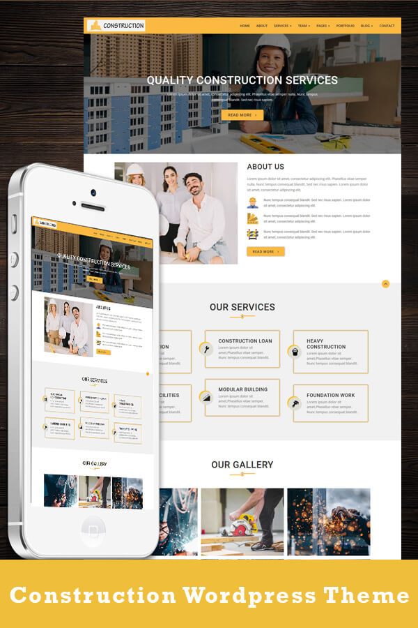
Crafting a responsive WordPress theme with Foundation involves a blend of flexibility and design. Foundation’s grid system ensures seamless adaptation across devices. Integrating its components in WordPress enhances user experience, delivering a mobile-friendly interface effortlessly.
Using Foundation Grid System
Foundation Grid System helps create responsive layouts easily. It uses rows and columns. These adjust to different screen sizes. Each column has a width in percent. This makes them flexible. You can mix different column sizes. This helps in creating unique designs. Foundation has many predefined classes. These make layouts easy to manage. You can use these classes in your HTML. This helps in controlling the layout. The grid system supports 12 columns. You can divide them as needed. This makes it simple to design modern websites. Use classes like .small-12, .medium-6, and .large-3. These help in defining column sizes for different screens.
Responsive Navigation Menus
Navigation menus must be responsive. They help users find content. Foundation provides responsive menu components. These adapt to different devices. You can use .top-bar for desktop menus. For mobile, use .off-canvas. This makes menus slide in. Keep menu items clear and simple. Use icons for better understanding. Organize items logically. This helps users navigate easily. Use dropdown menus for sub-items. This keeps the main menu clean. Always test menus on different devices. This ensures they look good everywhere.
Credit: elegantmarketplace.com
Customizing Theme Appearance
Creating a unique look is fun. Use the Foundation framework to make it simple. Start by editing the style.css file. This file controls the theme’s look. You can change colors, fonts, and layouts. Make sure to use colors that match. This keeps the theme looking nice. Add media queries for better responsiveness. This helps your theme look good on any screen size.
Widgets and sidebars make themes better. They add useful tools and info. Go to the functions.php file. Here, you can register new sidebars. Use the register_sidebar() function. Widgets can be added through the WordPress dashboard. They are easy to drag and drop. Sidebars can show recent posts, a calendar, or even social links. This keeps users engaged and informed.
Enhancing Theme Functionality
Crafting a responsive WordPress theme with Foundation enhances functionality. This approach ensures seamless display across devices. Utilize Foundation’s grid system for a flexible layout, improving user experience.
Using Foundation Components
Foundation provides many useful components for WordPress themes. These components help in making your site look good on all devices. You can use grids to create responsive layouts. Buttons from Foundation can be added to improve user interaction. Also, use the navigation bar for easy menu creation. This helps users find content quickly.
Foundation’s cards are great for displaying information in a neat way. Modals can be used for pop-up messages. Use them to show alerts or extra info. Adding these components makes your theme engaging and user-friendly.
Adding Custom Post Types
Custom post types allow for special content. Use them to add unique content like portfolio items or testimonials. This helps in organizing content better. WordPress functions make adding these easy. Use register_post_type() to create a new post type. Define labels and features for your post type. This ensures they fit your theme’s purpose.
Custom post types can have custom fields. These fields provide extra details for each item. They help in displaying content in a structured way. Adding custom post types enhances content variety and organization.
Testing And Optimizing Your Theme
Crafting a responsive WordPress theme with Foundation involves testing and optimizing each element for adaptability. Ensure your theme adjusts seamlessly across devices, enhancing user experience. Utilize Foundation’s tools to refine layouts, styles, and features, ensuring compatibility and efficiency.
Cross-browser Compatibility
Building themes that work on all browsers is important. Users might have different browsers like Chrome, Firefox, or Safari. Test your theme on each browser. Check how it looks and works. Make sure buttons and links are easy to click. Fix any broken parts. Use tools to help with testing. These can show problems that need fixing. A theme should look good everywhere. This keeps users happy and engaged.
Performance Optimization Techniques
A fast theme keeps users on your site. Slow sites lose visitors. Reduce image sizes for quicker loading. Use lazy loading for images outside the view. Minify CSS and JavaScript files. This reduces file sizes. Fewer HTTP requests mean faster loading. Use caching to save data. This speeds up repeated visits. Check website speed with online tools. Optimize your theme for mobile users. Mobile users need quick access too.
Deploying Your Responsive Theme
Crafting a responsive WordPress theme with Foundation involves creating adaptable designs. Utilize Foundation’s grid system to ensure your theme adjusts seamlessly on all devices. Integrate its components to enhance functionality, ensuring a smooth user experience across various screen sizes.
Preparing For Deployment
Check your theme on different devices. Make sure it looks good. Responsive design is key. Your theme must adjust to screens. All buttons should work. Links should open correctly. Test everything carefully. Errors can ruin the user experience. Make sure images load quickly. Slow images can frustrate users. Optimize your files for speed. Users love fast websites.
Backup your files. Use a reliable method. Losing data can be a nightmare. Store backups safely. This step ensures safety. Clean unnecessary files. Remove clutter from your theme. It makes the site run better. Users appreciate clean and fast sites.
Uploading To A Live Server
Choose a good host. Your website depends on it. Upload your theme using FTP. Make sure everything transfers well. Check for broken links. Fix them before going live. Set permissions correctly. Keep files secure. Test your site again. Make sure it runs smoothly. Launch your theme. Share it with the world.
Credit: www.templatemonster.com
Frequently Asked Questions
What Is A Responsive WordPress Theme?
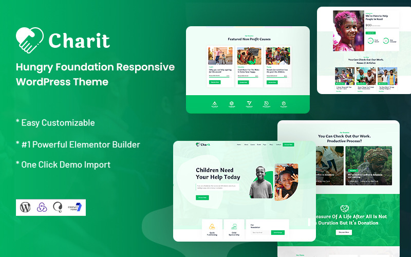
A responsive WordPress theme adjusts seamlessly to different devices and screen sizes. It ensures optimal viewing and interaction. Foundation framework helps in building such themes efficiently. Using Foundation, you can create a theme that looks great on desktops, tablets, and mobile phones.
This enhances user experience and engagement.
Why Choose Foundation For WordPress Themes?
Foundation is a flexible front-end framework ideal for responsive design. It offers pre-designed components and a mobile-first approach. This makes theme development faster and easier. Its robust grid system and customization options ensure a unique and responsive theme. Foundation also supports modern web standards.
How Do I Start With Foundation In WordPress?
To start, download the Foundation framework and install it in your WordPress theme directory. Create a custom theme folder and include Foundation’s CSS and JavaScript files. Use Foundation’s grid system and components to build your theme layout. Customize styles and scripts as needed for a unique design.
Can I Customize Foundation Components In WordPress?
Yes, Foundation components are highly customizable. You can modify styles using CSS or Sass for tailored designs. Override default styles in your WordPress theme’s stylesheet. This allows you to achieve a unique look while maintaining responsiveness. Foundation’s modular structure makes it easy to update and customize.
Conclusion
Building a responsive WordPress theme with Foundation is rewarding. You blend design and function seamlessly. Focus on simplicity for user engagement. Foundation offers flexibility for unique designs. Ensure your theme adapts to all devices. This boosts user experience significantly. Keep learning and experimenting with new features.
They enhance your skills and improve your themes. Regular updates keep your theme fresh and relevant. Remember, practice makes perfect. Every theme you build is a step forward. Use feedback to refine your work. Enjoy the creative process. Your theme is a reflection of your vision and hard work.