Are you looking to make your WordPress site stand out with stunning, full-width images? A full-width image can grab your visitors’ attention instantly and give your website a professional, modern look.
But if you’re unsure how to add one, don’t worry—you’re in the right place. You’ll discover simple, step-by-step methods to add full-width images to your WordPress site without any hassle. By the end, you’ll know exactly how to create a visual impact that keeps your audience engaged and coming back for more.
Let’s dive in!

Credit: support.competethemes.com
Choose The Right Image
Choosing the right image is key to making your full width image look great on your WordPress site. The image must fit well and load fast. It should catch the visitor’s eye without slowing down your page. Picking the perfect image helps keep your site professional and inviting.
Image Dimensions And Quality
Choose an image with large dimensions. Full width images stretch across the screen. Small images may look blurry or pixelated. Aim for at least 1920 pixels wide for desktop screens. High quality images keep your site sharp and clear.
Check the image quality before uploading. Avoid low-resolution pictures. Clear and crisp photos create a better impression. Use images that look good on both small and large screens.
Optimizing For Web
Large images can slow down your website. Compress images to reduce file size. Use tools like TinyPNG or ImageOptim to shrink images without losing quality.
Save images in web-friendly formats like JPEG or WebP. These formats balance quality and speed. Fast loading images improve user experience and SEO.
Prepare Your WordPress Site
Preparing your WordPress site is the first step to adding a full width image. This step ensures your site supports wide images and looks great. A few key choices help you get ready quickly and easily. Follow simple tips to make your site ready for full width images.
Selecting A Full Width Compatible Theme
The theme controls your site’s design and layout. Choose a theme that supports full width images. Many themes have built-in options for wide image displays. Check the theme’s demo to see how it handles images. A good theme shows images stretching edge to edge of the screen. This feature is essential for full width images.
Free and paid themes often support full width layouts. Pick one that fits your style and needs. Avoid themes that limit image width or add large margins. Themes made for blogs, portfolios, or photography usually support full width images well.
Installing Necessary Plugins
Plugins add extra features to WordPress. Some plugins help create and manage full width images easily. For example, page builder plugins like Elementor or Beaver Builder have full width image options. These tools let you drag and drop images to fill the whole screen width.
Other plugins optimize images for faster loading. Large full width images can slow your site. Use plugins that compress images without losing quality. This keeps your site fast and visitors happy. Check plugin reviews and updates to choose reliable ones.
Upload Image To Media Library
Uploading an image to the Media Library is the first step to adding a full width image in WordPress. The Media Library stores all your images and files in one place. You can easily manage and reuse these files later. This process helps keep your website organized and efficient.
Adding Images Via Dashboard
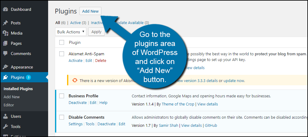
Start by logging into your WordPress dashboard. Find the “Media” option in the left menu. Click “Add New” to upload your image. You can drag and drop the file or select it from your computer. After uploading, the image appears in the Media Library. Now, it is ready to use anywhere on your site.
Organizing Your Media Files
Organize images by adding titles and descriptions. Use clear, simple names for easy searching. Group images in folders or by date if your theme or plugins allow. This keeps your media library clean and accessible. Well-organized files save time when editing or updating content.
Credit: www.greengeeks.com
Add Full Width Image Using Block Editor
Adding a full width image to your WordPress page can make your site look modern and clean. The Block Editor, also known as Gutenberg, lets you do this easily. You do not need extra plugins or code. Just a few clicks and your image will stretch across the entire screen.
This method works well for blog posts, landing pages, or any page where a large image can grab attention. The Block Editor gives you control over image size and placement. Let’s see how to add a full width image using this editor.
Inserting Image Block
Start by opening the page or post you want to edit. Click the plus (+) icon to add a new block. Search for the “Image” block and select it. You can upload a new photo or choose one from your Media Library. The image will appear inside the block area.
Setting Image To Full Width
Once the image block is added, select it. Look at the block toolbar above or on the right sidebar. Click the “Change alignment” option. Choose “Full width” from the available options. The image will now stretch across the entire screen width. Save or update your post to see the change live.
Customize Image Appearance
Customizing the appearance of your full-width image helps make your website look neat and professional. You can change how the image sits on the page and add helpful information. These small changes improve your site’s look and make it easier for visitors to understand your content.
Adjusting Alignment And Spacing
Align your full-width image to fit perfectly within your page layout. Use the WordPress editor to choose left, center, or right alignment. Adding space around the image stops it from touching other elements. Use padding or margin settings to create clear gaps. This keeps your page clean and easy to read.
Adding Captions And Alt Text
Captions provide extra details about the image. Place them below the image to explain what it shows. Alt text helps search engines and screen readers understand the image content. Write short, clear descriptions using keywords related to your page. This helps improve SEO and accessibility.
Use Page Builders For Advanced Design
Page builders offer simple ways to create full width images on WordPress pages. They let you design visually without code. This helps you build attractive, modern websites quickly. Many page builders have drag-and-drop features to place images perfectly.
Using page builders gives you more control over image size and placement. You can create sections that stretch across the entire screen. This makes your website look clean and professional. It also improves the user experience by using large, clear images.
Full Width Sections In Elementor
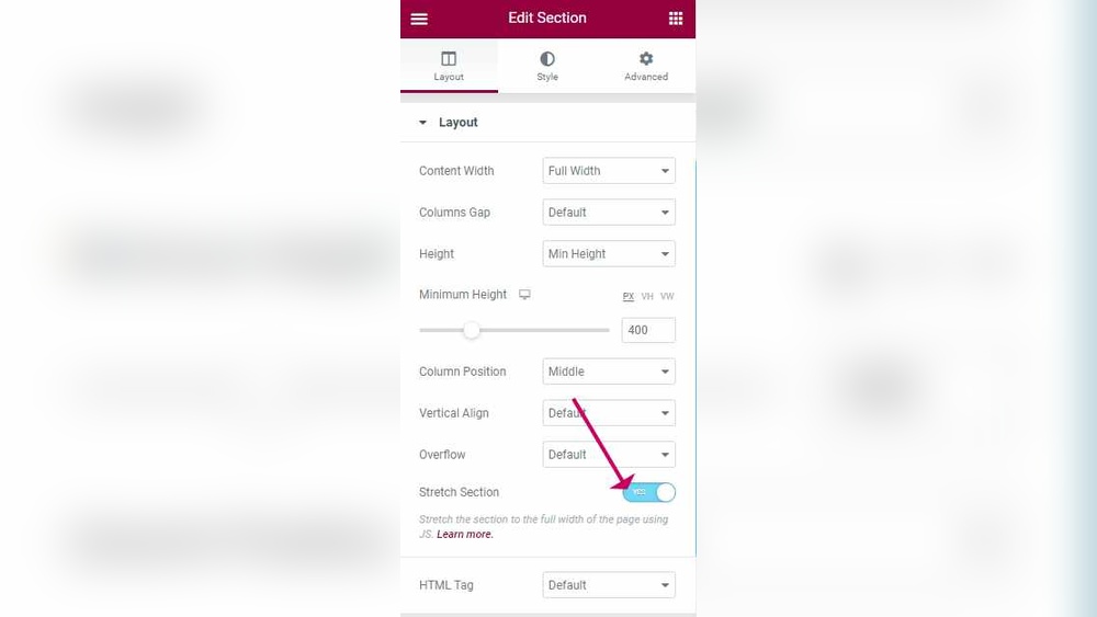
Elementor is a popular page builder with easy options for full width images. You start by adding a new section. Then set the content width to “Full Width” in the layout settings. This lets the image fill the entire screen.
Next, add an image widget inside the section. Upload your picture and adjust its size to cover the section. Use the “Stretch Section” option to remove any side margins. This ensures the image spans from edge to edge.
Elementor also allows you to add overlays or text on top of the image. This helps create eye-catching banners or headers. You can preview changes instantly and adjust until the design fits your needs.
Using Beaver Builder For Images
Beaver Builder also supports full width image sections easily. Add a new row and choose the full width layout. Insert an image module inside the row. Upload your image and set it to cover the entire row area.
Beaver Builder lets you control padding and margins. Remove these to make sure the image touches the screen edges. You can also add background colors or gradients behind the image for contrast.
This builder is great for simple and clean designs. It works well for beginners and advanced users alike. You can build responsive layouts that look good on all devices.
Troubleshoot Common Issues
Adding a full width image in WordPress can sometimes bring unexpected problems. These issues can stop your image from stretching across the entire screen. This section helps you fix the most common problems fast. Follow the tips below to make your images look great on any device.
Image Not Stretching Full Width
Sometimes your image does not fill the whole width. This often happens because of theme settings or container limits. Check your page builder or theme options. Look for settings that control content width.
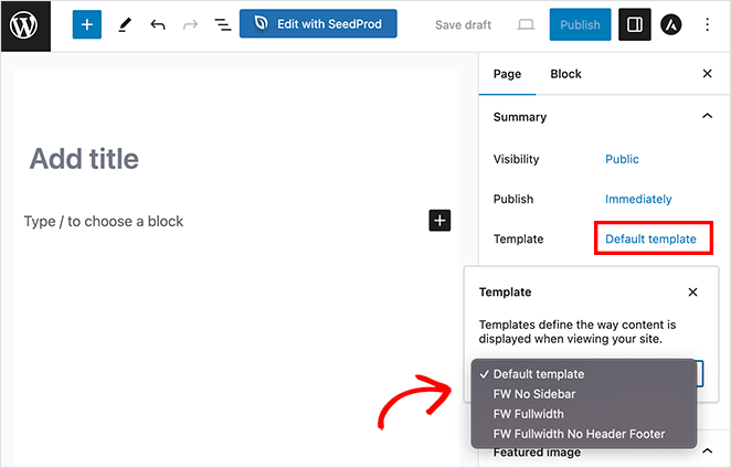
Try using the “Full Width” template for the page. Also, remove extra padding or margins around the image. Use the block editor’s “Cover” block. It naturally stretches images full width.
Responsive Design Fixes
Images must look good on phones and tablets too. Ensure your image size changes with screen size. Use CSS to set the image width to 100%. This makes the image shrink or grow with the screen.
Check your theme’s responsive settings. Some themes offer options to adjust image behavior on smaller screens. Test your website on different devices. Fix any issues by tweaking the CSS or theme options.
Credit: www.seedprod.com
Tips For Stunning Full Width Images
Full width images make your WordPress site look modern and clean. They grab attention and set a strong visual tone. Use them wisely to improve your site’s appeal and keep visitors interested.
Here are some simple tips to create stunning full width images that fit well with your content. These tips focus on color choices and balancing images with text.
Choosing Complementary Colors
Select colors that work well together. Use a color wheel to find pairs that match or contrast nicely. Complementary colors make images pop without clashing.
Keep your site’s theme in mind. Choose colors that fit your brand and message. Avoid bright colors that hurt the eyes or distract from the main content.
Use soft backgrounds with bold accents to highlight important parts. This helps visitors focus on key areas of your image.
Balancing Text And Visuals
Make sure text is easy to read over full width images. Use contrasting colors for text and background. White text on dark images or dark text on light images works well.
Limit the amount of text on images. Too much text can overwhelm visitors and reduce impact. Keep messages short and clear.
Place text in empty spaces or areas with less detail. This keeps your image clean and your message visible. Use overlays or shadows to improve readability if needed.
Frequently Asked Questions
How Do I Add A Full Width Image In WordPress?
To add a full width image, use the Gutenberg editor’s “Cover” block. Upload your image, then select “Full Width” alignment to stretch it across the screen.
Can I Make Images Full Width On Any WordPress Theme?
Most modern themes support full width images. If your theme lacks this, use a page builder or custom CSS for full width display.
What Size Should A Full Width Image Be In WordPress?
Use a high-resolution image at least 1920 pixels wide. This ensures clarity and proper display across large screens without pixelation.
Does Adding Full Width Images Affect Website Speed?
Large images can slow your site. Optimize images by compressing them before uploading to maintain fast loading times.
Conclusion
Adding a full width image in WordPress makes your site look clean and modern. It helps grab visitors’ attention quickly. You can do this easily by following the steps shared above. Choose the right image size for the best fit.
Make sure your theme supports full width layouts. Try it yourself and see how your pages improve. Simple changes like this can boost your site’s appeal and user experience. Keep practicing to get comfortable with WordPress features. Your website will look more professional and engaging in no time.