Are you tired of your WordPress site looking clunky and unappealing on mobile devices? You’re not alone.
Many website owners struggle with optimizing their themes for the small screen. But here’s the good news: customizing your WordPress theme for mobile doesn’t have to be complicated or stressful. In fact, with the right guidance, you can enhance your site’s mobile experience, boosting user engagement and improving your site’s performance.
Imagine your visitors effortlessly navigating through your site, feeling impressed by its sleek design and functionality on their smartphones. That’s exactly what we’re going to help you achieve. Dive into this guide to discover easy, actionable steps to make your WordPress theme mobile-friendly, ensuring your website shines on every device. Let’s get started on transforming your mobile presence and keeping your visitors engaged!

Credit: www.youtube.com
Importance Of Mobile-friendly Themes
Mobile-friendly themes help your site look good on phones. Most people use phones to browse websites today. If your site looks bad on a phone, visitors might leave. This is why a mobile-friendly theme is important. It makes sure your site is easy to read and use on small screens.
Good themes also improve your site’s speed. A fast site keeps users happy. Google likes fast sites too. This can help your site rank higher in search results. So, always check if a theme is mobile-friendly before using it. This step can make a big difference.
Selecting A Responsive Theme
Choosing a responsive theme is very important. This theme works well on all devices. It adapts to mobile screens easily. Many themes offer this feature. Check the theme description carefully. Look for themes with mobile-friendly features. These themes have good designs. They adjust to different screen sizes. This helps your site look great on mobile phones.
Try out the theme. See how it looks on a phone. Make sure text is readable. Images should fit properly. Navigation should be easy. Users must find it simple to browse your site. A good theme improves user experience. It helps in engaging visitors. More visitors mean more success for your site.
Using WordPress Customizer
Start by logging into your WordPress dashboard. Once you’re in, look for the Appearance menu on the left side. Click on it. A list will appear. Choose Customize. The WordPress Customizer will open up. You can now see your site on the right. On the left, you’ll find different options to change your theme.
In the Customizer, you can change many things. Look for the Site Identity option. Here, you can change the site title and logo. For colors, select the Colors option. Choose colors that look good on mobile. To change fonts, find the Typography option. Pick fonts that are easy to read on small screens. Preview changes on the right. Make sure everything looks good.
Responsive Design Techniques
Customizing a WordPress theme for mobile involves adjusting layouts for small screens. Focus on responsive design techniques to ensure seamless navigation and readability. Tailor fonts, images, and buttons for mobile users to enhance user experience and engagement.
Media Queries
Media queries help make your site look good on all devices. They let you apply different styles for different screen sizes. Use them to change layouts for phones, tablets, and desktops. For example, you can make text smaller on small screens. Or hide big images on phones. This keeps your site fast and easy to use.
Flexible Grids And Layouts
Flexible grids help in making sites adaptable. They use percentages instead of fixed sizes. This means your site can stretch or shrink. It fits any screen size. For instance, a three-column layout can become two columns on a phone. This keeps content readable and well-organized.
Optimizing Images For Mobile
Image Compression Tools help images load faster. They reduce file size without losing quality. Tools like TinyPNG and ImageOptim are popular. They make images small but keep them clear. Users enjoy faster websites.
Using Responsive Images is smart for mobile. They adjust to fit any screen size. Use the srcset attribute in HTML. It lets browsers choose the best image. Big screens get big images. Small screens get small images. This saves data and speeds up loading. Everyone gets a better experience.
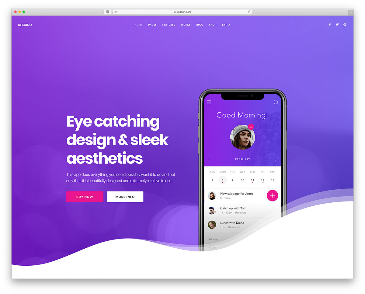
Credit: colorlib.com
Testing Theme On Mobile Devices
Browser developer tools help test WordPress themes on mobile. Open your site in a browser. Press F12 or right-click and select “Inspect”. A new window pops up. Find the mobile icon. Click it to see how your site looks on phones. Change sizes to test different screens. Check if text is easy to read. Ensure images fit well. No parts should be cut off.
Mobile testing plugins are useful for WordPress sites. Install a plugin from the WordPress store. Plugins show how your site looks on mobile. They offer extra settings. Adjust layout and font sizes easily. Some plugins offer previews. Previews help see changes instantly. This ensures your site is mobile-friendly.
Improving Mobile Performance
Enhancing mobile performance starts with customizing your WordPress theme. Focus on responsive design to ensure seamless user experience. Optimize images and minimize code to boost loading speed. Adjust font sizes and layouts for better readability on smaller screens.
Minifying Css And Javascript
Make your website load faster by reducing file sizes. Minifying CSS and JavaScript removes extra spaces and comments. It makes your site cleaner and quicker. Use tools like Minify or UglifyJS. They help reduce the size of your files. Smaller files mean faster loading times on mobile devices. Easy and effective!
Leveraging Browser Caching
Speed up your site with browser caching. It stores parts of your site on the visitor’s device. Next time they visit, it loads faster. Set up caching in your site’s settings. This keeps repeat visitors happy. They don’t have to wait long. Fast sites make users smile!
Common Issues And Fixes
Text on mobile should be clear and readable. Small fonts can be hard to read. Use a font size of at least 16 pixels. This helps users see text without zooming.
Fonts should look good on all devices. Choose responsive fonts that adjust to screen size. Avoid fancy fonts that are hard to read.
Buttons and links must be easy to tap. They should be big enough for fingers. A good size is 44 by 44 pixels. This prevents mistakes when tapping.
Links should be spaced out properly. Avoid placing links too close together. This helps users click the right link without errors.
Credit: support.undsgn.com
Frequently Asked Questions
How Do I Make My WordPress Theme Mobile-friendly?
To make your WordPress theme mobile-friendly, use responsive design principles. Customize your theme with CSS media queries and optimize images. Ensure text is readable on small screens and test across various devices. Consider using mobile-specific plugins to enhance functionality and improve user experience.
Can I Customize WordPress Without Coding?
Yes, you can customize WordPress themes using the WordPress Customizer. It allows changes to colors, fonts, and layouts without coding. Use plugins for additional features and page builders for drag-and-drop design. For more advanced customization, consider hiring a developer.
What Plugins Help With Mobile Optimization?
Plugins like WPtouch and Jetpack optimize your site for mobile. WPtouch creates a mobile-friendly version of your site. Jetpack offers responsive design features and performance improvements. These plugins enhance user experience on mobile devices and are easy to configure.
How Do I Test Theme On Mobile Devices?
Use online tools like BrowserStack or Responsinator to test your theme. These tools simulate your website on various mobile devices. You can also test directly on different smartphones and tablets. Ensure that design elements and functionality perform well across all devices.
Conclusion
Customizing your WordPress theme for mobile is vital. It enhances user experience. A responsive site attracts more visitors. Start by choosing a mobile-friendly theme. Adjust images and fonts for better readability. Use plugins to enhance functionality. Test your site on various devices.
Ensure fast loading times. Always keep your design simple and clean. Focus on easy navigation. Consistent updates help maintain performance. Your efforts will boost engagement. Happy visitors return more often. With these steps, your site will thrive on mobile.