Are you struggling to make your WordPress site look great on mobile devices? You’re not alone.
With more people browsing on their phones than ever before, having a mobile-friendly website is crucial. Imagine losing potential readers or customers because your site doesn’t look good on a smartphone. You don’t want that, right? By learning how to convert your WordPress theme to mobile, you can ensure your site’s design is as appealing and functional on a small screen as it is on a desktop.
This transformation can enhance user experience, increase engagement, and boost your SEO ranking. In this guide, you’ll discover simple, actionable steps to make your WordPress theme responsive. Get ready to turn those bouncing visitors into loyal followers by making your site effortlessly mobile-friendly. Read on to unlock the full potential of your WordPress theme!
Understanding Mobile-first Design
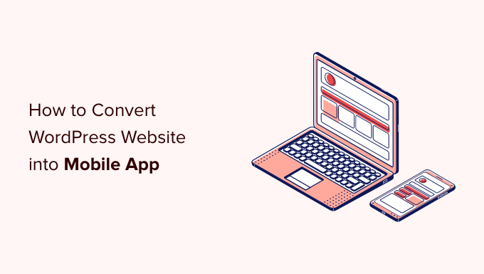
Mobile-first design means starting with the smallest screen. It focuses on smartphones and tablets first. This way, users get the best experience on their phones. The design is made to look good on a small screen. It is important to think about easy navigation. Users should find what they need quickly. The text should be easy to read. Images should load fast. This helps the page open quickly on mobile devices.
Make buttons big enough to tap with a finger. This makes it easier for users. Think about the layout. Use a single column layout. This works well on small screens. Avoid using too many images or videos. They can slow down the site. Always test the site on different devices. This ensures it looks good everywhere.
Credit: www.wpbeginner.com
Evaluating Your Current Theme
Assess your current theme to ensure it supports mobile responsiveness. Identify elements that hinder smooth mobile navigation. Simplifying layout and optimizing images can enhance user experience on mobile devices.
Analyzing Layout And Features
Understanding the layout is key. Check the layout adaptability. Does it adjust on small screens? Review the features offered by your theme. Are they mobile-friendly? Ensure buttons are easy to tap. Menus should be simple. Avoid complex designs. Simple designs work best on mobile.
Identifying Mobile Compatibility Issues
Mobile compatibility is crucial. Look for responsive design elements. Some themes may not fit well. Images might be too large. Text could be hard to read. Test the theme on different devices. Make sure everything looks right. Fixing these issues is important. It improves user experience. Users should easily navigate your site. Check loading times too. Fast loading is essential for mobile users.
Responsive Design Principles
Fluid grids help your site fit any screen. They use percentages instead of fixed sizes. This makes the layout adaptable. Flexible images are important too. They adjust to screen size. Use CSS to set image max-width to 100%. This keeps images from being too big. It helps them fit nicely. This way, your site looks good on all devices.
Media queries change styles for different devices. They check the device screen size. You can set different styles for small and large screens. Use CSS to write media queries. For example, change font size for small screens. Or hide some elements on tiny devices. Media queries help make your site responsive and user-friendly.

Credit: www.mobiloud.com
Customizing Css For Mobile
Fonts should be easy to read on small screens. Use simple fonts. Avoid fancy styles. Increase font size for better readability. Ensure contrast between text and background. Good contrast helps readability. Choose colors that are easy on the eyes. Limit the number of different fonts. Too many fonts can be confusing.
Make buttons big enough for fingers. Small buttons are hard to touch. Keep menus short and simple. Long menus can be hard to use. Use icons where possible. Icons are easy to understand. Ensure links are spaced apart. This prevents accidental clicks. Test the navigation on different devices.
Utilizing Mobile Plugins
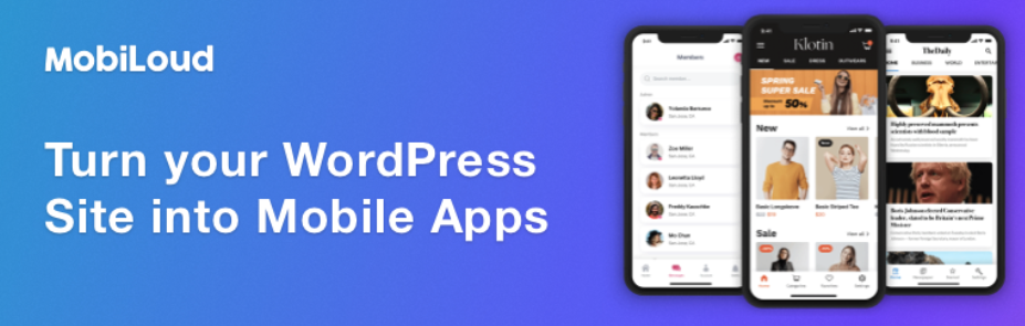
Choose plugins that work with your theme. Check for updates often. Read reviews from other users. Look for a plugin that has good support. Make sure it fits your needs. Some plugins are free, others cost money. Test the plugin before using it on your site. Choose wisely to avoid issues later.
Set up the plugin carefully. Start with basic settings. Adjust settings to fit your site. Use simple options first. Check how your site looks on a mobile device. Make changes if needed. Keep settings easy and clear. Regularly update and check for errors. This helps your site run well on mobile.
Testing Mobile Compatibility
Transforming a WordPress theme for mobile use ensures a seamless experience for users. Start by choosing a responsive design. Then, adjust images and fonts for smaller screens. Finally, test on various devices to ensure functionality and aesthetic appeal.
Cross-device Testing Tools
Testing your site on different devices is very important. Use tools like BrowserStack or Google’s Mobile-Friendly Test. These tools show how your site looks on phones and tablets. They help find problems. Fix these problems to make your site better. Your site should be easy to use for everyone. It should look good on all devices.
Addressing Performance Issues
Speed is very important for mobile users. Check your site’s speed with Google PageSpeed Insights. If your site is slow, visitors may leave. Make images smaller and faster to load. Remove plugins you do not need. Use a fast theme for better speed. Every second counts. Fast sites make users happy.
Seo Considerations For Mobile
Faster sites keep users happy. Optimize images to load faster on phones. Use smaller image sizes. Minimize CSS and JavaScript files. This helps pages load quickly. Choose a reliable hosting service for better performance. Consider using a Content Delivery Network (CDN). It speeds up content delivery to users worldwide.
Test your site speed regularly. Use tools like Google PageSpeed Insights. Aim for a loading time under three seconds. Remember, faster sites rank better in search engines.
Short URLs are easier for users to remember. Keep them simple and descriptive. Avoid long strings of numbers and letters. Use hyphens to separate words. This improves readability. Ensure your URLs work well on all devices.
Use a responsive design. It adjusts content based on screen size. Check that links are easy to tap. This improves user experience. Finally, test URLs to ensure they load correctly on mobile devices.
Launching Your Mobile-optimized Theme
Backup your theme files before making changes. Use reliable tools for this task. Mistakes can happen during theme conversion. A backup helps you recover quickly. Version control is crucial. Track changes with tools like Git. This helps in managing updates smoothly. Avoid confusion over theme versions. Keep notes of changes. This ensures clarity in the future. Organize your files well. It aids in easy retrieval.
Listening to users is important. Monitor user feedback regularly after launching. This highlights issues quickly. Respond to feedback promptly. Make necessary changes based on user input. Happy users lead to more visits. Keep an eye on comments and reviews. This helps in improving the theme. User insights are valuable. They guide better updates. Always aim for a user-friendly experience.
Credit: wpengine.com
Frequently Asked Questions
How Do I Make My WordPress Theme Mobile-friendly?
To make your WordPress theme mobile-friendly, use responsive design techniques. Ensure your theme adapts to different screen sizes. Utilize media queries and flexible grids. Optimize images for faster loading. Test your design on various devices to guarantee compatibility. Consider using plugins designed for mobile optimization.
Can I Convert Any WordPress Theme To Mobile?
Yes, you can convert any WordPress theme to mobile. Focus on responsive design elements. Update CSS and HTML to support various devices. Use mobile testing tools to check compatibility. Ensure all features work smoothly on smaller screens. Consider expert help for complex themes.
What Tools Help In Mobile Conversion?
Many tools assist in mobile conversion for WordPress themes. Use responsive design frameworks like Bootstrap. Test with mobile emulators and browsers. Plugins like WPtouch offer mobile optimization solutions. Online resources and forums provide additional support. Choose tools that align with your specific needs.
Why Is Mobile Optimization Important For WordPress Themes?
Mobile optimization is crucial for WordPress themes because most users access sites via mobile devices. It enhances user experience, improves site speed, and boosts SEO rankings. Mobile-friendly sites tend to have lower bounce rates. Optimized themes ensure accessibility across all devices.
Conclusion
Making your WordPress theme mobile-friendly boosts user experience. Ensures accessibility on various devices. Start by checking your theme’s responsiveness. Use media queries for tailored adjustments. Optimize images for faster loading times. Consider touch-friendly navigation. Test your changes on different screens.
Look for feedback from users. This helps refine the design further. A mobile-friendly site enhances engagement and reach. Keeps visitors returning for more. Always prioritize simplicity and functionality. Regular updates will maintain compatibility. Make your website a seamless experience. Keep exploring new trends and tools.
Adapt, improve, and watch your site flourish.