Are you ready to transform your WordPress site into a sleek, responsive masterpiece? Imagine a website that looks stunning on any device, whether it’s a phone, tablet, or desktop.
Creating a responsive WordPress theme doesn’t have to be a daunting task. With the right guidance, you can craft a design that captivates your audience and keeps them coming back for more. Picture this: a seamless user experience that boosts engagement and skyrockets your site’s performance.
In this tutorial, you’ll learn step-by-step how to build a responsive theme tailored to your unique vision. Let’s dive in and unlock the potential of your WordPress site together.
Credit: themeforest.net
What Is A Responsive Theme?
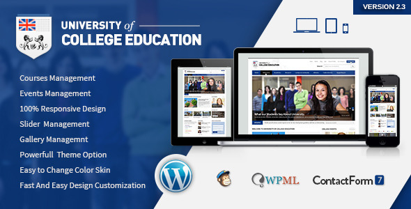
A responsive theme changes based on the screen size. It works well on phones, tablets, and computers. This theme makes sure your site looks good on all devices. Websites load faster with responsive themes. They also provide a better user experience. This keeps visitors on your site longer. Responsive themes use flexible grids. They also use flexible images and media queries. These help the theme adjust to different screens. A responsive design is important today. More people use phones to browse the web. A responsive theme helps you reach more people. It’s a smart choice for any website owner.

Credit: wpmudev.com
Essential Tools And Software
Choosing the right code editor is important. Visual Studio Code and Sublime Text are popular choices. They offer syntax highlighting and auto-completion. These features make coding easier. They help in finding errors quickly.
Developer tools help in testing your theme. Chrome DevTools is very useful. It lets you inspect elements and see CSS changes live. You can see how your theme looks on different devices. It helps in making your theme responsive.
Keeping track of changes is crucial. Git is a great tool for this. It lets you save different versions of your theme. You can go back to previous versions if needed. It also helps in working with others.
Setting Up Your Development Environment
First, download a local server software like XAMPP or WAMP. These tools help you run WordPress on your computer. After downloading, install the software following the instructions. Once installed, start the Apache and MySQL services. This will allow your computer to act like a server. Now, you can host your WordPress site locally.
Download the latest version of WordPress from its official site. Extract the files into the htdocs folder of your local server. Open your browser and type localhost/wordpress. This will start the WordPress setup. Follow the steps to configure your site. Use a database name that you created earlier in phpMyAdmin.
Create a new folder in the wp-content/themes directory. Name it after your theme. Inside this folder, add necessary files like style.css and index.php. These files are essential for your theme. You can also add other files such as header.php and footer.php. This folder structure helps in organizing your theme files.
Basic Theme Structure
WordPress themes need some essential files to work. Each theme has a style.css file. This file tells WordPress about the theme. Another important file is index.php. It is the main template file. The functions.php file helps add features to the theme.
Themes also have directories. A theme directory holds all the theme files. Inside, there is often a templates folder. This folder has template files. These files help with different page types. The image folder holds images for the theme.
WordPress uses a template hierarchy to display pages. This means it uses different files for different pages. For example, it uses single.php for single posts. The page.php file is for static pages. If these files are missing, WordPress uses the index.php file.
Template hierarchy helps make themes flexible. It lets you change how pages look. This makes each page type unique. Knowing this helps make better themes.
Designing For Multiple Devices
Creating a responsive layout helps your site look good on all devices. Each device has a different screen size. Your layout must adjust to fit these screens. Use flexible grids and layouts. They are essential for a responsive design. These tools help your site scale properly. Images should also be flexible. They need to resize and fit different screens.
Media queries are key to responsive design. They check the device’s size. Then, they apply styles based on the screen. This ensures your site is always user-friendly. Different screens need different styles. Media queries make this possible. They help you create a better experience for users. Your site will be easy to navigate, on any device.
Css And Javascript Integration
To make your theme work well, you need to add scripts and styles correctly. Use the wp_enqueue_script() and wp_enqueue_style() functions. These functions help you add JavaScript and CSS files. It keeps your theme neat and fast. First, add these functions in the functions.php file. Always use the right path for your files. This helps in loading them properly on your site. You can also set the order of loading files. It ensures all scripts work together smoothly.
Responsive Frameworks
Responsive frameworks make design easy. They offer ready-made grids and styles. Use frameworks like Bootstrap or Foundation. They help your site look good on all devices. Download and add them to your theme. They come with many features. Use them to build your theme quickly. Choose a framework that fits your needs. It saves time and effort. This way, your website will look great everywhere.
Testing Responsiveness
Cross-Browser Testing is vital. Each browser shows websites differently. Some features might not work. Test on popular browsers. Use Chrome, Firefox, and Safari. Each browser has unique quirks. Fix issues for smooth user experience.
Device Emulation Tools are helpful. They mimic different devices. Test on phones, tablets, and desktops. Google Chrome has a built-in emulator. Open Developer Tools to access it. Adjust screen size and resolution. Check layout changes and responsiveness. Ensure the site looks good everywhere.
Optimizing For Performance
Crafting a responsive WordPress theme enhances website performance and user experience. Learn to design themes that adapt to different devices, ensuring fast load times and seamless navigation. Optimize your theme for speed and efficiency using simple coding techniques.
Minification And Compression
Minification makes files smaller. It removes spaces and unnecessary code. This helps pages load faster. Faster pages improve user experience. Compressing files saves space. It reduces file size. Smaller files mean quicker downloads. Gzip is a popular tool for compression. It works well with most servers. Minification and compression are simple steps. They boost site speed.
Image Optimization Techniques
Images can slow down websites. Optimizing images is important. Use formats like JPEG or PNG. These formats are common and efficient. Make images the right size. Big images take longer to load. Use tools like TinyPNG to compress images. This reduces file size without losing quality. Lazy loading can also help. It loads images only when needed. This saves bandwidth and speeds up page load time.
Deploying Your Theme
Learn to deploy a responsive WordPress theme with ease. This tutorial guides you through setting up and customizing your theme. Enhance your website’s look and functionality with step-by-step instructions.
Preparing For Launch
Make sure your theme is ready to go live. Check all the files. Ensure no errors. Test your theme on different devices. It must look good on all screens. Check the loading speed too. Slow themes can lose visitors.
Back up your website. Save all important data. This step prevents data loss. It is very important. Review your theme’s code. Make sure it is clean and organized. A messy code can cause issues.
Theme Submission To WordPress Repository
Visit the WordPress theme submission page. Create an account if needed. Fill in the required details. Upload your theme files. Include a clear description of your theme. Explain its features and benefits.
Follow WordPress guidelines. Ensure your theme meets all requirements. Double-check for errors. Submit the theme. Wait for the review process. The WordPress team will check your theme. Be patient; this can take time.

Credit: defyn.com.au
Frequently Asked Questions
What Is A Responsive WordPress Theme?
A responsive WordPress theme adjusts seamlessly to different screen sizes and devices. It ensures your website looks great on desktops, tablets, and smartphones. Using flexible grids and layouts, it enhances user experience by providing easy navigation and readability. Responsive design is essential for SEO and improving website accessibility.
Why Is Responsiveness Important For WordPress Themes?
Responsiveness ensures your website adapts to any device, providing a better user experience. This adaptability increases user engagement and reduces bounce rates. Search engines prioritize responsive websites, improving your SEO ranking. A responsive WordPress theme helps reach a wider audience and ensures consistent functionality across all platforms.
How Can I Make My WordPress Theme Responsive?
To make your WordPress theme responsive, use flexible grids and layouts. Implement CSS media queries to adjust styles for different devices. Optimize images for faster loading and use responsive plugins if needed. Test your theme on various devices to ensure compatibility and seamless user experience.
What Tools Help In Creating Responsive Themes?
Several tools assist in creating responsive WordPress themes. Use frameworks like Bootstrap or Foundation for pre-designed responsive elements. Employ CSS preprocessors like SASS for efficient styling. Browser developer tools help test responsiveness on different devices. Plugins like WP Touch can enhance mobile responsiveness.
Conclusion
Creating a responsive WordPress theme enhances user experience. It ensures your site looks good on all devices. Follow the steps in this tutorial for a seamless design process. Focus on clean code and flexible layouts. Test on different screens to spot issues early.
This approach builds a strong foundation for your site. Keep learning to improve your skills. Responsive design is crucial today. It attracts more visitors and boosts engagement. Stay updated with the latest trends. Your theme will thrive in the digital world.
Happy designing!