Are you tired of your WordPress site looking great on a desktop but messy on a mobile device? You’re not alone.
In today’s digital age, having a responsive theme isn’t just a luxury—it’s a necessity. Imagine visitors landing on your site only to struggle with navigation because the layout is all wrong on their phone. Frustrating, right? But here’s the good news: creating a responsive theme in WordPress doesn’t have to be a daunting task.
With the right approach, you can ensure your site shines on any screen size, providing a seamless experience for every user. Ready to transform your website and keep your audience engaged? Let’s dive into the steps that will guide you in crafting a WordPress theme that adapts beautifully, no matter where it’s viewed.
Understanding Responsive Design
Mobile devices are everywhere. People love using them. Websites must look good on phones. This is called mobile compatibility. It helps users see content clearly. Easy reading. Easy navigation. No zooming needed. Google likes mobile-friendly sites. It helps with search rankings. More traffic, more visitors. Happy users. Happy businesses.
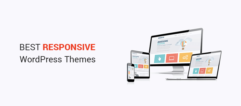
Fluid grids make layouts flexible. They adjust to any screen size. Images should be flexible too. They resize smoothly. Media queries help detect screen sizes. They apply custom styles. Touch-friendly elements are important. Big buttons are easier to tap. Responsive design focuses on user needs. It ensures a great experience. Across all devices. Simple. Effective.
Credit: www.isitwp.com
Setting Up Your Development Environment
Picking the right tools is very important. You need tools that are simple and easy. Start with a text editor. Some good choices are Visual Studio Code or Atom. They help you write and edit code. Next, find a browser like Chrome or Firefox. These let you test your website. Make sure your tools are updated. This helps you avoid problems later. Using the right tools makes your work smoother and faster.
Install WordPress on your computer. First, download XAMPP or MAMP. These help run WordPress locally. Next, create a database. Use phpMyAdmin. It’s easy and fast. After that, download WordPress from its website. Unzip the file. Place it in the htdocs folder in XAMPP. Open your browser. Type localhost/yourfoldername. Follow the steps on the screen. Fill in the database details. WordPress will install. Now, you can start building your theme.
Creating A Custom Theme
Start with a clear theme structure. It helps in building a responsive theme. A WordPress theme needs specific files. The most important files include index.php, style.css, and functions.php. These files define how your theme looks and works. The style.css is the stylesheet. It gives your theme its color and style. The index.php file is the main template. It shows the content on the site.
Themes have folders and files. The essential directories include templates, includes, and assets. Templates hold layout files. Includes have PHP files for extra features. Assets store images and scripts. Each folder helps keep things organized. This makes the theme easy to manage. It also helps with updating the theme. Having the right structure is important. It makes the theme work well across devices.
Using Html5 And Css3
Semantic HTML helps make code clear. It shows the meaning of content. Tags like
CSS3 provides tools like flexbox and grid. These tools help design responsive layouts. They adjust the layout to fit any screen size. Flexbox arranges items in a row or column. Grid divides the page into sections. Both provide flexibility. They help create a smooth user experience. Use media queries for further adjustments. Media queries change styles based on screen size. They ensure the theme looks good on all devices.
Implementing Media Queries
Media queries help design for different screen sizes. They adjust the layout on phones, tablets, and computers. Each device has a different width. Use CSS to set rules for each size.
Targeting Devices And Viewports
Set rules based on device width. Smaller screens need different designs. Use breakpoints to decide layout changes. Keep content easy to read. Make sure buttons are big enough. Adjust images to fit the screen.
Handling Breakpoints Effectively
Breakpoints change styles at certain widths. Choose common device sizes. Test how your site looks on different screens. Use flexible grids to make layout smooth. Text should be easy to read. Ensure navigation is clear. Keep important info visible.

Credit: stewartgauld.com
Incorporating Responsive Images
Responsive images make websites look good on all devices. Use the right attributes for this. The width and height tags help. They define the image size. This helps keep the layout stable. Also, use alt text. It describes the image. This is good for accessibility.
The srcset attribute is key. It tells the browser which image to use. Different screen sizes need different images. Combine this with the sizes attribute. This helps the browser pick the best image. It saves bandwidth and loads pages faster. Your site will feel smooth and quick.
Testing Your Theme
Cross-Device and Browser Testing ensures your theme works everywhere. Check the theme on phones, tablets, and computers. Use different web browsers like Chrome, Firefox, and Safari. Look for any errors or strange displays. Fix them as soon as you find them. Make sure everything looks good and works smoothly.
Utilizing Developer Tools is very helpful. These tools show how your theme behaves. Inspect elements to see changes in real time. Find problems quickly and understand why they happen. Use them to make your theme better. They help you improve the theme’s design and function.

Credit: cyberchimps.com
Optimizing Performance
Crafting a responsive theme in WordPress enhances user experience across devices. Start with flexible grids and fluid images for adaptability. Implement media queries to adjust styles, ensuring seamless performance on mobile and desktop platforms.
Minimizing File Sizes
Small files load faster. Compress images and videos to reduce size. Use tools like TinyPNG for images. Reduce CSS and JavaScript file sizes. This helps pages load quickly. Users prefer fast websites. Google also likes fast sites. Fast sites can rank better in search results.
Leveraging Caching Strategies
Caching makes sites faster. It stores data for quick access. Use plugins like W3 Total Cache. These plugins help in saving data. They reduce server load. This makes the site load faster. Faster sites make users happy. Happy users stay longer on your site.
Deploying Your Theme
Preparing for Launch involves a few simple steps. First, backup your WordPress site. This ensures you can restore it if needed. Next, check all links and images. Make sure they work properly. After that, test your theme on different devices. This helps ensure it is responsive. Now, you are almost ready to go live.
Before launching, review your theme’s SEO settings. Use descriptive titles and meta tags. These help improve your site’s visibility. Finally, update your site map. Submit it to search engines for better indexing.
Monitoring Post-Deployment is crucial. Track your site’s performance regularly. Use tools like Google Analytics. This helps you understand visitor behavior. Also, keep an eye on site speed. A fast site keeps users happy. Check for broken links often. Fix them to improve user experience. Updating your theme is important too. It keeps your site secure and efficient.
Frequently Asked Questions
What Is A Responsive Theme In WordPress?
A responsive theme in WordPress adjusts its layout based on device size. It ensures your website looks great on desktops, tablets, and smartphones. This adaptability enhances user experience and improves your site’s SEO. Responsive design is crucial for retaining visitors and providing seamless navigation across all devices.
How Do I Make My WordPress Theme Responsive?
To make your WordPress theme responsive, use flexible grid layouts and media queries. Implement responsive images and consider using frameworks like Bootstrap. Test your design on various devices to ensure compatibility. Plugins and custom CSS can also help achieve a responsive design, enhancing the site’s usability and appearance.
Why Is A Responsive Theme Important For Seo?
Responsive themes improve SEO by providing a better user experience across devices. Google favors mobile-friendly sites in search rankings. A responsive design reduces bounce rates and increases user engagement. It ensures faster loading times, which are crucial for SEO. Overall, responsiveness enhances your site’s performance and visibility.
Can I Use Plugins To Create A Responsive Theme?
Yes, plugins like WPtouch and Jetpack can help make your theme responsive. They offer mobile-friendly features and design adjustments. However, combining plugins with proper coding practices is recommended for optimal results. This ensures flexibility and control over your site’s appearance and functionality across different devices.
Conclusion
Creating a responsive WordPress theme is essential today. It ensures your site works on all devices. Start by choosing a flexible layout. Use media queries to adjust styles. Test your theme on different screens. Keep your design simple and clean.
Mobile users appreciate fast loading pages. Regular updates keep your theme running smoothly. Don’t forget to optimize images for quick load times. With these steps, your site will be ready for any visitor. A responsive design enhances user experience. It also helps your site rank better in search engines.
Your WordPress theme can now reach a wider audience.