Are you ready to elevate your WordPress site with a stunning, responsive theme? If you’re looking to combine the flexibility of WordPress with the sleek design of Bootstrap 3, you’re in the right place.
In this guide, you’ll discover how to create a WordPress theme that’s not only visually appealing but also adapts seamlessly across all devices. Imagine the satisfaction of watching your site come alive, looking perfect on a phone, tablet, or desktop.
You’ll be tapping into the power of Bootstrap’s responsive grid system, ensuring your content shines no matter where it’s viewed. Get ready to transform your site and captivate your audience. Dive in and see how easy it is to build a WordPress theme that sets your site apart.
Benefits Of Responsive Themes
A responsive theme adjusts to any screen size. This makes it easy to view on phones, tablets, and computers. Users will have a better experience with responsive designs. Search engines prefer sites that are easy to use. This can help your site show up higher in search results.
Responsive themes also save time. You don’t need to make different versions for each device. This can save money on development costs. It also makes updates simpler. Changes will show on all devices. This keeps your site looking fresh and modern.
Getting Started With WordPress
Learn to create a responsive WordPress theme using Bootstrap 3. Combine Bootstrap’s grid system with WordPress functionality. Style your theme with CSS for a modern look.
Setting Up A Local Development Environment
Setting up a local environment helps in testing safely. Use software like XAMPP or MAMP. These tools create a server on your computer. Download and install one. Configure it to run PHP and MySQL. This setup mimics a real server. It is easy and free. Follow the instructions provided by the software.
Installing WordPress
Download WordPress from the official site. Extract the files into the htdocs folder. This folder is in your server software. Create a new database using phpMyAdmin. Name it something simple. Open your browser and type localhost/yourfoldername. Follow the installation steps. Enter your database name, username, and password. Set up your site title and admin account. WordPress will install in a few minutes.
Introduction To Bootstrap 3
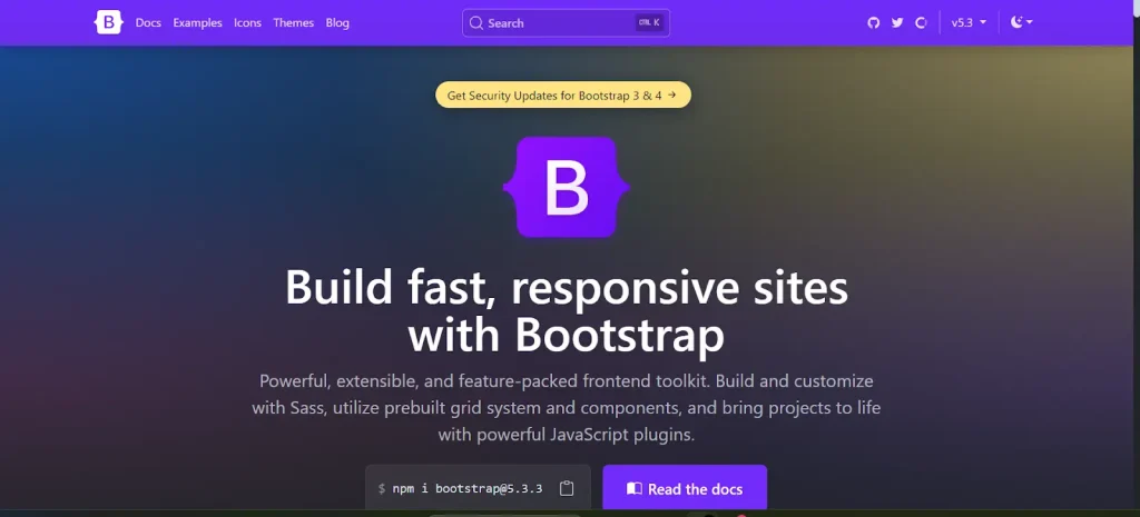
Bootstrap 3 is a free tool for building websites. It’s very popular among developers. This tool helps make websites look good on all devices. Phones, tablets, and computers. Responsive design is its main feature. This means the website changes to fit any screen size. The design elements are easy to use. Buttons, forms, and menus are included. Developers love using Bootstrap 3 for its simplicity.
Key Features Of Bootstrap 3
| Feature | Description |
|---|---|
| Grid System | Makes arranging content simple and neat. |
| Components | Includes ready-made UI elements like buttons. |
| Responsive Design | Fits all screen sizes perfectly. |
| Customizable | Easy to change styles with CSS. |
Why Choose Bootstrap For WordPress
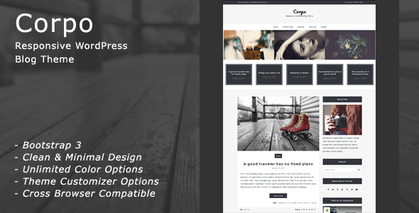
WordPress themes need to be flexible. Bootstrap 3 helps with this. It makes themes easy to customize. Developers can change the look with CSS. This tool saves time. Themes built with it are modern and stylish. It has a large community. Help is always available online. Many developers trust Bootstrap 3. WordPress and Bootstrap make a great team.
Credit: themeforest.net
Creating A New WordPress Theme
Building a responsive WordPress theme with Bootstrap 3 involves using HTML, CSS, and JavaScript to ensure adaptability across devices. Start by setting up a local WordPress environment and integrating Bootstrap. Customize styles and layouts to create a seamless, user-friendly design that enhances the site’s functionality and appearance.
Understanding The WordPress Theme Structure
Start by knowing the basic structure of a WordPress theme. Themes have many files. The main ones include index.php, style.css, and functions.php. These files work together to create your site’s look. Each file has a special role. Understanding these roles is key. It helps in creating a theme that works well.
Setting Up The Theme Files
First, create a new folder in your wp-content/themes directory. This folder is for your theme. Give it a simple name. Next, create the style.css file. This file tells WordPress about your theme. It includes details like the theme’s name. Don’t forget the index.php file. This is the main template file. It helps display your site.
Now, add the functions.php file. This file is like a toolbox. It helps you add features to your theme. You can enqueue Bootstrap styles and scripts here. This makes the theme responsive. Keep your files organized and easy to find. It will make development easier.
Integrating Bootstrap 3
Start by linking Bootstrap CSS in the head section of your HTML. Use the CDN link for Bootstrap 3. This makes sure the site loads fast. Next, link the Bootstrap JavaScript file before the closing body tag. This helps in making interactive components work. Using CDN ensures updates are automatic.
Linking Bootstrap Css And Javascript
Add the CSS link between the head tags. Place the JavaScript link before the closing body tag. Use the correct version of Bootstrap 3. Verify the links to avoid errors. Ensure all links are secure and HTTPS.
Customizing Bootstrap Components
Bootstrap components can be customized easily. Use custom CSS to change styles. Overwrite Bootstrap classes with your styles. Keep changes simple for better performance. Test changes across different devices. Make sure the theme looks good on mobile phones too.

Credit: themeforest.net
Building Responsive Layouts
The Bootstrap Grid System helps in creating a layout. It divides the page into 12 columns. You can use these columns to make your page look neat. You can combine columns to create wider sections. For example, use three columns to make a section one-fourth of the width. Or use six columns for a section half the width. It is flexible and easy. This system makes your page look good on any screen size.
Media queries are used to change styles for different devices. They adjust the design based on screen width. For small screens, hide large images or change font size. This makes content fit better. Media queries keep your site user-friendly. They ensure a good experience on phones and tablets. They help maintain a neat and clean design.
Enhancing Theme With WordPress Features
Custom menus make sites easy to navigate. They help users find pages fast. In WordPress, adding custom menus is simple. First, go to the admin dashboard. Next, click on “Appearance” then “Menus”. Create a new menu. Choose the pages you want in your menu. Save it. Now, assign the menu to a location. Use the “Manage Locations” tab. Your menu is ready to use. Custom menus help organize content.
Widgets add useful features to your site. They show information like recent posts or social media links. Sidebars hold widgets. They appear on the side of your pages. To add a widget, go to “Appearance” then “Widgets”. Drag a widget to the sidebar area. Customize its settings. Widgets enhance user experience. Sidebars provide space for extra content. They make your theme look professional.
Testing Responsiveness
Crafting a responsive WordPress theme with Bootstrap 3 enhances mobile accessibility. Start by integrating Bootstrap’s grid system for flexible layouts. Test responsiveness by resizing your browser or using online tools to ensure seamless viewing across devices.
Testing On Different Devices
Check your theme on many devices. Use a phone, tablet, and computer. This helps you see how it looks everywhere. Devices have different screen sizes. Your theme should fit well on all screens.
Using Browser Developer Tools
Open your browser’s developer tools. They help you see your theme on different screens. Look for the device toolbar. It shows how your theme looks on phones and tablets. Change the screen size using the toolbar. Make sure everything looks good. Fix any problems you see.
Optimizing For Performance
Minifying CSS and JavaScript helps your site load faster. It removes unnecessary spaces and comments. This makes files smaller. Smaller files mean quicker loading. Use tools like CSSNano for CSS. For JavaScript, try UglifyJS. These tools are easy to use. They improve performance significantly. Your site will feel snappier.
Leveraging Caching Plugins is another way to speed up your site. Caching saves a copy of your site. It shows this copy to visitors. This reduces load on the server. Popular caching plugins include W3 Total Cache and WP Super Cache. They are simple to set up. Caching improves user experience. Users love fast websites.
Deploying Your Theme
Deploying your theme involves integrating Bootstrap 3 for a responsive WordPress design. Ensure all elements adjust seamlessly on various devices. Test thoroughly to maintain consistent user experience.
Preparing For Live Deployment
Start by checking your theme’s settings. Make sure everything is ready. Review the theme’s structure and design. Test it on different devices. This ensures responsiveness across all screens. Validate your code for errors. Correct any mistakes you find. This helps prevent issues later. Optimize your images. This improves loading times. Smaller files load quicker. Ensure your site is secure. Update plugins regularly. Backup your files. This keeps your data safe.
Installing On A Live Server
Choose a reliable hosting provider. Upload your theme files. Use an FTP client for easy transfer. Set permissions correctly. This controls access to files. Install WordPress on the server. Follow the steps carefully. Activate your theme. Check each page loads well. Test every link. Ensure all functions work. Monitor your site’s performance. Look for any bugs or issues. Fix them quickly. Keep your site updated. Regular updates help security.
Credit: cyberpanel.net
Frequently Asked Questions
What Is Bootstrap 3 Used For In WordPress?
Bootstrap 3 is a popular front-end framework that helps in creating responsive and mobile-first websites. In WordPress theme development, it simplifies the process by offering pre-designed components and a grid system. This allows developers to build themes that adapt seamlessly to different screen sizes, enhancing user experience.
How Do I Start Building A Theme With Bootstrap?
To start building a WordPress theme with Bootstrap, first, download Bootstrap 3 from its official website. Next, set up a basic WordPress theme structure. Integrate Bootstrap’s CSS and JS files into your theme. Finally, use Bootstrap components and grid system to design your theme layout.
Is Bootstrap 3 Mobile-friendly?
Yes, Bootstrap 3 is designed to be mobile-friendly. It features a responsive grid system that automatically adjusts to different screen sizes. This ensures that your WordPress theme looks great on both desktop and mobile devices. Additionally, Bootstrap 3 includes CSS styles and components optimized for mobile interfaces.
Can I Customize Bootstrap 3 In WordPress?
Yes, you can customize Bootstrap 3 in WordPress to match your design needs. You can modify Bootstrap’s CSS, override styles, or use Bootstrap’s variables for custom themes. Utilize WordPress functions and hooks to integrate custom scripts and styles, ensuring your theme aligns with your brand identity.
Conclusion
Building a responsive WordPress theme with Bootstrap 3 is simple. Start by understanding the basics. Bootstrap offers a strong foundation. It helps create mobile-friendly designs. Remember to test your theme on different devices. This ensures it works everywhere. Keep your code clean and organized.
Use Bootstrap’s grid system wisely. It ensures your theme is flexible. Practice makes perfect. Try different layouts and styles. This enhances your skills. With patience and creativity, success is within reach. Enjoy the process and keep learning. Happy coding!