Have you ever wondered why some websites look crisp and stunning on every device, while others appear blurry or pixelated? The secret lies in a term you might have come across: “Retina Ready WordPress.”
If you’re keen to ensure your website stands out with sharp visuals and a professional finish, understanding this concept is crucial. Imagine your visitors landing on your page and instantly being captivated by the clarity of your images and the sleekness of your design.
The psychological allure of high-quality visuals can significantly enhance user experience and engagement. You’ll discover what “Retina Ready WordPress” truly means, why it matters for your site, and how it can transform the way your audience perceives your online presence. Dive in to unlock the potential of your website and captivate your audience from the very first glance.

Credit: quadlayers.com
Retina Ready Basics
A Retina Ready website looks sharp on high-resolution screens. These screens have more pixels. More pixels mean clearer images. Websites need to use high-quality images. Low-quality images will look blurry.
The term comes from Apple’s Retina Display. Many devices now have similar screens. A site that looks good on these screens is important. People use phones, tablets, and computers. Websites must adapt to these devices.
Years ago, screens had fewer pixels. Websites did not need high-resolution images. As technology improved, screens got better. Companies like Apple led the change. They introduced high-resolution displays. Developers needed to adapt.
This trend changed web design. Designers needed to create flexible sites. Sites that work on all screens. Today, being Retina Ready is essential. It ensures everyone sees your site clearly.
Technical Aspects
Retina displays show images with more detail. They use high-resolution screens. Pixels are packed tightly together. This makes images look sharp and clear. Regular screens show less detail.
Pixel density measures how many pixels fit in a given space. More pixels mean sharper images. Retina screens have high pixel density. This improves image quality. Text looks crisp. Photos appear vivid.
Benefits For Websites
Retina Ready designs make images look clear and sharp. Colors appear more vivid and bright. Text is easy to read. Websites look modern and attractive. Users love sites that look good. It keeps them interested. Good visuals are key.
A better look means a better feel. Users find it easy to explore. Navigation becomes simple and smooth. Faster load times keep users happy. They stay longer on the site. Happy users return often. This boosts site traffic. A good experience builds trust. Trust leads to success.
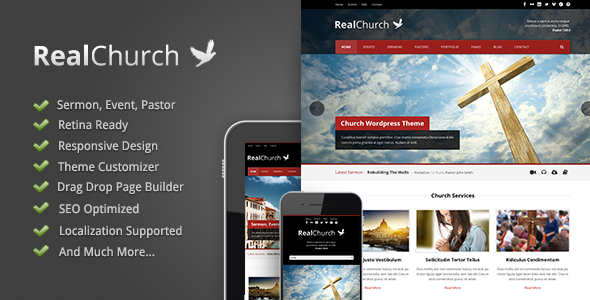
Credit: themeforest.net
Creating Retina Ready Graphics
Images must be crisp on retina displays. Use high-resolution images. Double the pixel density. This keeps images sharp. Compress images to reduce size. Use online tools. TinyPNG and JPEGmini are good options. Avoid losing quality while reducing size. Choose the right format. PNG is better for images with text. JPEG is great for photos. SVG is best for logos and icons. Always test images on different devices.
Vector graphics are scalable. They do not lose quality. Use them for logos and icons. Raster graphics are pixel-based. They can look blurry if enlarged. Use them for photos. Vector files are smaller than raster. They load faster on websites. Raster images need more care. Optimize them properly for better quality. Combine vector and raster wisely. This ensures the best visual experience.
Implementing In WordPress
Themes make websites look good on all screens. Retina displays need special themes. These themes show clear images. They use high-quality graphics. Retina Ready themes help your site look sharp. They improve user experience. Visitors enjoy looking at clear images. Choose themes that are Retina Ready. Check theme reviews. Read user feedback. They guide you to the best themes. Good themes make your site shine.
Plugins add features to WordPress. Retina plugins make images clear. They improve image quality. Use plugins for better graphics. They help with image resizing. They ensure high resolution. Easy to install. Many plugins are free. Some plugins have advanced options. Choose plugins wisely. Read plugin ratings. They show how well plugins work. Good plugins improve site visuals.
Testing And Validation
Use tools to check if your site looks good. BrowserStack and Responsinator help you see how it looks. Check on different devices. Tablets, phones, and desktops. Make sure images are clear. Retina images need high resolution. Test both layout and design. Confirm buttons work. Ensure text is readable. Google Lighthouse helps test speed and quality. Use it often. Don’t skip this step.
Avoid using low-resolution images. They look blurry on high-resolution screens. Don’t ignore testing on different devices. Each device may show your site differently. Avoid overcrowding your design. Too many elements confuse users. Don’t forget text size. Small text is hard to read. Avoid neglecting updates. Keep your WordPress and plugins up-to-date. This helps maintain quality.
Future Trends
Retina Ready WordPress ensures websites look sharp on high-resolution screens. It uses high-quality images and responsive design. This trend caters to devices like iPhones and iPads, enhancing the user experience.
Advancements In Display Technology
Screen technology is changing fast. New screens show clearer images. Retina displays make pictures look very sharp. They have many pixels. This means images look real. Websites need to keep up with these changes. Old designs might look bad on new screens. Designers are creating better layouts now. They use more colors and details. This makes websites look amazing.
Impact On Web Design
Web design is adapting. Designers focus on how sites look on Retina screens. They use high-quality images. Text must be clear and easy to read. This is very important. New designs use more space. This helps users see everything well. Websites must look good on all devices. Mobile phones and tablets are popular. Designers make sure sites work everywhere. This helps users have a great experience.

Credit: wpmudev.com
Frequently Asked Questions
What Is A Retina Ready WordPress Theme?
A retina ready WordPress theme ensures images and graphics look sharp on high-resolution displays. These themes use higher pixel density, making visuals crisp and clear. Retina ready themes improve user experience by delivering vibrant visuals. They help maintain website aesthetics across various devices, enhancing engagement and satisfaction.
Why Choose A Retina Ready WordPress Theme?
Choosing a retina ready WordPress theme enhances visual appeal on modern devices. It ensures images are crisp and clear, improving user experience. High-quality visuals boost engagement and convey professionalism. This choice supports brand credibility and helps retain visitors by providing an aesthetically pleasing browsing experience.
How Do Retina Displays Affect WordPress Design?
Retina displays demand higher resolution images for clarity and sharpness. WordPress design needs adaptation to ensure visuals look good. Themes must provide high-quality graphics and scalable icons. This ensures the site remains visually appealing and functional on devices with high pixel density.
Are All WordPress Themes Retina Ready?
Not all WordPress themes are retina ready. Some older themes may lack support for high-resolution displays. It’s crucial to choose themes specifically labeled as retina ready. This ensures your website’s images and graphics look sharp, enhancing visual appeal and user experience.
Conclusion
Retina Ready WordPress enhances website visuals. Clear images attract more viewers. Better viewing experience leads to higher engagement. No blurry images means happy visitors. Consistent design builds trust. Easy navigation keeps users interested. Improved visuals boost site quality. Simple steps make sites Retina Ready.
Optimizing images is crucial. User satisfaction increases with sharp displays. Investing in Retina Ready features benefits your site. It’s important for modern web presence. Stay ahead in digital design trends. Your website deserves the best look. Consider Retina Ready for better user experience.
Make your site stand out today.