Have you ever visited a website on your smartphone and struggled to find your way around? You’re not alone.
Navigating websites on mobile devices can be tricky if they aren’t optimized for smaller screens. This is where the mobile menu in WordPress comes into play, transforming the way you interact with a site on your phone. But what exactly is a mobile menu, and why is it crucial for your WordPress site?
Imagine a tool that simplifies navigation and makes your website user-friendly on any device, increasing engagement and keeping visitors on your page longer. The mobile menu does just that. It’s not just a trend; it’s a necessity in making your site accessible and enjoyable for all users. Let’s dive in to explore what a mobile menu in WordPress is, why it matters for your website’s success, and how you can optimize it to enhance your users’ experience. Keep reading to unlock the secrets to a seamless mobile browsing experience!
Credit: quadlayers.com
Mobile Menu Basics
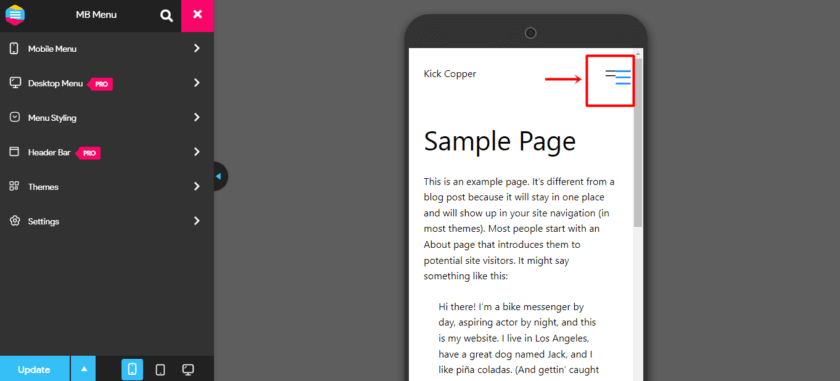
A mobile menu in WordPress is a special menu. It appears on small screens like phones. This menu helps users find what they need. The menu is simple. It often has a button or icon. When users tap it, the menu opens. This makes navigation easy on mobile devices. Websites look tidy with mobile menus.
Mobile menus are important for user experience. They help users find information fast. Without a mobile menu, users might feel lost. A good mobile menu means users stay longer. They have fun exploring the site. This keeps them happy and coming back.
Features Of A Good Mobile Menu
A good mobile menu must be responsive. It should adjust to different screen sizes. Users might use phones, tablets, or small screens. The menu should look clear and easy to use. No matter the device. Responsiveness makes users happy. It offers a better experience.
Navigation should be simple and easy. Users should find items quickly. No one likes to search too long. A good menu helps users find what they need. They can click links without confusion. Easy navigation is key to user satisfaction.
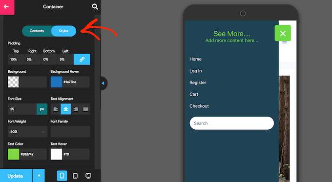
Menus should offer customization options. Users have different tastes. Some might want bright colors. Others prefer simple designs. A customizable menu gives users choices. They can change looks and styles. Customization makes the menu unique for every user.
Creating A Mobile Menu In WordPress
WordPress themes often have built-in mobile menus. These menus make browsing easy on small screens. Most themes have settings for mobile menus. Users can customize colors and styles. Many themes use responsive designs. This ensures that menus look good on any device. Themes usually offer easy setup. No need for coding. Mobile menus improve user experience. They help visitors find content quickly.
Plugins add extra features to mobile menus. They offer more design options. Some plugins have drag-and-drop builders. This makes menu creation simple. Plugins can add animations to menus. They enhance visual appeal. Many plugins are free. Some have premium features. Always check plugin reviews. Good reviews mean reliable plugins. Remember to update plugins regularly. This keeps them secure and functional.
Best Practices For Mobile Menus
A mobile menu should be simple and clear. Users should find what they need quickly. Too many options can confuse users. Limit the number of items in the menu. Keep it short and sweet. Use familiar words that people understand. Icons can help make the menu clear. Make sure each icon makes sense. The goal is to guide users easily. Keep the design clean and not cluttered.
Menus should work well on all devices. A user should see the same menu on phones and tablets. This makes it easy for users to switch devices. Keep the menu layout similar. Users like things to stay the same. Consistent menus make sites feel reliable. Always test menus on different screens. Check if they look good everywhere. Consistency helps users trust your site.
Common Issues And Solutions
Mobile menus can sometimes not show correctly. This can confuse users. Check your theme settings first. Look for any hidden options. Plugins might cause issues too. Deactivate each plugin one by one. See if the menu shows up. Sometimes, CSS conflicts happen. Check your style sheets for errors. Clear your browser cache. This might fix the display problem. Regular updates can prevent display issues.
Slow menus can annoy users. Reduce image sizes for faster loads. Use optimized images. Minimize CSS and JavaScript files. This helps speed up the site. Enable caching plugins. They store data for quick access. Choose a lightweight theme. Heavy themes slow down the site. Regularly update plugins and themes. This can improve load times. Fast menus make users happy.
Credit: www.wpbeginner.com
Popular WordPress Plugins
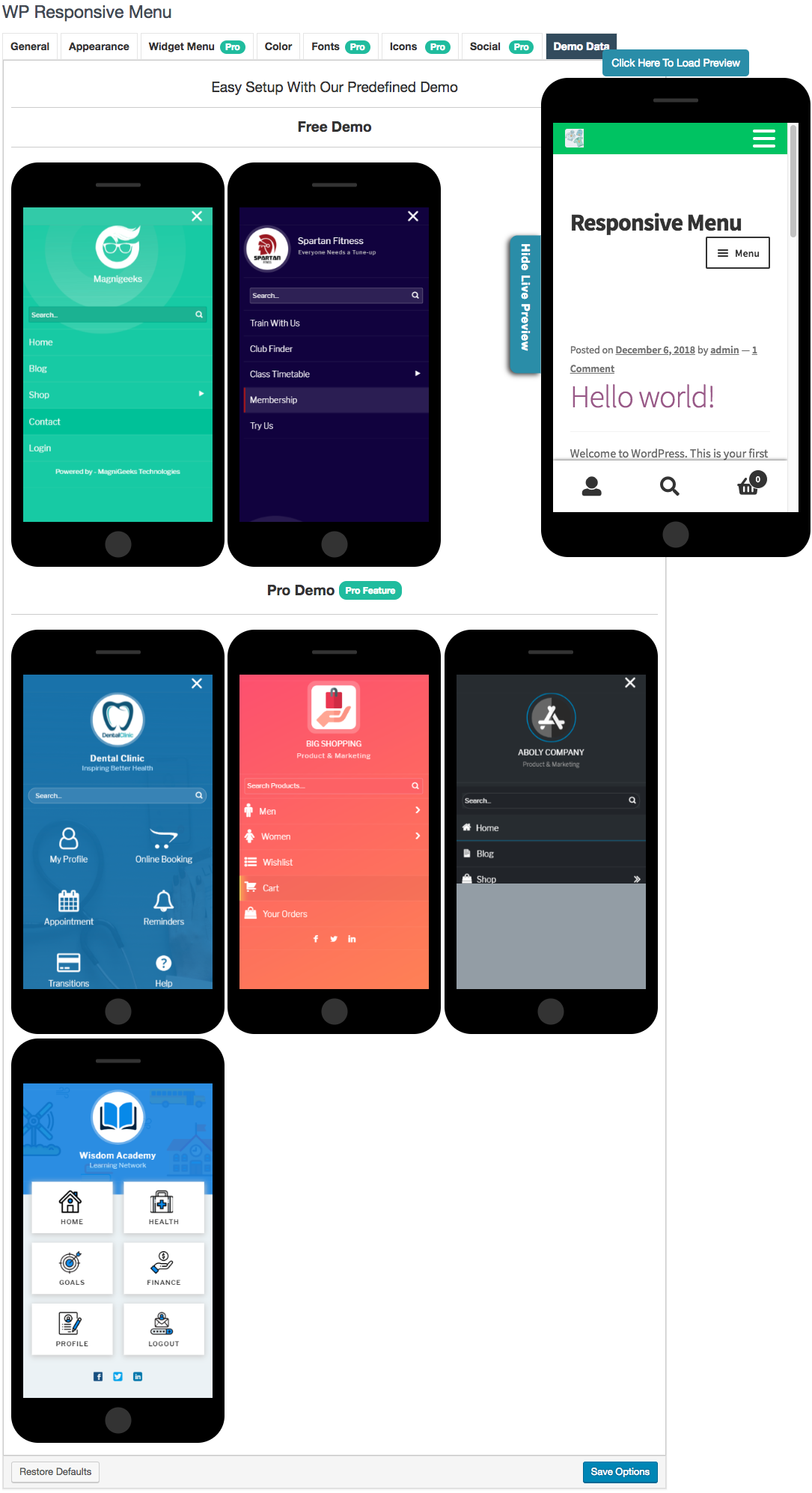
Plugins make websites better. They help with tasks like menu design. Some plugins are very popular. WP Mobile Menu is one of them. It is easy to use. Another favorite is Max Mega Menu. It gives many options for design. Responsive Menu is also loved by many. It is fast and simple.
Installing plugins is simple. First, find the plugin in the WordPress store. Click install. After installation, click activate. Setup is important. Go to plugin settings. Choose your menu style. Save your changes. Preview your menu. Make sure it looks good. Test it on mobile devices. Check if it works well. If needed, adjust settings. Always keep plugins updated.
Future Trends In Mobile Menus
Mobile menus in WordPress streamline navigation on smartphones. Users tap icons to reveal links, enhancing mobile experience. Future trends include more intuitive designs and voice-activated navigation, making browsing more user-friendly.
Emerging Technologies
Mobile menus are getting smarter. Voice commands may change menu navigation. AI could predict what users want to see. Augmented Reality might show menus in 3D. These technologies make browsing faster and more fun. Users can find things easily with new tech.
Predictions For Design Innovations
Designs will get simpler and cleaner. Minimalist designs may become popular. Smooth animations can make menus more lively. Bold colors and clear fonts will be the trend. Users will see more icons and fewer words. This makes understanding easy for everyone. Designers aim for beauty and simplicity.
Credit: wordpress.org
Frequently Asked Questions
What Is A Mobile Menu In WordPress?
A mobile menu in WordPress is a navigation system optimized for smartphones and tablets. It enhances user experience by providing easy access to site links. Typically, it appears as a collapsible menu icon, ensuring better usability and accessibility on smaller screens.
How Do I Customize My Mobile Menu?
You can customize your mobile menu in WordPress using themes and plugins. Themes often offer options for styling and placement. Plugins like “Responsive Menu” provide additional features, enabling you to modify design and functionality to suit your needs.
Why Is A Mobile Menu Important?
A mobile menu is crucial for user experience and SEO. It ensures easy navigation on smartphones and tablets, reducing bounce rates. A well-structured mobile menu improves accessibility, helping visitors find information quickly, which can lead to higher engagement and conversions.
Can I Add Icons To My Mobile Menu?
Yes, you can add icons to your mobile menu using plugins or theme settings. Icons enhance visual appeal and usability by providing intuitive navigation cues. Many plugins allow easy integration of font libraries like Font Awesome for icon customization.
Conclusion
Understanding the mobile menu in WordPress is vital. It enhances user experience. Easy navigation keeps visitors engaged on your site. Customizing your mobile menu can reflect your brand. It can also improve site accessibility. Remember, a user-friendly menu boosts visitor satisfaction.
It encourages them to explore more. This can lead to increased site traffic and engagement. So, make sure your mobile menu is intuitive. Simple design and clear labels work best. Keep it updated as your site grows. This ensures a seamless experience for all users.