Are you struggling to find the perfect dimensions for your WordPress slider? You’re not alone.
Choosing the right size can feel like a daunting task. Get it wrong, and your website might look unprofessional or, worse, drive visitors away. But when you nail it, your site will look polished, your images will shine, and your visitors will be more engaged.
We’ll dive into the ideal dimensions for a WordPress slider, so you can enhance your site’s appeal and functionality. Stay with us, and you’ll discover the secrets to creating a visually stunning and user-friendly website.
Credit: lambertgroupproductions.com
Importance Of Slider Dimensions
Choosing the right dimensions for a WordPress slider is crucial. It affects the overall look of your website. A slider that’s too large can slow down your site. Slow websites can make visitors leave quickly. A slider that’s too small might not show images clearly. This can make your site look unprofessional.
Dimensions also impact mobile viewing. Many people use phones to browse sites. A well-sized slider works well on all devices. This improves user experience. Happy visitors are more likely to stay longer. They might even return.
Always test your slider on different devices. This ensures it looks good everywhere. Proper dimensions make your site look neat and organized.
Credit: www.inkthemes.com
Common Slider Sizes
Full-width sliders stretch across the entire screen. These sliders usually have a width of 1920 pixels. The height can be around 500 to 800 pixels. This size works well on large screens. It gives a bold and dynamic look.
Boxed sliders are not as wide as full-width ones. They often measure around 1200 pixels in width. The height varies between 400 and 600 pixels. This size fits well with many website designs. Boxed sliders keep content neat and tidy.
Mobile sliders are smaller to fit phone screens. A width of 320 to 480 pixels is common. Heights range from 150 to 300 pixels. These sliders are easy to view on mobile devices. They ensure a smooth browsing experience.
Choosing The Right Dimensions
Aspect ratio is important for slider images. Common aspect ratios are 16:9 and 4:3. These ratios help images fit screens well. A 16:9 ratio is wide. It fits laptops and tablets nicely. A 4:3 ratio is more square. It works well for older screens and mobile phones. Choose the ratio based on your audience’s screens. This keeps images clear and visible.
Image resolution affects quality. Higher resolution means clearer images. Use 1920×1080 pixels for high quality. This resolution is good for desktops. For mobile, 1280×720 pixels can be enough. Too high resolution makes pages slow. Balance quality and speed for best results. Keep images optimized for fast loading.
Impact On User Experience
Choosing the right dimensions for a WordPress slider can greatly affect user experience. Properly sized sliders ensure clarity and enhance visual appeal. Large, clear images load quickly, keeping visitors engaged without frustration.
Loading Speed
Fast loading speed keeps users happy. Sliders with large images can slow down websites. This affects the user experience negatively. Use images that are optimized and not too large. This helps the slider load faster. A slow website can make users leave quickly. Nobody likes waiting for pages to load. Keep your slider simple and light. This helps the whole website perform better.
Visual Appeal
Sliders should be visually appealing to attract users. The right image sizes and dimensions make a big difference. Images should be clear and not blurry. Use high-quality images, but keep the file size small. This balance is important for a good user experience. Choose colors and styles that match your website. A well-designed slider can make your site look professional and inviting.
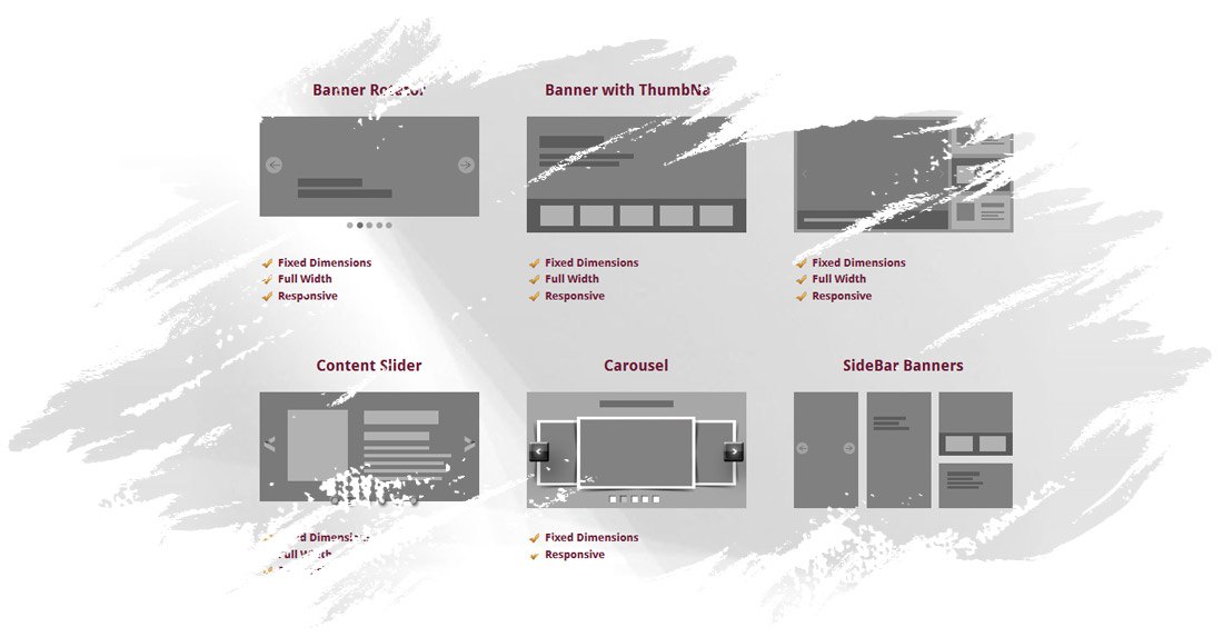
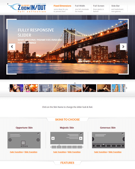
Tools For Designing Sliders
WordPress plugins make slider design easy. Many plugins offer drag-and-drop features. This helps in creating sliders quickly. Some popular plugins are Slider Revolution and MetaSlider. They come with pre-made templates. These templates save time and effort. Plugins also allow adding animations and transitions. This makes sliders more attractive. Most plugins are easy to use. They are perfect for beginners. Explore different plugins to find the best fit.
Image editing software is useful for slider design. Programs like Photoshop and GIMP help edit images. They let you adjust brightness, contrast, and colors. These tools can crop images to fit sliders. Properly sized images load faster. This is good for website speed. Edited images look more professional. Use software to add text or logos. This makes your sliders unique.
Best Practices For Slider Design
Make your slider fit all screens. Responsive design is key. Ensure images adjust smoothly. Use percentages instead of fixed pixels. Check sliders on different devices. Test on phones and tablets. Avoid heavy images. Large files slow down loading. Users get bored and leave. Fast sliders keep visitors happy. Simple transitions are best. Fancy effects can confuse users.
Optimize text for clarity. Short sentences are easy to read. Use clear fonts. Users should read text quickly. Avoid too many words. Concise content is essential. Use meaningful captions. They guide users. Highlight key points. Bold words help focus. Ensure text contrasts with background. Good contrast improves readability. Test different color schemes. Choose colors wisely. Match slider style with your site.
Credit: codecanyon.net
Frequently Asked Questions
What Are The Ideal Dimensions For A WordPress Slider?
The ideal dimensions vary based on your theme and needs. Generally, 1200×600 pixels works well. It ensures clarity and responsiveness on most devices. Always consider aspect ratio for uniformity. Adjusting dimensions might be necessary for mobile optimization. Testing on different devices can help refine the size.
How Do Dimensions Affect Slider Performance?
Dimensions directly impact loading speed and user experience. Larger images slow down load time, affecting SEO and engagement. Optimizing image size enhances performance, making it crucial for mobile users. Proper dimensions ensure faster loading and better site rankings. Always balance quality with speed for optimal results.
How To Choose Slider Dimensions For Seo?
Selecting dimensions involves balancing size and quality. Smaller images load faster, improving SEO. Ensure images are clear yet lightweight. Consistency in aspect ratio aids visual appeal. Test dimensions across devices for responsiveness. Proper dimensions can enhance search engine rankings, boosting site visibility.
Can I Use Different Dimensions For Mobile Sliders?
Yes, using different dimensions for mobile is beneficial. Mobile users need faster loading times. Smaller dimensions enhance speed without sacrificing quality. Responsive design ensures sliders adapt to various screens. Testing on multiple devices ensures proper functionality. Always prioritize user experience on mobile.
Conclusion
Choosing the right dimensions for your WordPress slider is crucial. It impacts your site’s appearance and user experience. Ensure your slider fits your theme and content. Test different sizes to find the best fit. Remember, mobile responsiveness is key. A well-sized slider enhances engagement.
It keeps visitors interested and improves navigation. Always prioritize clarity and aesthetics. With the right dimensions, your website looks professional and inviting. Keep experimenting to find what works best for your audience. A perfect slider size can make a big difference.
It helps create a seamless and enjoyable browsing experience.