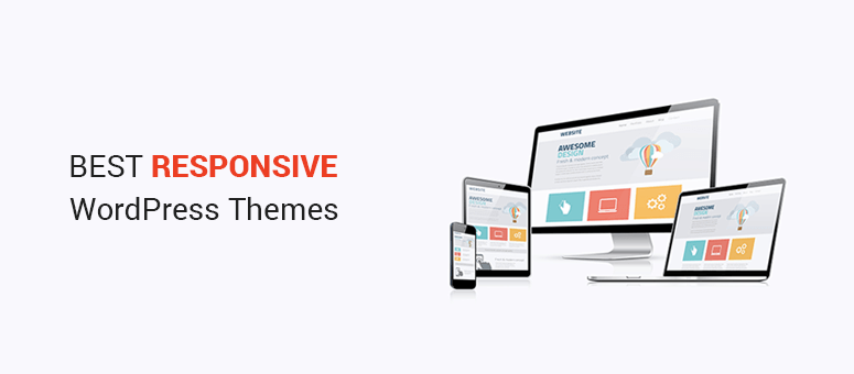
Are you tired of your website looking clunky on mobile devices? You’re not alone.
With more people browsing on their phones and tablets, having a responsive WordPress theme is essential. Imagine offering your visitors a seamless experience, no matter what device they’re using. It’s not just about looking good; it’s about keeping your audience engaged and improving your site’s performance.
In this guide, we’ll show you how to create a responsive theme in WordPress that adapts beautifully to any screen size. You’ll discover simple strategies and effective techniques that you can implement without needing to be a coding expert. Ready to transform your website and captivate your audience? Let’s dive in!
Understanding Responsive Design
Mobile-friendly themes are crucial today. People use phones more than computers. A site must look good on small screens. If not, visitors leave quickly. This means fewer visits and less success. Search engines prefer mobile-friendly sites. This helps with better rankings. A good theme adjusts to any screen size. It keeps users happy and engaged. This is essential for business growth.
Responsiveness means adapting to all devices. A responsive theme uses flexible grids. Images and text resize for different screens. This ensures clarity and readability. Use media queries for CSS. They help apply styles to specific devices. Test your theme on many devices. This ensures the best user experience. Keep designs simple and clean.
Credit: www.isitwp.com
Setting Up Your Development Environment
Start with a text editor. Popular choices include Visual Studio Code and Sublime Text. These editors help you write code easily. Use a browser like Google Chrome for testing. It shows how your theme looks on the web. An FTP client is also needed. FileZilla is a good one. It helps move files to your server.
Install a local server. XAMPP and MAMP are popular options. They make your computer work like a real server. This is important for testing your theme. After installing, create a new database. Use phpMyAdmin to do this. It’s a simple tool for managing databases. Make sure your local server is running. This will let you view your theme locally.
Creating A Child Theme
Child themes allow easy customizations. They keep your main theme safe. Updates won’t erase your changes. This makes child themes very helpful. You can experiment freely. Mistakes won’t affect the main theme. They also help in learning WordPress. Beginners find them useful. You can try new ideas. Your main theme stays intact. Child themes are easy to manage. They bring flexibility. They offer a good start for new developers.
First, make a new folder. Name it wisely. Add a style.css file. Write basic info in it. Include theme name and author. Next, create a functions.php file. Link it to the main theme. Use enqueue functions for styles. This ensures proper loading. Test your child theme. Activate it through WordPress. Check if everything works. Make adjustments if needed. Explore its features. Learn and grow with it. Enjoy making changes safely.
Implementing Responsive Layouts
CSS media queries are like magic for websites. They help your site look good on any screen. You can set different styles for phones, tablets, and computers. Use media queries to check the screen size. Then change the style. For a small screen, hide big images. Make text bigger. On bigger screens, show more details. It keeps your site looking nice everywhere. Always test on different devices. Make sure everything looks right.
Flexible grids make your website easy to use. They let content fit any screen size. Use a percentage-based grid for this. It helps things stay in place. Not too big or small. A grid system divides the page into columns. Each column has a size you can change. This makes it easier to organize content. It looks neat and tidy. A flexible grid is a smart choice for responsive design.
Optimizing Images For Responsiveness
Scalable images are important for a responsive theme. They change size based on screen size. Use images with a high resolution. This helps them look good on any device. Save images in formats like SVG or PNG. These formats scale well. They keep the image quality high. Always use the srcset attribute in the img tag. It helps browsers choose the right image size.
Lazy loading makes websites faster. Images load only when needed. This saves bandwidth and improves performance. Use the loading="lazy" attribute in the img tag. This tells the browser to load images only when visible. Lazy loading is easy to implement. It makes your WordPress theme better. More responsive. More user-friendly. Everybody benefits from a faster website.

Credit: wp101.com
Testing Across Devices
Creating a responsive theme in WordPress involves testing across various devices to ensure optimal display. Adjust layout and design elements to fit screens of all sizes. Use tools like browser developer options to simulate different resolutions for thorough testing.
Tools For Responsive Testing
Testing your WordPress theme is important. Your theme should look good on all devices. Use tools to help with this. BrowserStack lets you test on many devices. Google Mobile-Friendly Test checks if your site is mobile-ready. Responsinator shows how your site looks on phones and tablets. These tools make testing easy.
Ensuring Compatibility
Themes must work on different browsers. Use CrossBrowserTesting to check this. It shows how your site looks on different browsers. Fix any problems you see. Make sure your theme works everywhere. This keeps your site good for everyone.
Enhancing User Experience
Easy navigation helps users find things fast. Make menus clear and simple. Use drop-downs for extra options. Keep links short and direct. Add a search bar for quick finds. Highlight active links for better guidance. Organize content in logical groups. Ensure buttons are big enough to click.
Fast loading keeps users happy. Optimize images to reduce size. Minimize CSS and JavaScript files. Use caching for quicker access. Avoid heavy plugins that slow down speed. Check theme performance regularly. Use tools to test loading times. Keep server settings updated for efficiency.
Credit: themeforest.net
Frequently Asked Questions
What Is A Responsive Theme In WordPress?
A responsive theme automatically adjusts its layout and design according to the user’s device screen size. It ensures optimal viewing experience on desktops, tablets, and smartphones. This adaptability enhances user engagement and improves site accessibility, making it essential for modern WordPress websites.
Why Is Responsiveness Important For WordPress Sites?
Responsiveness improves user experience by providing seamless navigation across devices. It boosts SEO rankings, as search engines favor mobile-friendly sites. Moreover, it increases accessibility, ensuring all visitors can easily interact with your content, regardless of their device.
How Do I Test WordPress Theme Responsiveness?
You can test responsiveness using tools like Google’s Mobile-Friendly Test or browser developer tools. These tools simulate different screen sizes and devices, helping you identify layout issues. Regular testing ensures your theme remains adaptable to new devices and screen resolutions.
Can I Make Any WordPress Theme Responsive?
Yes, most WordPress themes can be customized for responsiveness using CSS and media queries. However, it’s easier to start with a theme designed to be responsive. Consider using responsive frameworks or plugins that offer additional customization options for better adaptability.
Conclusion
Creating a responsive theme in WordPress boosts your site’s user experience. It ensures your website looks great on all devices. Visitors will stay longer when your site is easy to navigate. Google rewards mobile-friendly sites with better rankings. Use flexible layouts and test your design on various screens.
Plugins can help, but keep them lightweight. Optimize images to load quickly. Remember, a responsive theme adapts to different devices seamlessly. Regular updates keep your site running smoothly. Your WordPress theme should be both beautiful and functional. Make sure your website stands out and engages users effectively.