Are you looking to make your WordPress site easier to navigate and more user-friendly? Adding a hamburger menu is one of the best ways to achieve that.
It keeps your site clean and organized, especially on mobile devices, while giving visitors quick access to all your important pages. In this post, you’ll learn exactly how to add a hamburger menu to your WordPress site—step by step, without any confusing tech jargon.
Keep reading, and by the end, your site will look sharper and work smoother, making your visitors stick around longer.
Why Use A Hamburger Menu
The hamburger menu is a popular design choice for websites today. It helps keep the site clean and easy to use. Many WordPress users add it to improve navigation on small screens. The simple icon hides the menu until needed. This saves space and reduces clutter on the page.
Using a hamburger menu can make your site look modern and tidy. It gives visitors a clear way to find what they need. This menu style works well on phones, tablets, and desktops. It adapts to different screen sizes without crowding the view.
Html: Clean Design And Space Saving
The hamburger menu keeps the design clean. It hides long menus behind a small icon. This saves space on smaller screens. Users see a neat interface without many buttons.
Html: Improved User Experience
Visitors find it easy to use. Clicking the icon opens the menu quickly. It shows all options without overwhelming the user. The menu stays hidden until needed.
Html: Mobile-friendly Navigation
Most people browse on phones today. The hamburger menu fits well on small devices. It makes navigation simple and clear. Users can tap the icon to explore the site.
Credit: wpmet.com
Choose The Right Theme
Choosing the right theme is key to adding a hamburger menu in WordPress. A good theme supports mobile-friendly menus. It also offers easy customization options. This makes it simple to create a clean, user-friendly navigation experience.
Not all themes have built-in hamburger menus. Some require extra plugins or custom code. Picking a theme with native support saves time and effort. It ensures your menu works smoothly on all devices.
Check For Responsive Design
A responsive theme adjusts to different screen sizes. It changes the menu style for phones and tablets. The hamburger menu usually appears on smaller screens. Responsive design keeps your site neat and easy to use everywhere.
Look For Built-in Menu Options
Some themes include menu options in their settings. You can enable a hamburger menu with a few clicks. These themes offer drag-and-drop menu builders. This makes organizing links simple and fast.
Consider Theme Popularity And Reviews
Popular themes often have better support and updates. Reviews show real user experiences with menus. Themes with positive feedback usually have fewer bugs. Choose themes praised for mobile navigation features.
Test Demo Versions
Try the theme demo on different devices. See how the menu behaves on phones and tablets. A demo helps you check if the hamburger menu fits your needs. Make sure the menu is easy to open and close.
Install A Menu Plugin
Installing a menu plugin is a simple way to add a hamburger menu to your WordPress site. Plugins make it easy to create and customize menus without coding. They offer various styles and features that fit different website needs.
Most plugins work well with any WordPress theme. They let you control menu appearance and behavior directly from the dashboard. This saves time and helps maintain a clean design.
Popular Hamburger Menu Plugins
Several plugins are popular for creating hamburger menus. “WP Mobile Menu” offers a user-friendly interface and responsive design. “Responsive Menu” allows deep customization and smooth animations. “Max Mega Menu” supports both desktop and mobile menus with easy drag-and-drop setup. These plugins are reliable and regularly updated.
Plugin Installation Steps
Start by logging into your WordPress dashboard. Go to “Plugins” and click “Add New.” Search for the hamburger menu plugin you want. Click “Install Now” and then “Activate.”
Once activated, find the plugin settings in the dashboard menu. Configure the menu style and position. Add your menu items and save changes. Preview your site to see the hamburger menu in action.
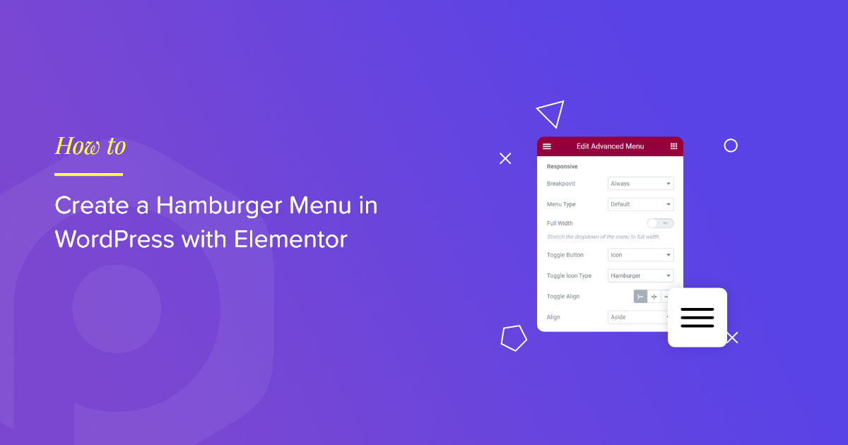
Credit: powerpackelements.com
Create Your Menu
Creating a menu in WordPress is a simple step to improve your site’s navigation. It helps visitors find pages and content quickly. The process starts with building the menu itself. This section guides you through adding items and arranging them.
Add Menu Items
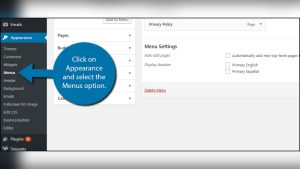
Begin by opening the WordPress dashboard. Go to Appearance, then Menus. Here, you can create a new menu or edit an existing one. Use the left panel to select pages, posts, or custom links. Click “Add to Menu” to include them. Add as many items as you want. Each item will appear in your menu list.
Organize Menu Structure
After adding items, arrange them in order. Drag and drop menu items to reorder. Place important pages at the top for easy access. You can create submenus by moving items slightly to the right. This creates a dropdown effect in your hamburger menu. Save your menu once you finish organizing. Your menu is now ready to use on your site.
Enable Hamburger Menu
Enabling the hamburger menu in WordPress makes your site easier to navigate on mobile devices. It hides the full menu behind a small icon. This keeps your header clean and tidy. Users click the icon to open the menu. This section explains how to enable the hamburger menu step by step.
Configure Plugin Settings
First, install a plugin that supports the hamburger menu. Many free options exist in the WordPress repository. After activation, go to the plugin’s settings page. Choose the option to enable the hamburger menu. Adjust the appearance to match your site’s style. Set menu animation and icon size for better usability. Save your changes to apply them.
Test Menu Functionality
Visit your site on a mobile device or use a browser’s mobile view. Tap the hamburger icon to open the menu. Check if all links work correctly. Make sure the menu closes smoothly after selection. Test on different screen sizes for consistency. Fix any issues by returning to the plugin settings.
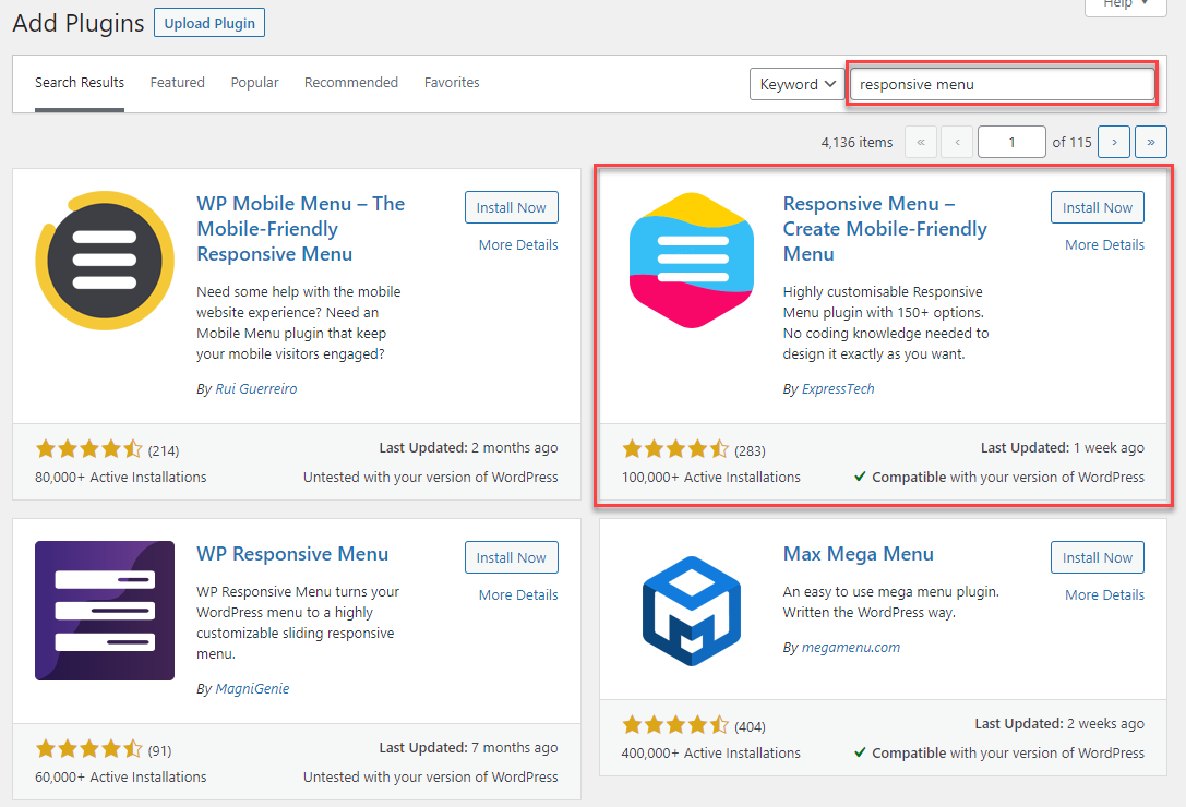
Credit: responsive.menu
Customize Menu Appearance
Customizing the appearance of your hamburger menu helps match your website’s style. You can change colors and styles to fit your brand. Adjusting the position of the menu makes it easier for visitors to navigate your site. These tweaks improve user experience and keep your site looking neat.
Change Colors And Styles
Start by choosing colors that match your website palette. Most WordPress themes let you change the background and icon colors of the menu. Use simple and clear colors. Make sure the menu stands out but stays easy on the eyes. You can also change the size and shape of the hamburger icon. Rounded corners or bold lines can give a fresh look. Test different styles until you find one that fits well.
Adjust Menu Position
Place the hamburger menu where users expect it. Usually, it is at the top right or left corner of the page. Some themes allow you to move it to the center or bottom. Adjusting the position helps users find the menu quickly. It also keeps your page layout balanced. Check your site on different devices to see how the menu looks. Make sure it is easy to tap on phones and tablets.
Add Hamburger Menu Without Plugin
Adding a hamburger menu without a plugin can make your WordPress site faster and cleaner. You control the look and behavior of the menu. This method saves space on small screens and keeps the site simple.
This section shows how to add a hamburger menu using code. You do not need to install extra tools. Just follow the steps carefully.
Use Custom Code
Start by writing HTML for the hamburger icon. Use three horizontal lines stacked on top of each other. This icon works as a button for the menu.
Add CSS to style the icon and the hidden menu. Use simple rules to hide the menu by default. Show it only when users click the icon.
Use JavaScript to toggle the menu’s visibility. When users click the icon, the script shows or hides the menu. Keep the script short and clear.
This method needs basic coding skills. It gives you full control over how the menu looks and works.
Modify Theme Files
Open your theme’s header.php file. Insert the hamburger icon code inside the navigation section.
Add CSS in the theme’s style.css file. Style the hamburger icon and the menu for mobile screens.
Place the JavaScript code either in the footer.php file or enqueue it properly. This script controls menu open and close actions.
Be careful when editing theme files. Back up your site before making changes. This avoids problems if something goes wrong.
Troubleshooting Tips
Adding a hamburger menu in WordPress can sometimes lead to small problems. These issues may stop the menu from working well or looking right on your site. Knowing how to fix these problems fast helps keep your site easy to use and professional.
Common Issues
The hamburger menu may not appear on some devices. This often happens due to theme conflicts or missing scripts. Sometimes, clicking the menu does not open it. This usually means a JavaScript error or plugin conflict. Another issue is the menu style looking broken or out of place. This often happens due to CSS problems or caching.
Quick Fixes
Clear your browser and site cache. This refreshes old files and fixes display problems. Disable other plugins one by one to find conflicts. Switch to a default WordPress theme to test if your theme causes the issue. Check your browser console for JavaScript errors. Fix or remove scripts that cause errors. Make sure your WordPress, theme, and plugins are up to date. Updates often fix bugs and improve compatibility.
Frequently Asked Questions
What Is A Hamburger Menu In WordPress?
A hamburger menu is a three-line icon that reveals navigation links. It helps save space and improves mobile usability in WordPress websites.
How To Add A Hamburger Menu Without Plugins?
You can add a hamburger menu by customizing your theme’s CSS and JavaScript. This requires coding knowledge and editing theme files carefully.
Which WordPress Themes Support Hamburger Menus?
Many modern WordPress themes like Astra, OceanWP, and GeneratePress support built-in hamburger menus for mobile responsiveness.
Can I Customize The Hamburger Menu’s Appearance?
Yes, you can customize colors, size, and animation using CSS or theme options to match your website’s branding.
Conclusion
Adding a hamburger menu to your WordPress site improves navigation. It keeps your design clean and user-friendly. You can easily customize it to fit your style. This simple step helps visitors find pages faster. Remember to test the menu on mobile devices too.
A good menu boosts your site’s usability and appeal. Start adding your hamburger menu today and enjoy a better website experience.