Are you struggling to find the perfect size for your WordPress background image? You’re not alone.
Choosing the right dimensions can be a daunting task, especially when you want your website to look stunning and load quickly. The wrong size can lead to slow page speeds, distorted images, and a poor user experience. But don’t worry—this guide is here to help you.
We’ll explore the ideal image sizes that will keep your website looking sharp and professional. Discover the secrets to optimizing your background images, and ensure your site leaves a lasting impression on every visitor. Let’s dive in and transform your WordPress site into a visual masterpiece.
Importance Of Background Images
Background images make websites look pretty. They give a site its own style. Visitors feel happy when they see nice images. The right image size is very important. A wrong size can make a site slow. Slow sites make people leave early.
A good size keeps the site fast. It should not be too big. It should not be too small. It needs to fit the screen well. This helps users enjoy the site. Happy users visit again. They tell their friends too. This makes your site popular.
Common WordPress Image Sizes
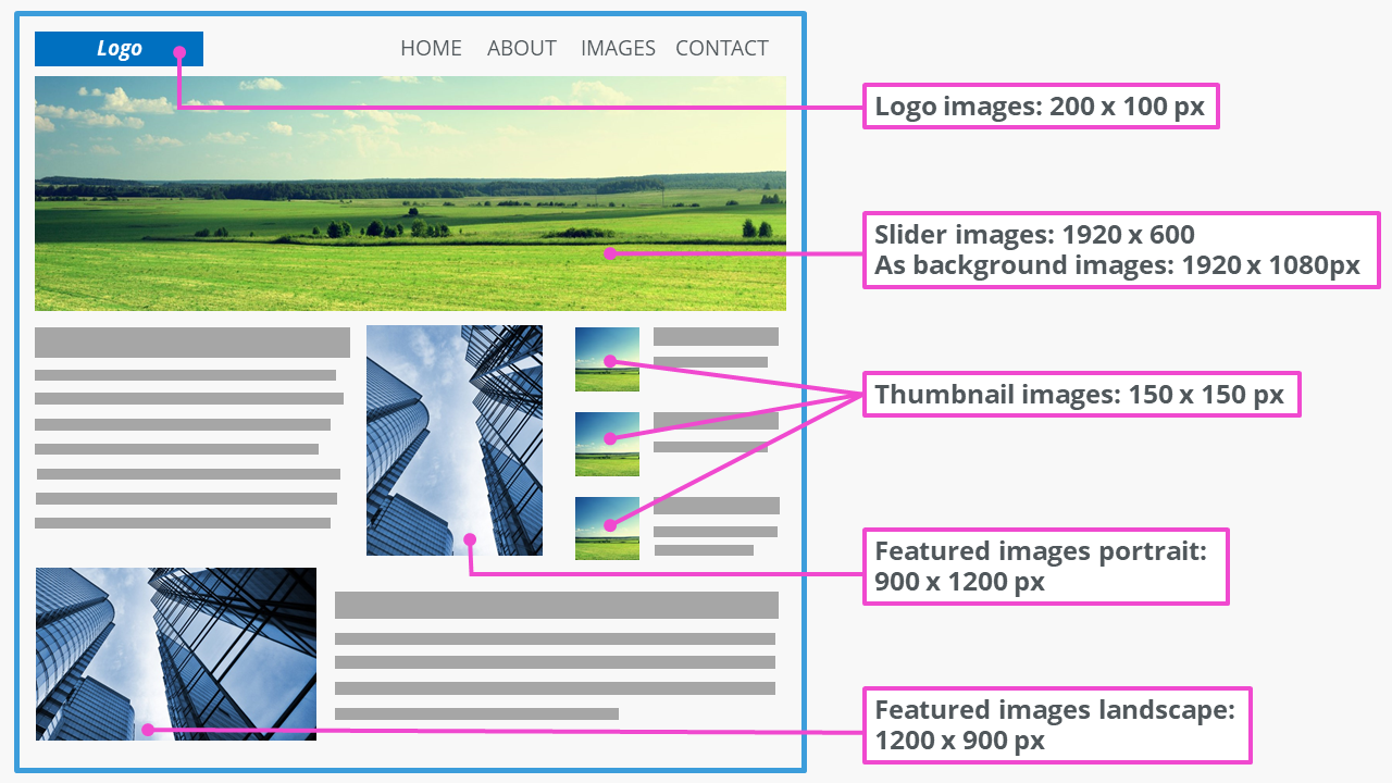
WordPress uses specific image sizes for different tasks. Thumbnail size is often 150×150 pixels. It fits small spaces. Medium size is usually 300×300 pixels. This size works well for blog posts. Large size is about 1024×1024 pixels. It’s best for full-width images.
Choosing the right size helps your website load faster. Custom sizes are an option too. You can set any size you need. But keep the file size small. Big files make websites slow. A slow site can upset visitors.
Factors To Consider For Image Size
Choose an image size that fits most screens. 1920×1080 pixels works well for desktops. Mobile screens need smaller sizes. 640×1136 pixels is often good for phones. Responsive images help fit all devices. Keep resolution high for clarity. Low resolution makes images blurry.
Large images slow down your site. Compress images to make them smaller. Use formats like JPEG or PNG. These load faster. Smaller file sizes improve speed. Fast loading keeps users happy. Slow sites lose visitors. Speed matters for good user experience.
Match image size with your design theme. Uniform sizes look neat. Random sizes break design harmony. Consistent image sizes make layouts pleasing. Align images with your text. This creates balance. Keep style consistent across pages. Consistency builds brand trust.
Credit: elementor.com
Recommended Image Dimensions
Choose background images with width of 1920 pixels. This is the common width for most screens. Height can be flexible, but ensure it’s at least 1080 pixels. This ensures clarity and detail.
Mobile screens need smaller images. Width should be around 750 pixels for good fit. Height should be at least 1334 pixels. This size works well for most mobile devices.
Retina screens have high resolution. Use images with width of 2880 pixels. Height should be 1800 pixels or more. This keeps images sharp and clear on Retina displays.
Optimizing Image Files
Keeping image sizes small is very important. Big files slow down your site. Compression helps make files smaller. Many tools help with this. Some are free. Others need payment. JPEG and PNG are popular formats. JPEG is great for photos. PNG is best for graphics. Each tool has its own methods. Test different ones. Find what suits you best. Small images load fast. Fast loading makes visitors happy. Happy visitors stay longer. This helps your site.
Different file formats suit different needs. JPEG is widely used. It is good for photos. PNG suits transparent backgrounds. GIF is for simple animations. Each format has its strengths. Choose based on your needs. Small files are important. They help sites load fast. Fast sites rank better. Better ranks mean more visitors. More visitors boost site success. Think before choosing a format. Right format makes a big difference.
Credit: www.ionos.com
Tools For Resizing Images
Many tools help resize images. Some are free, and others cost money. Adobe Photoshop is popular. It is not free. It offers many features. Another tool is GIMP. It is free. GIMP is easy to use. It works on most computers. Canva is another option. Canva is user-friendly. It helps with simple tasks.
Online tools like PicResize are helpful. They work in browsers. No download needed. PicResize is fast. It does basic resizing. ResizeImage.net is another online tool. It is free. It offers simple resizing. Choose a tool that fits your needs. Always save your work.
Testing Background Image Appearance
Background images must look good on all devices. Test on phones, tablets, and computers. Each device shows images differently. Make sure the picture is clear. A blurry background looks bad.
Check image size and quality. Large images slow down websites. Slow sites lose visitors. Fast loading is important. Make sure images load quickly.
Visual consistency is key. The image should fit the site style. Fonts, colors, and layout must match. Keep everything looking neat. A consistent look makes users happy.
Best Practices For Background Images
Always pick a background image that is not too small. A small image can look blurry or pixelated. Images around 1920×1080 pixels work well for most screens. This size fits most desktop monitors. It also scales down nicely for smaller screens.
Use the JPEG format for photos. JPEGs keep good quality while saving space. For graphics with fewer colors, consider PNG. PNGs handle transparency well. But, they can be larger in file size.
Compress images to make them load faster. Tools like TinyPNG or JPEG Optimizer are helpful. Smaller images mean quicker website loading. This is important for a good user experience.

Credit: kinsta.com
Frequently Asked Questions
What Is The Ideal Size For WordPress Background Images?
The ideal size for WordPress background images is 1920×1080 pixels. This ensures clarity and quality across devices. A larger image can be resized easily, ensuring it remains crisp. Always optimize images to reduce loading times without compromising quality.
Can I Use Smaller Images For WordPress Backgrounds?
Smaller images can be used but may appear pixelated on larger screens. Aim for at least 1920×1080 pixels. Smaller images might not cover the entire background, affecting aesthetic appeal. It’s best to test how they appear on different devices.
How Does Image Size Affect Website Speed?
Large image sizes can slow down website speed significantly. Optimizing images is crucial to maintain site performance. Compress images without losing quality to improve load times. Faster websites enhance user experience and can improve SEO rankings.
Should Background Images Be In Landscape Format?
Background images in landscape format work best for WordPress. They fit screen dimensions better, providing a seamless look. Portrait images might not cover the width entirely. Always preview images across devices to ensure proper alignment.
Conclusion
Choosing the right background size enhances your WordPress site’s appearance. A balanced image improves loading speed and visual appeal. Aim for a size that fits your theme perfectly. Keep file size in check to boost website performance. Always test images on different devices.
This ensures they look great everywhere. Experiment with different sizes to find the best fit. Stay mindful of your audience’s preferences. A well-chosen background can make a big difference. Remember, simplicity often works best. So, take your time to select the ideal size.
Enjoy a more engaging and user-friendly website.