Have you ever wondered how to make your WordPress site pop without overwhelming your visitors? The secret lies in mastering the art of accent colors.
Imagine transforming a simple website into an engaging digital experience that captivates your audience. Accent colors are more than just a splash of paint; they’re the subtle touches that guide your visitors’ eyes, evoke emotions, and reinforce your brand identity.
By understanding and strategically using accent colors, you can enhance your site’s aesthetics, improve user experience, and ultimately keep your visitors coming back for more. Dive into this article to discover how you can unlock the potential of accent colors and elevate your WordPress site to new heights.
Accent Color Basics
Accent colors make websites pop. They draw attention to key parts. Important buttons use accent colors. Links often get accent colors too. These colors help guide the visitor’s eyes. Choosing the right accent color is crucial. It should fit with the main theme. This creates a pleasing look. Contrast is key. A good accent color contrasts with the main color. This ensures visibility. Bright colors often work well. They stand out against softer shades. Accent colors can set the mood. They can make a site feel warm or cool. Keep it simple. Too many accent colors confuse users. Stick to one or two. This keeps the design clean and clear.
Importance In Web Design
Accent colors help users find important details. They make buttons and links stand out. This helps users click the right things. A good accent color makes a page nice to look at. It keeps users interested. They stay longer on the site. This improves user experience.
Brands use specific colors to stand out. These colors are part of their identity. A memorable accent color helps people remember a brand. It creates a strong visual link to the brand. This makes the brand easy to recognize. It builds trust and connection with users.
Choosing The Right Accent Color
Colors are powerful. They can evoke emotions. They can influence decisions. Color theory helps us understand these effects. The color wheel shows primary, secondary, and tertiary colors. Using opposite colors can create contrast. Similar colors can create harmony. Complementary colors are opposite on the color wheel. They create vibrant look. Analogous colors are next to each other. They make calm feeling.
Every brand has its unique identity. Accent colors should match this identity. Think about what your brand represents. Is it fun? Is it serious? Colors can help show this. Choose colors that fit your brand’s message. Consistency is key. Use the same accent color everywhere. This makes your brand recognizable. It builds trust with your audience.

Credit: www.wpbeginner.com
Implementing Accent Colors In WordPress
Accent color in WordPress highlights key elements on a website. It enhances design by drawing attention to buttons, links, and headers. Simple tweaks can lead to a more visually appealing site, improving user experience and engagement.
Using Customizer
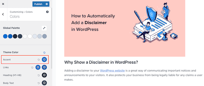
The WordPress Customizer makes color changes easy. Users can choose accent colors without coding. The Customizer tool is located in the Appearance menu. Select Customize to start. Here, you will find options for colors. Choose your desired accent color. Preview changes before applying them. This ensures satisfaction with the new look. The Customizer helps create a unique site style. It is user-friendly and intuitive. Beginners find it straightforward to use.
Theme Options
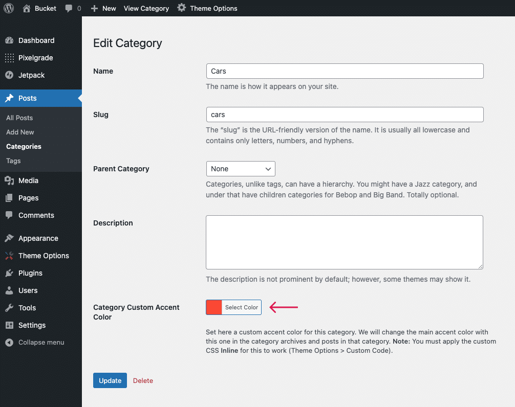
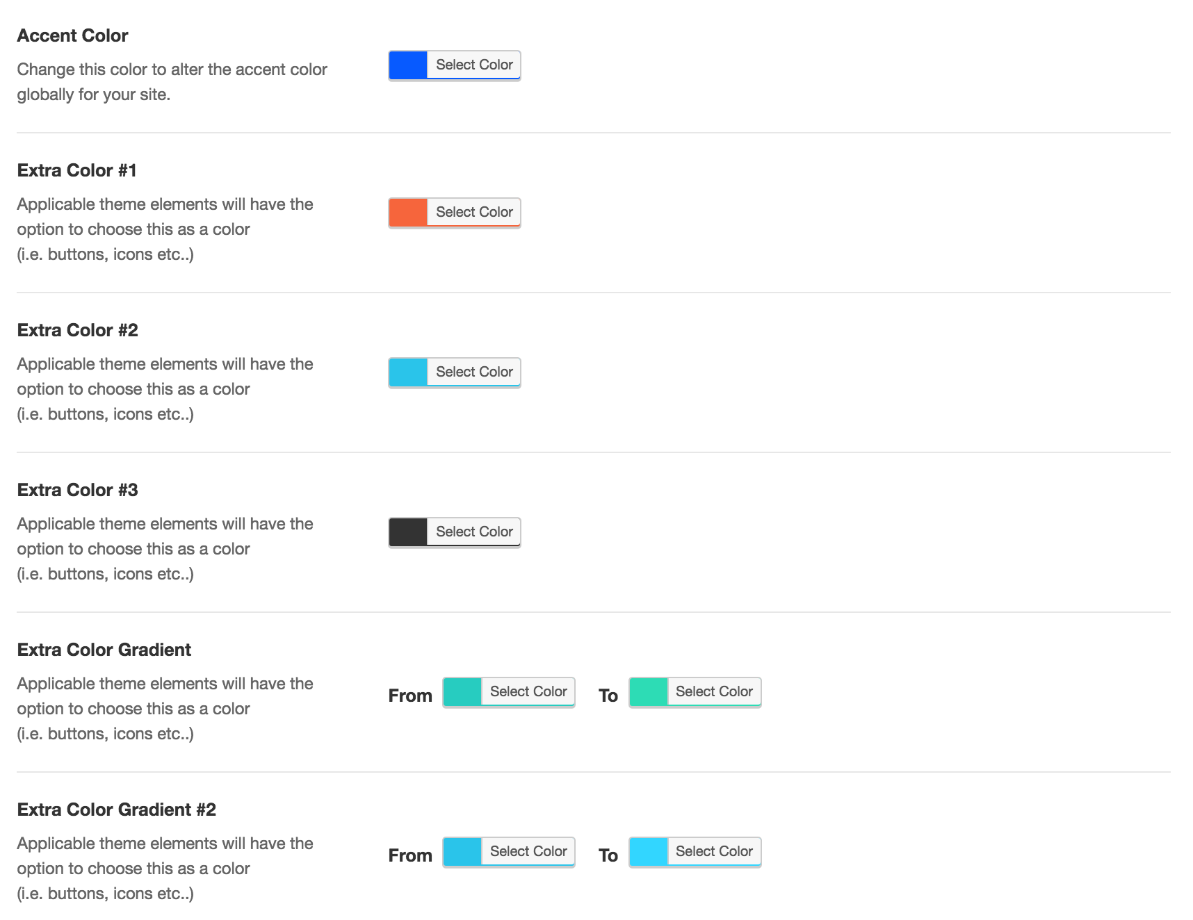
Some themes offer special Theme Options for colors. These options let you pick accent colors easily. Navigate to Appearance, then Theme Options. Here, you can adjust the accent color. This feature varies by theme. Not all themes have this option. Check your theme’s features before using it. Theme Options simplify the process for users. They add flexibility to design choices. Explore your theme’s options to enhance site appearance.
Tools For Color Selection
Color pickers help choose the right colors. They are easy to use. Just click and find the color you like. Many websites offer free color pickers. They show different shades and tones. This helps in selecting the best accent color for your WordPress site. Try experimenting with these tools. They are fun and helpful.
Online resources provide guidance for color selection. Websites like Adobe Color and Coolors are popular. They offer pre-made color palettes. These palettes are designed by experts. It saves time and effort. Users can download and use them directly. This ensures a professional look for your website. Always remember, the right color makes your site stand out.

Credit: pixelgrade.com
Common Mistakes To Avoid
Accent color in WordPress enhances design by highlighting key elements. Choosing a mismatched color can disrupt visual harmony. Overusing accent colors may lead to a cluttered appearance, confusing visitors.
Overuse Of Accent Colors
Too many colors can confuse users. A website should look clean and easy to read. Using too many accent colors makes it messy. Pick one or two colors for your accents. This keeps the design simple and appealing.
Balance is key. Accent colors should highlight important parts. They should not cover the whole page. Keep the main color simple and use accents wisely.
Ignoring Accessibility
All users must be able to read your site. Some people have trouble seeing colors. Use accent colors with good contrast. This helps everyone read better. Check how your site looks to people with color blindness.
Text should always be clear. Avoid using light text on light backgrounds. Dark text on dark backgrounds is also bad. Make sure your text stands out.
Case Studies Of Successful Websites
E-commerce sites use accent colors to guide buyers. Red or green buttons often highlight “buy” or “add to cart.” These colors make it easy for shoppers. They know where to click. Brands use their main color for trust. But accents give a clear call to action. Simple design helps users find what they need fast. Shoppers do not feel lost. Instead, they feel guided. This leads to more sales.
Personal blogs use accent colors to show style. A bright color can highlight quotes. Or links to other posts. This makes reading fun. Accent colors make stories pop. They catch the eye. Each blog has its own feel. Readers remember these colors. They connect them with the blog’s voice. Simple, but strong.

Credit: themenectar.com
Frequently Asked Questions
What Is An Accent Color In WordPress?
An accent color in WordPress is a theme design element. It highlights key sections or features on a website. This color enhances visual appeal and guides user navigation. It is often used in buttons, links, and headers. Choosing an effective accent color can improve user experience and engagement.
How To Change Accent Color In WordPress?
To change the accent color, go to the WordPress Customizer. Navigate to the “Colors” section and select “Accent Color. ” Choose your desired color from the palette provided. Save your changes to update the theme. This customization helps personalize your site and align it with your branding.
Why Use An Accent Color In WordPress?
Using an accent color makes your website visually appealing. It draws attention to important elements and improves navigation. Accent colors can also reinforce branding and enhance user experience. They help differentiate sections and guide visitors through content effectively. This increases engagement and retention on your site.
Can Accent Color Affect Website Performance?
Yes, accent colors can impact website performance by influencing user behavior. A well-chosen accent color can enhance readability and engagement. It helps users easily identify calls-to-action and navigate content. Poor color choices may confuse visitors and reduce interaction, affecting overall site performance.
Conclusion
Accent color in WordPress adds visual interest to your site. It helps highlight important elements, drawing attention to key areas. Choosing the right accent color can enhance user experience and brand identity. Experiment with different shades to find what suits your style.
Balance is key, so use accent colors sparingly. Too much can overwhelm users. A well-chosen accent color can make your site more attractive and memorable. It is a simple yet effective tool in web design. Try it to see the impact on your WordPress site.


