Imagine visiting a website and feeling unsure about what to do next. You’re interested in what you see, but without clear guidance, you might leave without taking any action.
This is where a Call to Action (CTA) button comes in, acting as your trusty guide. In WordPress, a CTA button is a powerful tool designed to prompt you to take specific actions, whether it’s signing up for a newsletter, downloading a free eBook, or making a purchase.
Why is this little button so crucial for your website? It’s simple: effective CTA buttons can significantly boost your engagement and conversion rates. They speak directly to your needs, encouraging you to take the next step and fulfill your intentions. Understanding how to strategically use CTA buttons in WordPress can transform your website’s performance. You’re about to discover how these buttons work and the best practices to make them irresistible. Keep reading to unlock the secrets of maximizing their potential on your WordPress site!
Call To Action Button Basics
A Call to Action (CTA) Button is a web element. It prompts users to take action. Clicking is the main goal. It can lead users to a sign-up page. Or a product purchase page. CTAs are often in bright colors. They stand out on the page. This draws attention. The button text is often short. Like “Buy Now” or “Learn More”. These words guide users. They make it clear what will happen next.
CTA buttons are crucial in digital marketing. They help increase conversion rates. More clicks can mean more sales. Or more subscriptions. CTAs engage users. They encourage interaction. They also help track user behavior. Marketers can see what works. And what doesn’t. This helps improve strategy. Better strategy leads to better results.
Design Elements
Colors make buttons stand out. Bright colors catch the eye. A blue button looks good on a white page. Contrast helps too. Dark text on a light button is easy to read. People notice it quickly.
Text should be short. Use simple words. “Buy Now” is clear. Typography is important. Big letters are easy to read. Bold letters show importance. The text should be straight and neat. Everyone can read it.
Size matters a lot. Buttons should be big enough. Small buttons are hard to click. Shape can be fun. Round buttons look friendly. Square buttons look serious. Pick the right shape for your site.
Placement Strategies
Call to action buttons should be seen quickly. Above the fold is where they get the most attention. This means putting the button in the top part of the page. People see this area first. It’s important for grabbing eyes and clicks. Many websites use this strategy. It works well for getting the visitor’s interest fast.
Buttons can be inside the text. Place them after a strong point. Readers feel ready to act. They feel engaged. This strategy flows naturally with content. It feels part of the reading experience. A button here can boost interaction. It makes taking action easy for readers.
Footers and sidebars are great spots for buttons. They are less intrusive. Yet, they are visible. They provide a consistent call to action. Many visitors scroll down. They notice the footer. Sidebars are always there. They offer a choice without pressure. It’s an effective placement for steady engagement.

Credit: www.youtube.com
WordPress Plugins For Cta
Elementor and WPForms are popular plugins. They help create CTA buttons easily. Each plugin offers unique styles and features. Thrive Leads is another option. It focuses on lead generation. OptinMonster is good for conversion optimization. These plugins are great for beginners. They are easy to use and set up.
Look for plugins with responsive designs. This ensures buttons look good on all devices. Customization options are important. They allow you to match your site’s look. Consider plugins with analytics features. These help track button performance. Ease of use is key. Beginners should find them simple to navigate. Some plugins offer A/B testing. This helps find the best performing button style. Cost can vary. Some plugins are free, others are not. Choose based on your budget.
Best Practices
A Call to Action (CTA) button in WordPress encourages visitors to take a specific action. It guides users to subscribe, purchase, or learn more. Proper placement and clear text enhance its effectiveness, making it a crucial element for user engagement.
A/b Testing
A/B Testing helps find the best button design. Test different colors and texts. Compare results. Choose the one with more clicks. It’s simple and effective. Testing improves conversions.
Mobile Optimization
Mobile Optimization is crucial. Buttons must be easy to tap. Ensure they fit on small screens. Users prefer quick actions. Avoid tiny buttons. Responsive design is key. It enhances user experience.
Clear Messaging
Clear Messaging grabs attention. Use simple words. Be direct and precise. Users understand quickly. Avoid confusion. Tell them exactly what to do. Clarity boosts engagement.
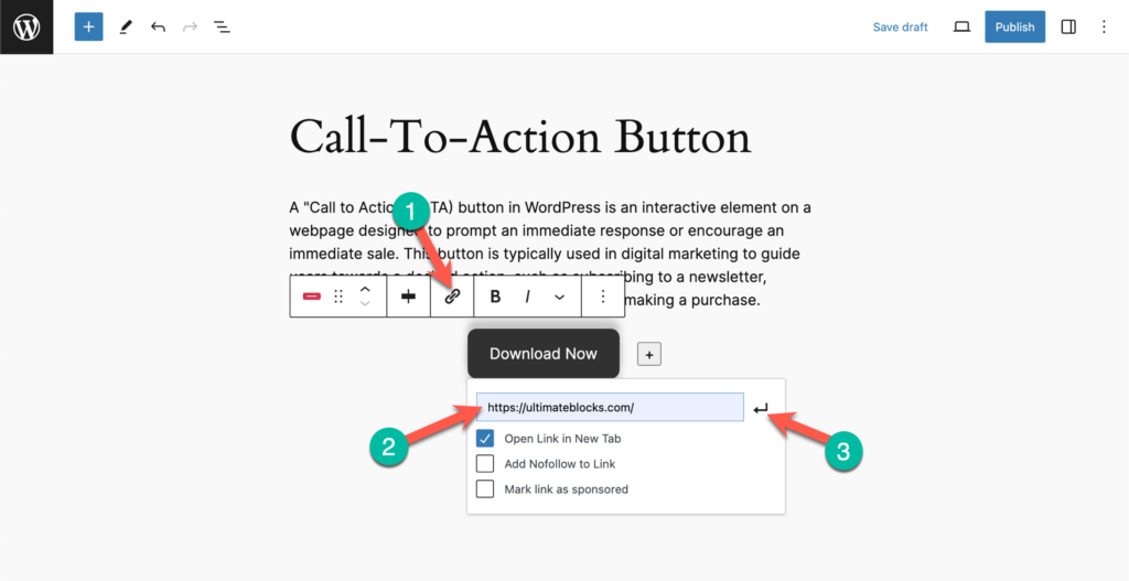
Credit: ultimateblocks.com
Common Mistakes
Too many buttons can confuse users. Keep it simple. A single, clear choice is best. Avoid cluttering your page. This keeps the focus on the main action.
Words like “click here” are not clear. Use direct words. Tell users what they will get. This builds trust and improves the user experience.
Analytics helps you understand what works. Without it, you miss valuable insights. Track how often buttons are clicked. Adjust your strategy based on data.
Case Studies
A Call to Action button in WordPress is a clickable element. It directs visitors to take a specific action, like signing up or purchasing. Essential for guiding user interaction, it boosts engagement and conversions on websites.
Successful Implementations
Many websites use Call to Action (CTA) buttons for success. These buttons help guide visitors to important actions. For example, signing up for a newsletter or making a purchase. A clear and visible CTA button increases user engagement. Websites with bright, bold buttons often see more clicks. They stand out and draw attention. Well-placed buttons improve user experience and navigation. Visitors find it easier to complete actions.
Lessons From Failures
Some websites struggle with their CTA buttons. They might be hard to find or read. A button that blends with the background goes unnoticed. If a button’s message is unclear, users feel lost. Websites need to test and learn from these mistakes. It’s important to try different colors and texts. This helps in finding what works best. Learning from failures leads to better design choices.
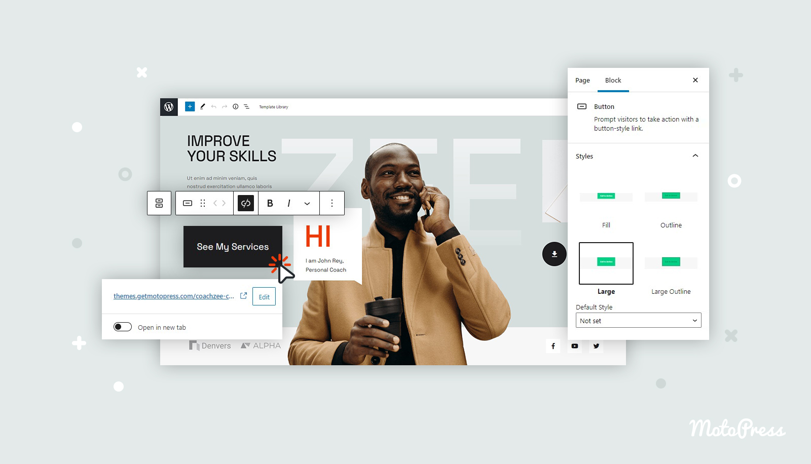
Credit: motopress.com
Frequently Asked Questions
What Is A Call To Action Button?
A Call to Action (CTA) button is an interactive element on a website. It encourages users to take specific actions like signing up or buying. In WordPress, it can be easily added using plugins or themes. A well-designed CTA button can significantly improve user engagement and conversions.
How Do I Add A Cta Button In WordPress?
Adding a CTA button in WordPress is simple. You can use plugins like Elementor or use built-in theme features. These tools offer customization options for design and placement. Ensure your CTA button is prominently displayed and aligned with your marketing goals.
Why Are Cta Buttons Important In WordPress?
CTA buttons are crucial for guiding user actions and increasing conversions. They help direct users to desired actions like subscribing or purchasing. In WordPress, well-placed CTA buttons can enhance user experience and improve website performance. A strategic CTA can significantly impact your website’s success.
Can I Customize Cta Button Design In WordPress?
Yes, you can customize CTA button design in WordPress. Using themes or page builders like Elementor, you can change colors, sizes, and fonts. This ensures the button aligns with your brand’s aesthetics. A visually appealing CTA button can attract more clicks and improve conversion rates.
Conclusion
Call to action buttons are vital for WordPress websites. They guide users to take specific actions, boosting engagement. Well-designed buttons enhance user experience and increase conversions. Keep them visible and simple. Use contrasting colors for better visibility. Test different designs to see what works best.
Remember, clear wording is crucial. A good call to action motivates users effectively. Focus on simplicity and clarity. Make sure your audience knows what to do next. Start optimizing your call to action buttons today. Watch your website’s performance improve steadily.